
Last modified: 2024-11-16 by  klaus-michael schneider
Keywords: error | ratio: 9:13 | tower(yellow) | castle(yellow) |
Links: FOTW homepage |
search |
disclaimer and copyright |
write us |
mirrors
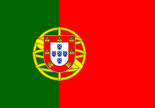
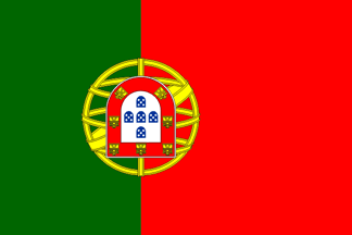
![[Portugal national flag]](../images/p/pt.gif) 2:3, image by Vítor Luís and António Martins-Tuválkin, 23 Sep 2004
2:3, image by Vítor Luís and António Martins-Tuválkin, 23 Sep 2004
The official design that ever existed is the one still in use, with two parts of green on the hoist and three parts on the fly, and always with the coat of arms (centred on the partition line, half the flag’s height in diameter). Given the relatively complexity of these specs, however, simplifications and incorrect versions abound, though.
António Martins-Tuválkin, 2 Jan 2002

At Euro celebrations shown on TV, I saw Portugal flags as they are, minus the coat of arms.
Zach Harden, 2 Jan 2002
I saw this seal-less flag flying in several places in France too, intending to be displayed for Portugal (because it was flying with 14 other flags, which were similar to the 14 other UE members’ flags).
Olivier Touzeau, 25 Feb 2003
I have also seen pieces of green and red cloth in a line with other E.U. member states’ flags, and I have seen them in Spain and in France. These are not bunting. They are pieces of cloth in the shape of a flag and flown from staffs or strung in a line with other flags which they resemble in shape and size. They are flags. They incorrectly symbolise Portugal, of course, but they are flown (ignorantly) specifically to symbolise Portugal.
André Coutanche, 26 Feb 2003
The flag of green and red vertically divided off-centered to hoist has no meaning whatsoever per se. It is a flag, certainly, if it is made of cloth and hoisted from a flag pole (it would be a flag even if that’s done virtaully, say per animated-gif, or even just as rectangular “patch” found on a begining of PT language paragraph on candy bar wrappings), but it is not the flag. I.e. it is not the flag of Portugal.
Željko Heimer, 26 Feb 2003
My experience tells me that that ugly rag is only used outside Portugal, probably to spare money with cheap displays, or something of the sort….
Jorge Candeias, 26 Feb 2003
They are certainly not according to the portuguese flag legal specification, which specifically specifies the coat of arms, though armless versions of the flag is an often seen simplifications — not really as a flag, but as a representation of the flag in iconic displays, as acceptable and proper as, f.i., an US flag with fewer stripes and stripes would be. Moreover, that design is used (with some sort or law backing it, I reckon) as tail fin and fuselage marking in some pPortuguese registered aircraft — namely warplanes and airliners.
António Martins-Tuválkin, 5 Jan 2002
It is also widely used as a simplication of the Portuguese national flag, especially for sash and ribbon design. See f.i. the flag-inspired TAP logo and airliner livery.
António Martins-Tuválkin, 24 Feb 2004
Our company sells this flag, made by Annin. Until some company decides to produce the flag with the arms, this is the only “courtesy” flag that we can offer. For some, being able to show their colours in part is better than not at all.
Rick Wyatt, 25 Feb 2003
The plain, armless, variation is one the more acceptable “mistakes”. Perhaps all portuguese heraldists and vexillologists would admit that such a simplification (or with a yellow disc in lieu of the arms) is much more acceptable than grossly misdepicted arms, as f.i. in the
Corel Draw suite clipart.
António Martins-Tuválkin, 26 Aug 2003
A friend on mine, in Macao, reported seeing them in use on small craft, without the arms.
Jim Ferrigan, 26 Feb 2003
I can understand how poor fishermen preferred to sew together two pieces of red and green cloth to be marginally within the law that orders vessels to display the flag of the nation they are registered in, instead of spending much-needed money in the purchase of fully armed flags. I can also see the Portuguese authorities closing their eyes to that violation, even in the times of dictatorship.
Jorge Candeias, 27 Feb 2003
image by António Martins-Tuválkin, 23 Aug 2003
The French city of Evian-les-Bains (where the last G8 summit took place) is decorated with vertical flags of several nations. The Portuguese flag is indeed without the emblem in the middle. I could not check the exact proportions of the flag, which was rectangular (not forked), with at least the red field bigger than the green one. (I am surprised nobody complained about this flag, since there is a sizeable Portuguese community in Evian and the neigbourhood.)
Ivan Sache, 23 Aug 2003
Correct red-to-green ratio must go along correct (or at least approximate) height-to-width ratio. Vertical portuguese national “flags” with unequal stripes, with coat of arms or not, are percieved as just plain odd.
António Martins-Tuválkin, 26 Aug 2003

I have a plate that I believe dates from between 1912 and 1917. It depicts the flags of several countries, including Portugal. The flag for Portugal, though, seems to be incorrect: It is shown as a red and green flag, split 50/50, with no sphere or shield.
Steve DeGroof, 29 Dec 2001
Occasionally hand-made flags are produced and flown or (more commonly) waved without the arms, and they look plain (pun intended) awful.
Jorge Candeias, 24 Feb 2004
Simplifications and incorrect versions abound. A simple red/green vertical equal bicolour is perhaps the most simple as it gets.
António Martins-Tuválkin, 2 Jan 2002
This is especially so, when vertical flags are envolved.
António Martins-Tuválkin, 26 Aug 2003

here is mentioned an official Portuguese postage stamp of 2000 where the national flag pattern (filling a star shape) is given as plain, equal red-green, while the other flags of countries are shown correctly in detail.
António Martins-Tuválkin, 19 June 2009
Heh, I really thought I had these covered for now - but no, just found two more "notable" incorrect depictions of the Portuguese national flag. Today we have the case of yellow-filled emblem, that is, when the gaps of the armillary sphere visible around the shield show through not the background (half green and half red, when applied on the national flag) but rather a solid yellow field.
This is visually a compromise between the real thing and the often, simplified version with a solid yellow disc in place of the emblem. But this version serves no simplification, it's just wrong. It may arise due to wrong coloration of flag depictions, both virtual or directly on paper, both intentionally or by mistake; it may also arise in actual cloth flags when incorrect or incompletely cut/prierced patches are applied on the background cloth (or, for flags printed in whole, when the menioned miscolored depictions are used).
One notable case of this incorrect version dates from last October 2013, when it starred on the official graphic image of the joint Parliamentary workshop of PSD and CDS (Jornadas Parlamentares), which were then the coalition in power in the Government of Portugal. It shows a fragment of the national flag as the background for its title and blurb, the upper fly quadrant on red background as on a flirting flag cloth (the exact version of the central emblem is the one commissioned in 2004 by the Sampaio Presidency to Vítor Luís Rodrigues and your truely), and indeed the visible gaps of the armillary sphere filled with the same shade of yellow.
It can be seen as a backdrop (or is it a mounting?) in this photo by Natacha Cardoso (Global Imagens) showing the then vice-Prime Minister Paulo Portas delivering a speech in an unflattering pose.
António Martins-Tuválkin, 20 Feb 2016
This error, not very common, stems from inaccurate adjoining of a mismeasured patch with the central emblem onto the flag bicolour background, a gap then bridged with a makeshift filler - be it on cloth, paper, virtual vectorial objects, or pixels. It is therefore akin to other such background vs. background mismatching of this flag: Flipped emblem, swapped emblem, emblem on white, and emblem on yellow.
António Martins-Tuválkin, 21 Feb 2016

An usual incorrect version is made from a "loose" image of the central emblem (typically on white background) pasted on the bicolour background of the flag without filling in the white areas of visible background in the gaps of the armillary sphere. This may come to be in all media: Computer-made flag images, hardcopy depictions (where "pasting" is the real thing, with glue), or even actual cloth flags.
Such design is used notably in the website of the official journal Diário da República: III Série
Source: Diário da República; favicon and logo
António Martins-Tuválkin, 8 Feb 2016
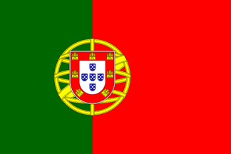
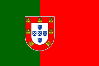
The quite usual wrong variation of the portuguese flag (and coat of arms), with towers instead of castles.
António Martins-Tuválkin, 13 Dec 2001
This flag (officially lowered for the last time at the private residence of the last portuguese governor of Macao) is wrong!! It has towers instead of castles! (That is a quite usual mistake, by the way.) Some joke of an empire, I say: they dont even care to have properly depicted flags!
This is a very widespread mistake and indeed predates the current national flag (for even longer than the mere century mentioned here. It is a heraldic error, as castles and (castle) towers are essentially different charges in heraldry, and as such should / will be addressed here with more detailed images.
António Martins-Tuválkin, 23 Dec 1999 / 9 Feb 2016
However I was shocked to learn that flag manufacturers make the national flag in 90×130 cm dimensions (ratio 9:13), instead of the correct 90×135 cm (ratio 2:3): I was told by one of them that it is so, because 130 is a “more even” number than 135!… At any rate, however, larger flags follow the official proportions: seems that f.i. the figures 2×3 m are “even” enough…. However, since 90 cm high are the most often used flags, one can say that there are more wrong flags in use than correct ones.
António Martins-Tuválkin, 13 July 1999

A few of years ago, I encountered a street vendor in Canterbury who sold a Portuguese flag split 50/50 with the charge centred.
Peter Hans van den Muijzenberg, 10 Feb 2016
This version, maybe less often than one would suppose, is the "missing link" between the correct flag and the simple bicolour. (The other such possible link is the version with no emblem but correct 2-green and 3-red areas here.)
António Martins-Tuválkin, 11 Feb 2016
Another typical mistake, “flipped arms”: I saw it again, hoisted in April 2003 at the balcony of the São Brás de Alportel municipal HQ.
António Martins-Tuválkin, 24 Feb 2004
This is an usual incorrect version, obtained by adding a "loose" image of the central emblem onto the flag surface, this time disregarding its symmetry. To achieve this wrong design , a pre-made patch of the central emblem with the "transparent" bits cut-off is pasted/applied to the wrong face of the flag: The patch intended to go on the reverse used on the obverse looks like image above - note the thicker ring, with the ecliptic/Zodiac slanted from lower hoist to upper fly, instead of the correct opposite.
António Martins-Tuválkin, 9 Feb 2016
A quiz, featuring the Portuguese national flag, was a typical early-era click-bait and challenged visitors to pick the right depiction of the Portuguese national flag from among four designs, one being the correct one and the other three more or less evident adultered versions (an easy puzzle to solve for the targeted audience). All four designs had two systematic errors, showing the shade of green not dark and the emblem slightly larger than the prescribed size , but were in general fairly correct in the overall ratio (2×3) and in the proportions of the two main areas (2+3). One flag had a blue bordure in the shield of the arms (instead of correct red).
Sources: here and vertical flag
António Martins-Tuválkin, 12 May 2016
Flag with swapped green and red fields; please note that, while this error is easy to describe, it is not very usual as such, as whoever would engage in it would likely compound it with additional incorrections.
António Martins-Tuválkin, 13 May 2016

There is another one of these, where the whole patch containing the emblem lacks the "holes" (usually found on smaller flags) and therefore, when wrongly applied or pasted, there is green where red should be and vice versa. This effect may occur also on depicted
flags, not only in the cloth, both in hard copy and in digital images.
This happens much more often on the reverse of the flag (i.e., on the side with the hoist at the viewer's right hand side), as often those patches exist only for the obverse.
António Martins-Tuválkin, 9 Feb 2016
The Portuguese national flag being vertically symmetrical except for a few details of the emblem (chief and base of the shield differently shaped and ecliptic ring of the sphere running diagonally from top hoist to lower fly), means that hoisting a regular flag upside down will result in a minimally changed look, with only the inverted emblem - not visible at great distances - giving it away.
Due to this, the Portuguese national flag is often flown upside down; the still current President Cavaco Silva was famously photographed at least twice in very official situations waving/hoisting the flag upside down.
Source: here.
António Martins-Tuválkin, 9 Feb 2016
![[wrong flag]](../images/p/pt!eurbr.gif) 2:3 image by João Madureira and António Martins-Tuválkin, 19 June 2004, |
![[wrong flag]](../images/p/pt!uefa.gif) 2:3 image by António Martins-Tuválkin, 9 Feb 2016 |
The left image above has got to be the ugliest flag I’ve ever seen… As has already been reported, Portugal is currently experiencing an unprecedented flag craze… And not all of the flags are entirely correct. I’ve seen this flag flying from a window here in Lisboa. It consists of the national flag flipped vertically with yellow “comic book” lettering applied over it: in the top "UEFA Euro 2004", and in the bottom, most peculiar of all, "Brasil"! The flag is clearly not home-made, it has clearly been printed in industrial machines. I’ve seen at least another of these flags, but this one had a somewhat more reasonable lettering in the bottom : "Portugal".
João Madureira, 19 Jun 2004
The right iamge above does include a full-on cascade of subsequente mistakes: 1st, someone chose the already less-than-perfect Apache-version of the central emblem, then put it upside-down on the flag cloth - what would not be too bad (this kind of flags being fitted with a sleeve that can be reversed upon "hoisting" on a broomstick or any other such staff) if the design didn't include additional lettering, which is in itself the 3rd mistake: National flags (or any flags) should not be defaced with additional "captions" - it's bad enough when those are part of the
official design. (I seem to recall that back at this time, during the 2004 European soccer championship, such defaced flags of all participating countries were on sale.) Finally, said caption manages to misidentify the country in question, reading "Brasil" (see left image) instead of "Portugal" - an error compounded by the fact that Brazil didn't even enter this competition, as its national team belongs to Conmebol (South America), not to UEFA (Europe).
The slightly less wrong version of this flag, reading Portugal instead, was photographed by me back then, and can be seen online here. The overall size of the emblem is smaller than the official specs (half the flag's height), possibly to give room for the lettering, and is off-centred downwards for the same reason (which are 2 further errors).
João Madureira's image of the Brazilian version shows the lettering set around the emblem on an otherwise undisturbed flag, with the emblem properly sized and placed, but I suspect that this was a GIFfing license and that the extra-wrong Brazilian version had the same altered specs as its corrected kind.
António Martins-Tuválkin, 9 Feb 2016
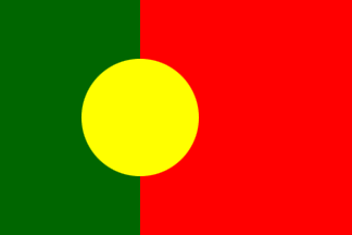
The average portuguese flag… lacking the armillary sphere… I found this in a restaurant in Barcelona, serving Brazilian and Portuguese cuisine. It could be a monarchist flag, using though the republican colours and lacking the crown — but it would be the only one I ever saw. I bet for sheer ignorance and carelessness.
António Martins-Tuválkin, 18 July 1999 and 7 Nov 2001
![[PT empty sphere small]](../images/p/pt!esf.gif) 2:3, image by Vítor Luís and António Martins-Tuválkin, 6 Jan 2008 |
![[PT empty sphere big]](../images/p/pt!nosh.gif) 2:3 image by Vítor Luís and António Martins-Tuválkin, 6 Jan 2008 |
It is the national flag with the shield removed, leaving only the armillary sphere, which in turn is slightly enlarged to some 60% (see right image above) of the height (instead of 50% (see left image above)). This as suggested in one of many suggestions that popped up in the Portuguese media lately, published in Diário de Notícias on 27 October 2003
as P.9 ("Opinião"") "Sugestão à bandeira nacional", by a Fernando Morgado de Andrade.
I don't think that the Portuguese national flag is about to be changed. If there has been some media attention about putative changes, that is just the (very minority) reaction by a an increase of flag use and awareness in the Portuguese society, which peaked with the soccer events of 2004 and 2006.
António Martins-Tuválkin, 6 Jan 2008
Even such an extremely precise and valuable reference as Flaggenbuch reprint 1992 [neu92] of the German Kriegsmarine painted it in light green (alongside the tones of dark green for other flags; therefore it was not a printing default), so this is nothing new. Obviously cheap thin cloth will never look very dark, and I guess this is one of the reasons why the light green is more comfortable.
This is obviously what Columbano Bordalo Pinheiro, the artist who presided the flag comission, had in mind. The word “dark” was used because he wanted it there, not by chance. He didn’t want a flag that would look lighter on the hoist side.
A. S. Marques, 25 Nov 1998
to next page click here.
back to Portuguese national flag click here.