 zachary harden
Keywords: ufe | unidentified flags | 2013 |
Links: FOTW homepage | search | disclaimer and copyright | write us | mirrors

Last modified: 2026-04-04 by  zachary harden
Keywords: ufe | unidentified flags | 2013 |
Links: FOTW homepage |
search |
disclaimer and copyright |
write us |
mirrors
Please note our Policy for Submissions and Enquiries.
Below is a series of images of flags that have been provided to FOTW; some we have recognized, and some we have been unable to recognize. If you can help us identify any of these flags, please let us know! Contact the: UFE Editor.
Identification Key:
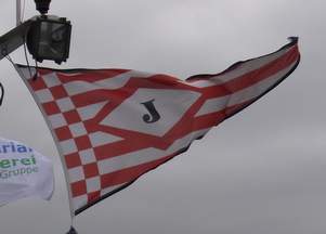 Image from Klaus-Michael Schneider, 1 January 2014
On 30 March 2012, I spotted this pennant at Billwerder Bucht in Hamburg. A skipper from another ship told me, it would be the houseflag of Jahn, or John or Johannsen or similar located in Syke. Unfortunately I didn´t write down the name. And a friend of mine from Syke confirmed that according to the phone directory there was no inland shipping company in her town beginning with a "J". Looking at the design I think, it is a Bremen based company. The pennant has the pattern of a Bremen flag with 11 stripes superimposed by a white lozenge fimbriated red with a black initial "J".
Klaus-Michael Schneider, 1 January 2014
It does look like a Bremen-related company, but then, Syke is just across the Weser. It could be a company that moved out of the city, for whatever reason. Still, Syke is not on the river, so maybe the company is actually in Weyhe or somewhere in Verden. Do you think your friend could be persuaded to have another look?
Peter Hans van den Muijzenberg, 2 February 2014
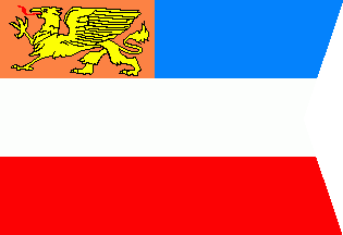
Image by Klaus-Michael Schneider, 1 January 2014
Jörg Karaschewski presented this flag on DGF 21 Meeting in Rostock. It is a swallow tail pennant, a blue over white over red tricolour. But it has an orange canton containing a yellow griffin of Rostock. Probably it is a shipping company.
Klaus-Michael Schneider, 1 January 2014
Mecklenburg Seeflagge: blue, white, red; as flown specifically: orange canton; from Rostock ships: Griffin? Except, didn't they use a black griffin for that?
Peter Hans van den Muijzenberg, 19 January 2014
I was there, when Jörg held the presentation of some flags of his collection. Clearly orange with yellow griffin, very unusual. None of us knew that flag. And it was a new flag made of poly.
Klaus-Michael Schneider, 20 January 2014
Yes; I guess the griffin of Rostock was black in the 19th century, but changed colour sometime to yellow in the 20th century. So if one were to make an merchant ensign in the 20th century it would look more like this. (Well, it would have to be after that change and while the style of a merchant ensign with an orange canton was still in use.) So, that's what it's design seems to be, though it may well be a house flag, or an event flag, or a tourist flag. But maybe Jörg knew how he got it?
Peter Hans van den Muijzenberg, 20 January 2014
Images from Klaus-Michael Schneider, 1 January 2014
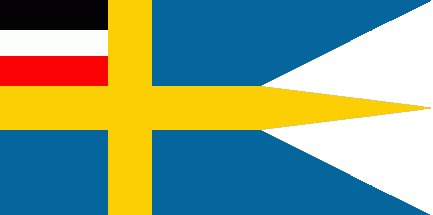
Jörg Karaschewski presented this flag on DGF 21 Meeting in Rostock. It is a Swedish split flag surprisingly bearing a black over white over red horizontal tricolour in the upper hoist corner.
Klaus-Michael Schneider, 1 January 2014
Perhaps a Swedish neo-Nazi flag, combining the national flag of Sweden with the flag of German Empire as the symbol of ideology? Seems that such a combination would be illegal in Sweden, though.
Tomislav Todorovic, 1 January 2014
The flag was too old to belong to a neo-Nazi group! It was made of cotton or linen.
Klaus-Michael Schneider, 2 January 2014
Well, could it not be an actual Swedish tongued split-flag, bearing an actual German Empire canton? In 1905, the Swedish flag lost it's colourful canton owing to Norway becoming independent. I could imagine that at the time, the Swedes would have been inclined to add flags to their flag, should the occasion arise. At the time there were post ferries between Sweden and Germany, and in 1909 the King's Line was officially opened, the train-ferry between Trelleborg and Sassnitz, that connected Stockholm and Berlin by a direct rail route. Such a flag might have been flown from such a ferry.
Peter Hans van den Muijzenberg, 7 February 2014
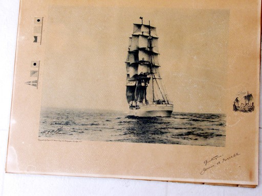 Image from Hugh Hagan, 7 January 2014
I am doing a bit of research on the last U.S. flag cargo carrying ship rigged sailing vessel the "TUSITALA" (310' LOA x 39'5" beam and carrying about 20,000 sq feet of sail). She was owned by James A. Farrell of the Farrell Lines Steamship Company. She was laid up in 1932 in New York Harbor.
I have a large undated photograph of the ship signed by Mr. Farrell that I believe was taken about 1930. The ship is carrying a flag hoist which reads as "MFIR" or possibly "M41R" - probably the vessel's call sign.
The flags are different from the current code flags. The "F" flag is a pennant shaped flag which in the black & white photo looks the same as the number "4" flag in present use. I could be either the number "4" or the letter "F" as it has the same shape in the B&W coloring as a flag so identified in the border of the picture. Similarly the "I" flag is very similar to the current number "1" flag. The letters M & R looks in B&W as being quite similar to our present day code set.
As mentioned the border shows two 3 flag hoists which were hand drawn and which were identified with notations. The first hoist reads "IQA" and the flags correspond with our present flag set. I have not been able to find an old code book which might translate the message.
The second 3 flag hoist is identifies as "IOF". The I and O flags correspond to the present flag set but the flag identified as "F" most closely resembles the present day number "4" - thus the confusion in identifying the hoist displayed on the "TUSITALA".
I am hopeful that perhaps some of your colleagues might be able to read these various hoists.
A better photo of the ship and a brief by her last master (Captain Barker) of one of her last voyages can be found on an Argentine website: I am attaching a not so great copy of the photo in question.
Hugh Hagan, 7 January 2014
A change of the ICS coming into force per 1934 changed the letters C - G, which had all had pennant shapes, to rectangular shapes, to free up the pennant shape for the introduction of digit flags. The actual designs were re-used for digits 1-5, which meant new designs had to be introduced for those five letters.
In a pre-1934 image, the pennant white cross on red would therefore represent F.
The Internet Archive has a copy of the ICS US edition, printed 1909. It lists
- IQA: Christmas
- IOF: cheer-ed-ing-ful-ly-ness
I guess the general idea is clear. (I checked, and "Merry" is not in the signal book.)
Peter Hans van den Muijzenberg, 8 January 2014
 Image from Edward Babcock, 9 January 2014
Any ideas where this is from. The cup is from the late 80s.
Edward Babcock, 9 January 2014
It looks like a US yacht or sailing club flag, from the general design, but I don't think we have it displayed on FOTW (yet).
Rob Raeside, 8 January 2014
But in the US the hoist tends to be red over blue. (This could be an exception, though) A triangular burgee, blue over red with a white fly lozenge. Or is it? It's hard to say whether the red might not be meant as a triangle.
If this is from the previous century, the late 80's would be fairly recent: 25 years ago or maybe a few years more. Is there a known location where this was found, or where it was made? (Or would it help to know what identifies it as late 1980's?)
Peter Hans van den Muijzenberg, 17 June 2014
This burgee is that of the Riverdale Yacht Club, as shown in Lloyd's Register of American Yachts (1972), plate 20. The Riverdale YC is located in the borough of the Bronx in New York City. The burgee can also be seen on the Riverdale Yacht Club "Tennis Booking" page.
Joe McMillan, 28 January 2015
A History of the Riverdale Yacht Club by Ruben P. Mendez is partly readable in Google Books. From this I found that the Riverdale Yacht Club was established on 2 March 1930. According to its certificate of incorporation, it was intended to support yachting, swimming, tennis and squash. Its target audience were the families forming the Riverdale neighbourhood. The burgee was designed by Dorothy "Dodo" Freeman, 17 years of age at the time, approved by special committee and finally registered and adopted in June 1933.
Lloyd's Register of American Yachts (1963) on the other hand lists the club as established 1932. It doesn't give a burgee for the club.
Peter Hans van den Muijzenberg, 28 January 2015
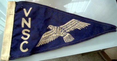 Image from Paul Vincent, 19 January 2014
Would you know a vintage pennant with V N S C written vertically on the left hand side in cream lettering with what looks to be a large seagull to the right with the number 15 stamped and is approximately 16 x 8 inches.
Paul Vincent, 19 January 2014
I do note these letters are the initials of the Flemish-Dutch Schelde Commission, but I cannot see any pennant of flag on their webpage. Perhaps some of our Dutch readers will be able to dig deeper on that page. The final two letters might also suggest "Sailing Club", but the only VN Sailing Club I can find is on Lake Victoria, Uganda, and also does not show any flags on its web page. It does seem to have a long history, though, so a "vintage" pennant may no longer be used.
Rob Raeside, 19 January 2014
That doesn't look like a seagull to me. Is there a ornithologist is the house?
There might be a language where we can match an initial to the right type of bird, once we know it.
Peter Hans van den Muijzenberg, 25 January 2014
This appears to be a burgee of the Victoria Nyanza Sailing Club [VNSC - located in Uganda], just as you had surmised, albeit a slightly different version of the current design.
Bill Connelly, 2 November 2014
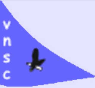 Image from Rob Raeside, 2 November 2014
A cropped version of the current VNSC burgee - this one needs a good artist´s hand.
Rob Raeside, 2 November 2014
This is the image of the original Burgee of the Victoria Nyansa Sailing Club. This Burgee was the official one used in the 1950's and early 1960's. The sailing club was and still is situated on lake Victoria at Kaazi in Uganda. The Letters vertically arranged and a depiction of a white Gull. I hope this helps.
David Cook, 9 June 2020
Has anybody made a drawing of this burgee? I have e-mailed the VNSC club asking for an image of their current burgee.
Pete Loeser, 9 June 2020
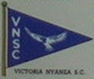 Image from Peter Hans van den Muijzenberg, 9 June 2020
The Complete Lloyd's Register of Yachts for 1939 is the first listing for: Victoria Nyanza Sailing Club, established 1935; Kampala, Uganda. At that time, no burgee is pictured.
In the 1959 edition, the club is pictured in Lloyd's with burgee, though as a late entry. The burgee that year is the same as a seller used two years later to illustrate a copy of the 1961 flag booklet. It's also the same as the last depiction by Lloyd's, in the 1971 final flags booklet.
I don't know whether the club had a burgee before 1959, or after 1971, but between those two years, it Lloyd's consistently pictures this specific burgee.
Peter Hans van den Muijzenberg, 9 June 2020
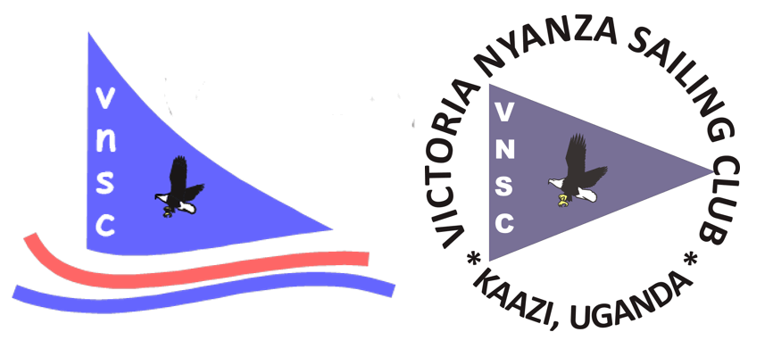 Images from Harriet Fowler, 7 July 2020
(images of logos combined for easier viewing by editor)
I just received the following message from Harriet Fowler, Victoria Nyanza Sailing Club Secretary:
"Greetings to you at this strange time! Emmanuel our manager forwarded your query about the Club burgee to me - I am the Secretary. Apologies for the delay in getting back to you. We do in fact still use both logos (attached). The bird is a fish eagle - very typical in Lake Victoria (Nyanza, Nalubaale depending whose name you use!) Best wishes and let me know if we can send you any more information."
I have requested more information for FOTW illustrators.
Pete Loeser, 7 July 2020


Image by Klaus-Michael Schneider - Image by Peter Hans van den Muijzenberg
I found a B/W photo within a filing card of Museum für hamburgische Geschichte. The description said, that the pennant was unknown, but probably a yacht club pennant. The stripes were black and red. The Background was white. On the photo the black stripe is broader - I have attached a GIF in a reddish shade.
Klaus-Michael Schneider, 20 January 2014
I make it a 3:5 flag, and as the grey background had to be removed anyway I drew a version with that ratio. Since we really only have a black and white image, I picked standard shades of the three colours.
Peter Hans van den Muijzenberg, 20 January 2014
It was a helmsman's flag of Akademischer Ruderclub Hamburg.
Klaus-Michael Schneider, 20 April 2023
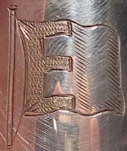 Image from Miles Harrison, 26 January 2014
I was wondering if you might be able to identify a flag for us. I think it might be a house flag, but I'm by no means certain. The engraving is from a 1961 English silver cruet set. Probably given to a ship's captain. Any ideas?
Miles Harrison, 26 January 2014
I think that this UFE is not a house flag but rather a stylized flag of the European Movement International, founded in the late 1940s.
James Ferrigan, 3 February 2014
It may be the hatchings are meant as the colouring of that flag. However, the E on the UFE has a rather different shape from the one we picture for the European Movement flag.
Peter Hans van den Muijzenberg, 3 February 2014
Is there any more information about this? It might, e.g., be helpful to know where this cruet set was encountered. If it was probably given to a ship's captain, is anything known about him, or is it merely "the kind of present given to a ship's captain"? After all is said and done, it may well be a simple initial. However, there would still have to be a reason why it was placed on a flag.
Peter Hans van den Muijzenberg, 16 June 2014
 Image from Andy Behrens, 28 February 2017
If the engraver has used the standard heraldic conventions for representing color in an engraving, the colors are black "E" on a white background at the hoist, with green-white-green vertical stripes to the right of it.
Andy Behrens, 28 February 2017
From the color composition mentioned by Andy Behrens, could we be talking about F.H. Bertling 1956/57 or not quite? (it is a wild guess).
Esteban Rivera, 2 March 2017
I would say the hatching is meant to represent the movement of the flag, rather than its colour. The E has been outlined precisely; if the rest of the flag included more than one colour, I would expect those to be precisely separated as well. Instead, the diagonal lines vary in width, which doesn't look like precise hatching at all. Different from the suggested colouring, the entire lower fly corner is hatched that way, thus the green would not form a mere column there.
Peter Hans van den Muijzenberg, 13 March 2017
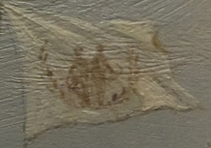
This flag has been identified as a State Flag of North Carolina c1862.
I served in the Khowst Province, Afghanistan with the 101st Airborne between 2010-2011. I acquired the flag during a mission of a local cell leader around the Patika/Sabari District and for years now have been very interested in the writings and symbols on it.
Matthew Polskin, 20 January 2014
In further communications with Matthew, he has reported that he asked an Afghan National Army soldier what it means and he said "Taliban commander bad man." Matthew also said "The flag extends out to 2 1/2 ft wide by about 6 foot. We believe it may be part of a banner because just the sides are ripped/cut?? But the top and bottom are rolled edges. It is completely green all the way to the edges."
Rob Raeside, 30 January 2014
 Detail
 Original Painting
Images from Forrest Chisman, 28 January 2014
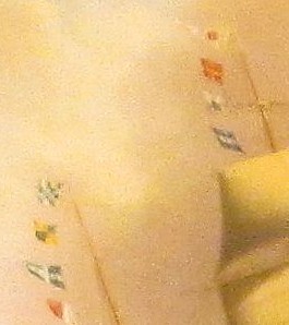
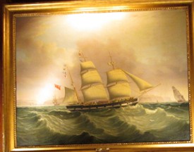
I recently purchased a 19th Century British maritime painting by Samuel Walters , and I am trying to understand more about it. In particular, as you can see from the attachment, the ship depicted is flying two flag signals, and I am looking for someone to help me decode the signals. I gather that the meaning of international flag signals changed in 1857 and then again in the 20th century.
This picture appears to be sometime in the mid-19th century, but I am not sure when. Do you know anyone who can help me with this problem, and if so can you tell me who that might be? I can try to photograph the flags or just describe them.
It seems to be hard to track down leads on this problem, so I will greatly appreciate any help you can provide.
Forrest Chisman, 28 January 2014
The fact that Samuel Waters apparently painted most of his works around the mid-19th century, a close examination of the paintings, and a comparison of its flags to those shown in the excellent Signals Flags webpage leads me to believe that those shown in the painting correspond to Marryat's Code of Signals, with an 1854 reference work to its numeric codes found in, The universal code of signals for the mercantile marine of all nations. With a selection of sentences adapted for convoys, and a system of geometrical signals by G.B. Richardson. Using this resource, I make out the main (central) mast's flags to read from the top: 1st distinguishing pendant, 7, 1, 2, which, if I understand the Marryat system correctly, indicates the ship "Autumn", whose Admiralty-assigned numeric ship's code, as referenced in the 1854 book, was "712". The mizzen (rear) mast appears to be flying the flags: RE ("rendevous", or in this case indicating "home port"), 9, 4, 3. Sadly, the book has no listing for "943" in its Part IV. Perhaps later editions of the work may hold an entry for the port or location designated (after 1854?) as "943."
In any event, you might do well to direct Mr. Chisolm to turn to maritime historical societies, especially some of the British ones listed at the British Commission for Maritime History (BCMH), to find more information about this British barque named "Autumn" and its home port indicated by those numeric flags.
Bill Connelly , 8 December 2014
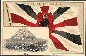 Image from Clayton Horner, 29 January 2014
Information has been moved to Glarus Canton - Early 20th Century flag representation
I found these pictures on photobucket.
They show the Colombian flag, but also two other flags (a horizontal flag, with yellow/red/white stripes). They are supposably related to the Municipality of Tocancipá. The Tocancipá's flag, as seen on the official Tocancipán website, is the same one displayed on FOTW. Since I cannot find any match between these two other flags and the flag of the Municipality of Tocancipá, I ask if any reader can identify what these unknown flags are.
Esteban Rivera, 1 February 2014
This is the flag of Fundación Jaime Duque taken at Parque Jaime Duque, an amusement park or theme park in Tocancipá.
Norberto Marne, 22 March 2014
Indeed, the flag reported is that of Fundación Jaime Duque. So here's a bit more information on this topic, so we can include it in the organizations flags of Colombia NGO section.
Fundación Jaime Duque is a non-profit organization named in honor of Jaime Duque Grisales, an aviator and first Chief of Pilots of Avianca (sources: parquejaimeduque
and Wikipedia: Jaime Duque Grisales. The park from which the flag originated is called Parque Jaime Duque a theme park but also a venue
used for concerts and other events as well.
By the way, there is another image of the flag at the Park located (here) from (source).
Esteban Rivera, 19 January 2016

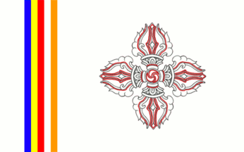
Image from Corentin Chamboredon, 17 February 2014 Drawing #1 from Corentin Chamboredon, 3 April 2014
I found on Flickr an unknown flag. The description of the photograph only reads "A local flag flies over Leh, with Zanskar mountains in the back". It has a white field, with the silhouette of a double vajra drawn with black and red lines. Between the hoist and the double vajra, there are five thin vertical stripes : blue, yellow, red, white, orange.
This flag looks too simple to be a prayer flag (which are usually covered with written prayers or religious characters). The stripes strongly suggest it is a buddhist flag, but il could just show the buddhist identity of the area. Maybe this is the flag of the Ladakh Autonomous Hill Development Council, that was chosen in 2011. Leh was the capital of ther former kingdom of Ladakh.
Corentin Chamboredon, 17 February 2014
Great drawing, but don't the stripes look like they angle from the top left corner at a slight slant? Perhaps it is just the waving motion of the flag?
Pete Loeser, 3 April 2014
I also thought about it, and you can be right, but I had the impression that the flag was in fact somehow wrapped around its staff, as we can see that the top of the staff looks thicker than near the bottom of the flag. What do you think about this photo?
Corentin Chamboredon, 4 April 2014
The flags looks to me as if there is more wrapped fabric, or it is wrapped tighter, at the bottom than at the top. Still I'd agree that the stripes are probably slanted, for the wrapping seems not to be sufficient to make this slanting angle. What I'm not quite sure, though, is if the blue stripe's edge should begin in the very corner of the flag of at the distance of one thin stripe's width. At the bottom, distance from the corner is about four times (if the edge begins in the corner) or five times the thin stripe's width (if the edge begins at the distance).
Tomislav Todorovic, 4 April 2014
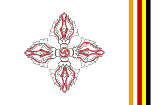 Image from Peter Hans van den Muijzenberg, 4 April 2014
Seriously: I tried changing the vajra cross to get away a bit from that rather dominant inner circle. Also, I really don't see the blue, so I went for black, and I wasn't comfortable claiming that this is a dexter hoist flag, as in case this is a printed flag the gankill would be in reverse on the dexter hoist side, so I turned it back into a sinister hoist flag. I have to assume the white top hoist comes almost straight towards us, as the alternative is that the stripes aren't straight.
It's the sinister hoist side of a white flag, with along the hoist, but not starting at the edge, five stripes with each a different colour, and centred in the field beyond the stripes in black and red lines a vajra cross bearing at its centre a gankill. The colours of the five stripes, starting at the one nearest the hoist are black, yellow, red, white, orange.
Peter Hans van den Muijzenberg, 4 April 2014
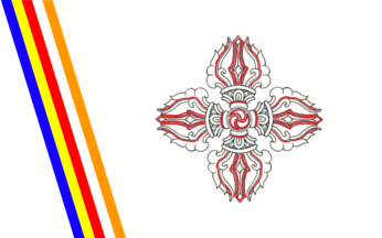 Image #2 from Corentin Chamboredon, 4 April 2014
I counter with another gif. I made it with slanty stripes, and a counter-clockwise gankhyil. I keep thinking there is a blue stripe, which indeed appears very dark.
Maybe. It would be quite different from us since Ladakh is an area of Tibetan culture, and in fact, if people speak Ladakhi dialect they write in classical Tibetan, which is written from left to right.
Corentin Chamboredon, 4 April 2014
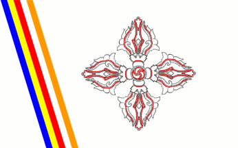
Image made from those of Corentin Chamboredon and Peter Hans van den Muijzenberg,
modified by Pete Loeser, 12 April 2014
How about this? Combining both of your drawings I get this, and it looks very close to the picture.
Of course, we still haven't identified the flag.
Pete Loeser, 12 April 2014
Well, I'm open to any suggestion. Nevertheless, I used the Gimp color selector on the original photo, and if the lower half of strip is indeed black, the upper one has a slight blue shade. [Blue appears often in flags of the Tibetan cultural area, while black is almost absent.]
Corentin Chamboredon, 12 April 2014
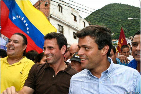 Photo from Esteban Rivera, 22 February 2014
During this news report back in December 18, 2012 when this article appeared, mentioning the consolidation of "Voluntad Popular" (a political party), one can see a maroon flag with a dark yellow fist and below the word "DEMOCRACIA", behind the two main figures in this picture (from left to right: in maroon shirt Henrique Capriles Radonski (who would become the opposition leader during the 2012 Venezuelan Presidential elections and again the main opposition candidate during the 2013 Venezuelan Special Presidential elections after the death of President Hugo Chávez); and in blue shirt Leopoldo López Mendoza, who would become the main opposition figure during the current 2014 Venezuelan protests against the current regime, incarcerated on February 18, 2014.
Any comments on this are appreciated.
Esteban Rivera, 22 February 2014
This party is actually called PODEMOS. Here are some of my notes on it:
Por la Democracia Social (Podemos, acrónimo de Por la Democracia Social) es un partido político venezolano con tendencia socialdemócrata, fundado en 2002 y legalizado el 23 de abril de 2003, surgido de la escisión por la izquierda del Movimiento al Socialismo (MAS). Bajo sentencia del TSJ los derechos sobre el partido Podemos fueron cedidos al ex-gobernador del estado Aragua Didalco Bolívar.
"For Social Democracy (PODEMOS, an acronym for "For Social Democracy") is a Venezuelan political party claiming to be social democratic, founded in 2002 and legalized 23 April 2003, emerging from a split of the Movement Toward Socialism (MAS) [which claimed to be left, but allied to the right] and the ruling TSJ rights party of the former Governor of Aragua, Didalco Bolívar."
There is at least three versions: 1. logo at hoist and name at side (below the name, in white por la democracia social); 2. logo above and name below; and 3. name above, below other inscription (I can't read it), below a third inscription (also I can't read it) and at hoist of the three inscriptions a vertical blue rectangle with a white sign or letters (perhaps VOTE, but is unclear).
Jaume Ollé, 23 February 2014
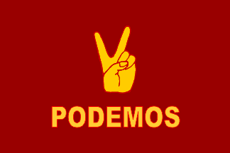 Image by Zoltan Horvath, 23 February 2014
Based on image located by Esteban, and contribution by Jaume, I created a new flag image of this party flag. It's likely that inscription under the fist is the party name.
Zoltan Horvath, 23 February 2014
 Image from Rick Wyatt, 22 February 2014
Someone sent me this picture. Any ideas?
Rick Wyatt, 22 February 2014