 klaus-michael schneider
Keywords: education |
Links: FOTW homepage | search | disclaimer and copyright | write us | mirrors

Last modified: 2021-08-26 by  klaus-michael schneider
Keywords: education |
Links: FOTW homepage |
search |
disclaimer and copyright |
write us |
mirrors
See also:
Other Institutions:
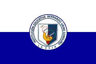 image by Ivan Sache, 10 September 2014
Institución Educativa Bernardo Uribe Londoño was established in La Ceja
(Antioquia Department) by Ordinance No. 24 of 30 November 1966, as Liceo
Agropecuario Bernardo Uribe Londoño. Colegio Bernardo Uribe Londoño was
established by Municipal Resolution No. 25 of 5 February 2000 as the merger of
Liceo Bernardo Uribe Londoño and of Escuela Urbana Integrada Los Leones.
Institución Educativa Bernardo Uribe Londoño was eventually established by
Departmental Resolution No. 528 of 23 January 2003, as the merger of Colegio
Bernardo Uribe Londoño, Escuela Urbana Justo Pastor Mejia, and Escuela Urbana
Obreros de Cristo. The institute is named for Dr. Bernardo Uribe Londoño, a
noted doctor.
Source: http://www.iebul.edu.co/ -
Institute's website
The flag of the institute is horizontally divided white-dark blue with the
institute's emblem in the middle. The white stripe is a symbol of transparency
and peace. The lower stripe is a symbol of immensity, deepness, and tranquility
that leads to knowledge in a tolerant, harmonious and respectful environment.
Source:
http://www.iebul.edu.co/test/bandera - Institute's website
The emblem of the institute features a shield vertically divided white-dark
blue, recalling the colours of the flag and of the student's uniform. The rings
with the colour of the flag of La Ceja (yellow, red, and green) represent
integrity and unity, while their diagonal display represents activity and
the dynamism of the parents, educationalists, and students. The words written
inside the rings ["SABER3, To Know; [SERVIR], To Serve; [PROGRESAR], To
Progress] express each aspect of the institute's mission and vision.
Source:
http://www.iebul.edu.co/test/escudo - Municipal website
Ivan Sache, 10 September 2014
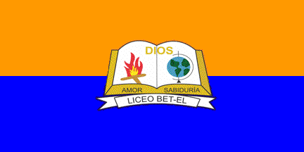 image by Ivan Sache, 30 July 2014
Liceo Bet-El was established in 2005 in Suba (Bogotá) by the Baptist Church.
The institute is named for Hebrew words meaning "House of God".
The flag of the institute is horizontally divided orange-blue with the
institute's emblem in the middle. Blue represents the Celestial Town. Orange is
the combination of yellow, representing science and knowledge of God, and red,
representing blood and love of Christ.
The emblem of the college is made of an open book charged with a fire and a
globe, and "DIOS" (God) in yellow letters. Beneath the book is a scroll
inscribed with the institute's name in black letters. The front side of the book
is inscribed with "AMOR" (Love) and "SABIDURIA" (Knowledge).
Source:
http://simbolosbetel.blogspot.fr/ - Unofficial institute's blog
Ivan Sache, 30 July 2014
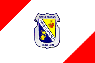 image by Ivan Sache, 25 December 2002
Colegio Bethlemitas is located in Medellin.
It was founded on 10 February 1947, as Colegio del Sagrade
Corazo'n de Jesu's (School of the Sacred Heart of Jesus), and
renamed Colegio Bethlemitas in 1972. The flag has a white field
with two red triangles placed in upper hoist and lower fly,
respectively, and the shield of the school placed in the middle
of the flag. Red stands for the Sacred Heart, symbol of love, and
dynamism and creativity. White stands for peace, purity and
candor.
The shield is tierced per bend. Its upper part, in chief, is
yellow with the red Sacred-Heart crowned with spines.
Yellow symbolizes the sun, the fire, nobleness and charity. Its
lower part, in point, is blue with a yellow lamp, which
symbolizes the scientific thought. Blue symbolizes justice,
gentleness, innocence and devotion. The bend bears the Latin
motto Virtus et Sapientia (Virtue and Wisdom), in blue capital
letters. Bethlemitas and Medellin are written above and below the
shield respectively, in blue capital letters. The whole is
inscribed on a grey coat.
Source: <www.bethlemitas.edu.co>
located by Dov Gutterman .
Ivan Sache, 25 December 2002
 image by Ivan Sache, 14 November 2010
Colegio Bilingüe Beth Shalom was established in 2000 in Bucaramanga by
Pastors Carlos Orlando Anaya and Emperatriz Arenas de Anaya, founding members in
1986 of the Iglesia Comunidad Cristiana de Fe y Restauración. In 2010, the
institute set up a "strategic partnership" with Beth Shalom Gimnasio Campestre
de Bogotá and was renamed Beth Shalom Gimnasio Campestre. "Beth Shalom" means
"The House of Peace" in Hebrew.
The flag of the institute is white with the institute's emblem in the middle.
White is a symbol of purity, holiness and transparency.
The emblem of the institute is circular, the circle being the perfect geometric
shape. It features a dove, representing peace and the Holy Ghost, and ending as
a house charged in the middle with a yellow square. This element represents the
people's heart and the house's windows, which allow looking at the outside word,
as well as light supplied by the Holy Ghost. The institute's name is written in
gray letters beneath the emblem. Blue is a symbol of depth, knowledge and
intelligence, seriousness, safety, trust, harmony, and friendship. These
elements are supplied by God. Yellow is a symbol of felicity, strength, power,
and light. These elements are supplied by the Holy Ghost. Gray is a symbol of
generosity, management and humanitarian skills, and independence. These elements
are required to accomplish the missions assigned by God.
Source:
http://www.bethshalom.edu.co/subsecciones.asp?id_subseccion=3 - Institute
website
Ivan Sache, 31 July 2014
 image by Ivan Sache, 14 November 2010
"Colegio Bilingüe Beth Shalom" was founded in 2000 in Bucaramanga by Pastors
Carlos Orlando Anaya and Emperatriz Arenas de Anaya, founding members of the
"Iglesia Comunidad Cristiana de Fe y Restauración" in 1986. The name of the
institute, "Beth Shalom", means "The House of Peace" in Hebrew.
The flag of the institute, as shown
graphically and described on the website of the institute,
is vertically divided blue-red-blue, with thin white stripes separating the
fields, and the emblem of the institute in canton.
Blue represents depth, knowledge and intelligence, as well as seriousness,
safety, confidence, harmony and friendship. It is the colour of God.
Red represents love and passion, as well as vitality, joy and dynamism. It is
the colour of the sacrificed blood of Jesus.
White represents purity, health and transparency. It is the colour of the Holy
Spirit.
The emblem of the institute is made of a white shield charged with five curved
stripes of four different colours representing the values of the institute, love
(red), service (blue), truth (green), justice and transparency (yellow). The
colours also recall the flags of Colombia and Bucaramanga. Upon the lower right
part of the shield is placed the circular emblem of the "Iglesia Comunidad
Cristiana de Fe y Restauración", patron of the institute. Upon the upper left
part of the shield is placed another circular emblem, white with a schematic,
red representation of a student and an open book.
Ivan Sache, 10 January 2009
 image by Ivan Sache, 08 September 2014
Institución Educativa Betulia is located in the village of Betulia, part of
the municipality of Momil (Córdoba Department)
The flag of the institute is horizontally divided blue-yellow-green.
Source:
http://ce-betulia.wikispaces.com/SIMBOLOS+DE+NUESTRO+CENTRO+EDUCATIVO -
Institute's blog
Ivan Sache, 08 September 2014
 image by Ivan Sache, 13 October 2018
Instituto Bíblico Pentecostal (IBP) was established by Álvaro Torres, then
President of the United Pentecostal Church of Colombia (Iglesia Pentecostal
Unida de Colombia - IPUC), as Instituto Bíblico Movil (IBM), with two seats
located in Baranquilla and Sincelejo. IBP is now composed of 33 districts.
The flag of IBP is horizontally divided blue-white-yellow with the school's
emblem, writing excluded, in the center. Blue represents the celestial vault.
White symbolizes purity and justice. Yellow identifies the glory of God and his
shining presence.
http://ibpipuc.org/la-bandera/
IBP website
The emblem of IBP
features the Bible in the background, symbolizing God's World as the base of
teaching at IBP. The flame symbolizes the awakening fostered by preaching.
http://ibpipuc.org/logo/
IBP website
Ivan Sache, 13 October 2018
 image by Ivan Sache, 05 September 2017
Liceo Birmingham was established on 10 September 2004 in Kennedy - Ciudad
Tintal (Bogotá) by Patricia Edith Vargas Nova and Henry Durán Nova, as Liceo
Psicopedagógico La Villa del Saber. Relocated in 2012 to Kennedy Central, the
institute was renamed Liceo Birmingham the same year, to highlight bilingual
English-Spanish classes.
Source: Institute's website
The flag of Liceo Birmingham is horizontally divided orange-blue, with three
white stars placed at hoist in the orange stripe, according to a descending
diagonal.
Orange is a symbol of the high values and of the joy of a safe coexistence.
Blue is a symbol of the progress of knowledge obtained through science and arts.
Source:
Institute's website
Ivan Sache, 05 September 2017