
Last modified: 2026-02-28 by antónio martins
Keywords: praia | disc (blue) | tree (white) | house | pillory | waves: 4 | chain (green) | chain: 5 links | stars: 10 (yellow) | coat of arms: quartered | coat of arms: inescutcheon (cross: red) | gyronny: 8 (blue white) |
Links: FOTW homepage |
search |
disclaimer and copyright |
write us |
mirrors

image by António Martins, 17 Apr 2016
See also:
External links:
A white flag with the logo on it (source:
official website). I have found, over
the past two years, several versions [of the flag
and the emblem].
Jens Pattke, 13 May 2012
Concerning the adoption date, the earliest proof of its existence I
found so far is
this
photo taken on 2008.08.27. The flag, sadly limp for lack of wind,
is hoisted on the balcony of the City Hall, to the left of the
national flag, and shows the white background and a
piece of the scroll — visible as very pale blue: This is either
due to sun bleaching (which would date this flag from early 2008 or
earlier) or to the use of much lighter colors back then.
António Martins, 21 Dec 2016

image by António Martins, 23 Mar 2017
This photo, posted by Vanja
Poposki in the Facebook group I Love Flags without source or
comment, shows a variant of the Praia municipal flag:
Compared with the image
at the official website, the logo uses a much lighter shade of blue
and, in what could not be discarded as a meaningless printing variation,
the white lines suggesting the folds of the scroll are absent. The flag
itself seems at first glance to be 3:4 in ratio (instead of the more usual
2:3) with the logo shifted to the hoist — it may be instead a 3:5
flag with centered logo and the remainder of the fly tucked away (although
very carefully so, as it is not visible, hanging at the lower right on the
photo).
António Martins, 23 Mar 2017
.gif)
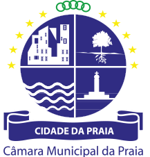
image by António Martins, 17 Apr 2016
The logo is darkest blue and consists of a disc (or a circular shield, if we interpret this heraldically, as seemingly the law does) divided in four quadrants (maybe inspired in the also quartered colonial coat of arms?)by a thin white line, each filled with white on blue monochrome motifs:
Digital images of this version, with the scroll forming smoother loops and
not showing forked ends, is shown in the
official website, and
elsewhere.
António Martins, 17 Apr 2016
It can be seen also in “meatspace” use at the city hall: as of
2025.02 (non flag use)
and 2023 (flag hoisted on balcony),
dispelling any doubts about which is the official version of the emblem.
António Martins, 26 Dec 2025
I have found, over the past two years, several versions.
Jens Pattke, 13 May 2012
f.gif)
image by Jens Pattke, 13 May 2012
Here is another variant.
Jens Pattke, 13 May 2012
This version was possibly outdated/abbandoned or even erroneous.
António Martins, 17 Apr 2016
Another such variant, with the II quarter of the
emblem in colors, can also be
found
online.
António Martins, 17 Apr 2016
The official website at CMP.cv holds relevant content
only up to 2012
and seems to have been abandoned; its masthead contained the
color
variant of the logo and one of its latest incarnations, around
2018,
redirected to the municipality’s online store, therefore also official, and
still showing the colored
version.
António Martins, 26 Dec 2025
Used on a variant of the flag: uses a much
lighter shade of blue and the white lines suggesting the folds of the
scroll are absent.
António Martins, 10 Mar 2017
Considering what we know about municipal hall hoisting of municipal vs. national flags in Cabo Verde, these photos show interesting characteristics and variations: The Praia city hall has three slanted flags poles on its main balcony, the middle one being taller (and somehow less slanted) and having been added later (after 2008, before 2012). There are sightings of:
Here
we see two poles, one for each flag (municipal and national),
but both flags are upside down. While the national flag is know to be
often flipped thusly, fastening upside down an indoor,
eye-level flag, with writing on it, and repatedly so, must have to it more than
lack of attention to detail. I suspect that these flags are meant to be hoisted
outdoors an the upper hoist side of fastening device doesn’t fit well
with the finial of the indoor mount staff. These two cases (the other was in
Tarrafal de Santiago) being photo ops for the same
outfit (Nos Genti magazine/website), I presume the photographer hoped
nobody would notice the unreadable text next to the flattering poses and
cheerful dignitas as captured.
António Martins, 26 Dec 2025
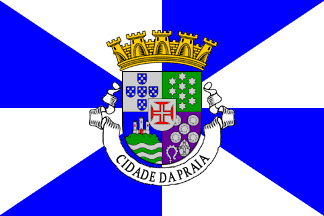
image by Sérgio Horta and António Martins, 24 Dec 2025 |
(source)
It is a typical Portuguese
municipal flag with the coat of arms
centered on a white and blue background, gyronny of eight
(city status for the municipality seat) by diagonals and apothemas
(source: [drn95]).
Jens Pattke, 25 Mar 2016
At HeraldicaCivica.PT
we can see Sérgio Horta’s account of these arms and flag; unusually,
no official journal legal prescription is quoted, so Sérgio’s source was likely
the Overseas Armourial [lgh66]. The arms
are drawn in the same style as contemporary CHAAP
artwork; other sources, such as [lgh66] itself
and postage stamps, may differ in details.
António Martins, 24 Dec 2025
![[flag]](../images/p/pt-'bw8.gif)
image by António Martins, 28 Feb 2010
Non-monocolored portuguese subnational flags are
allowed to have armless variations.
Jorge Candeias, 18 Jul 1999
While the current law, adopted in 1991,
doesn’t apply to municipal flags in the colonies, independent in 1975, it
however draws most of its content from the 1930 ministerial dispatch, incl.
the regulation of armless variations allowed for non-monocolor municipal flags.
This 1930 ruling affected all future Portuguese municipal flags, including the
colonial ones.
António Martins, Feb 2026
![[flag]](../images/c/cv-74_h).gif)
image by Sérgio Horta and António Martins, 24 Dec 2025 |
(source)
The coat of arms image from HeraldicaCivica.PT
was also uploaded
to Wikimedia Commons, whence it illustrates several Wikipedias.
António Martins, 24 Dec 2025
These arms are similar to those of mun. Santa Catarina
(Assomada town), differing in the II and III quadrants, likely created in the
19th century.
António Martins, 24 Dec 2025
The coat of arms is (in Portuguese):
Brasão:Source: [drn95]
Coat of arms:
- esquartelado,
quartered (shield)escudete sobre-o-todo de prata carregado com uma cruz da Ordem de Cristo;
- I. Portugal-Antigo;
On the Ist Portugal ancien.- II. de verde, dez estrelas de seis raios de prata, postas em três palas 3, 4, 3;
On the IInd Vert ten estoiles Argent set in three pales of three and four and three.- III. de azul, uma cidade de prata sobre um terrado de sua cor e uma ponta ondada de azul e de prata;
On the IIIrd a representation of a city Argent on a ground proper and a base wavy barruly Azure and Argent wavy.- IV. de púrpura, uma mitra e um báculo encimados por quatro pedras de sal, tudo de prata;
On the IVth Purprure a mitre and a crozier topped by four saltstones everything Argent.
Over all an escutcheon Argent charched with a cross of the Order of Christ.- escudo encimado por coroa mural tendo por timbre uma roda de navalhas de ouro, e ladeado por dois ramos de verde passados em aspa e atados de vermelho.
Shield crowned with a mural crown and for crest a St. Catherin wheel Or flanked by two branches Vert per saltire and tied Gules.
This is interesting, as the special characteristic of this crown, it
being golden, not silvery (as Praia is was the provincial capital), is
not mentioned, and also because a crest (timbre) is mentioned, and
the applicable law proscribed implicitly any crests.
The image matches the 1961 postage stamp series of
colonial municipal coats-of-arms (see
stamp
in Ralf
Hartemink’s website) but Durán’s
[drn95] wording seems to predate the law
that proscribes crests and makes the crown golden — either the
1930 “dispatch” or some later,
more detailed legislation. I would say that the description quoted by
Durán [drn95] is the blazon
of the pre-1930 arms which was later on minimally changed (off with the
crest, paint the crown gold); I have no idea whether this previous
coat-of-arms had any flag to go with it, though. (There’s a detail
difference, too, as the 1961 image shows 5 saltstones and the pre-1930
text says 4.)
António Martins, 08 Apr 2016
![[flag]](../images/c/cv~89-7.gif)
António Martins, 06 Jul 2017
Signal flag legislated to be hoisted on Cabo
Verde post offices in 1889-1891 to indicate outgoing and arriving mail
ships to/from Praia (main city/port on Santiago
island prescribed at the same level as the islands): Red and white
triangular vertical bicolor.
António Martins, 06 Jul 2017
Anything below this line was not added by the editor of this page.
.jpg)
.jpg)
.jpg)
.jpg)
.png)