
Last modified: 2026-10-24 by  zachary harden
Keywords: tapa | laane-virumaa | saksi | lehtse |
Links: FOTW homepage |
search |
disclaimer and copyright |
write us |
mirrors
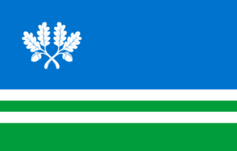
image by Tomislav Šipek, 25 September 2026
See also:
Saksi vald and Tapa linn with Lehtse
vald from Jarvamaa county have formed a new municipality
called Tapa vald at 20.10.2005. A new flag and coat of arms would
be choused for this municipality during this year.
Erki Kurrikoff, 4 November 2005
2017 (and current flag) Explanation of the colors of the Tapa Municipality flag and coat of arms: Blue is the color of the sky. Green is the color of forests and meadows. The silver stripes on the green background represent the railway, which is of great importance to the municipality. Two identical, crossed oak branches symbolize strength—a quality also embodied by the intertwined oaks of Lehtse.
The designer of the new Tapa Municipality flag and coat of arms is Tatjana Dalton.
Tomislav Šipek, 25 September 2026
tapavald17.gif)
image by Tomislav Šipek, 25 September 2026
2017 (and current flag) Explanation of the colors of the Tapa Municipality flag and coat of arms: Blue is the color of the sky. Green is the color of forests and meadows. The silver stripes on the green background represent the railway, which is of great importance to the municipality. Two identical, crossed oak branches symbolize strength—a quality also embodied by the intertwined oaks of Lehtse.
The designer of the new Tapa Municipality flag and coat of arms is Tatjana Dalton.
Tomislav Šipek, 25 September 2026

image by Tomislav Šipek, 25 September 2026
tapavald05.gif)
image by Tomislav Šipek, 25 September 2026
Tapa vald – The flag and coat of arms of the new Tapa
vald are at <www.tapa.ee>.
Erki Kurrikoff, 31 August 2006
2005-2017 symbols: The coat of arms and flag of Tapa Municipality were divided diagonally into three sections.
The upper-left section was red, referencing the coat of arms of the town of Tapa and symbolizing battles believed to have taken place in the Tapa area in the past.
The lower-right section was black, symbolizing the peatlands of Lehtse and referencing the former coat of arms of Lehtse Municipality.
Between them ran a diagonal wavy white line (silver on the coat of arms), representing the Valgejõgi River and referencing the former coat of arms of Saksi Municipality.
Depicted within the red area was a triskelion—a symbol of good luck—representing renewal, movement, and the continuity of life through its unbroken, cyclical form. The symbol’s movement in three different directions signified the roads branching out from Tapa.
Three silver stars were placed on the lower black section, representing the three merged municipalities.
Silver was the color of light and purity.
Red was the color of youthfulness and vitality.
Black symbolized a connection to the land.
The coat of arms and flag of Tapa Municipality were selected through a public competition in the autumn of 2005. The designer is Liina Kald.
Tomislav Šipek, 25 September 2026