
Last modified: 2026-05-30 by ian macdonald
Keywords: são tomé city |
Links: FOTW homepage |
search |
disclaimer and copyright |
write us |
mirrors
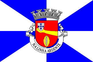 image by
Sérgio Horta and António Martins-Tuválkin,
27 April 2026
image by
Sérgio Horta and António Martins-Tuválkin,
27 April 2026See also:
Durán [drn95] reports
the following for the pre-1975 flag of the
municipality headed by the city of São Tomé (not
for the whole island!): Flag gyronny (city
rank) of blue and white (in the usual variants of 2:3 and 1:1),
the arms over all. This is gules, five open cacao nuts set in saltire
(Durán says «in palo», «per pale»,
but the illustration shows per saltire, which is much more
logical…), shells or, seeds argent lined
sable; bordure argent with seven eschuteons azure, each with
five bezants argent per saltire. Mural crown or (overseas
province capital rank) of five towers (city rank), white
scroll reading in black capitals CIDADE DE SÃO
TOMÉ.
António Martins-Tuválkin, 08 August 1999
.gif) image by
Sérgio Horta and António Martins-Tuválkin,
27 April 2026
image by
Sérgio Horta and António Martins-Tuválkin,
27 April 2026
São Tomé had a first set of arms and flag, granted in 1962, later (unofficially?) replaced by a second one.
São Tomé as that hagionym, Saint Thomas (the Doubter, not Aquinus), is also
both the name of the island and the name of its main settlement and municipal
seat, also colonial era overseas province capital and post-independence national
capital. And also because this coat of arms is one of those few whose scroll
bears not a toponym of any kind but a motto.
It's a typical Portuguese
municipal flag, with the coat of arms centered on a white and blue gyronny
field. The 1962 arms are Gules an escutcheon of Portugal
ancien on the dexter chief upheld by the hand of an arm outstretched Or
issuant from the dexter flank and in base a cocoa pod Or split and seeded Argent
set palewise. Mural crown Argent (not Or) with five visible towers (city rank)
and white scroll reading in black upper case serif letters "na linha ardente".
The banner should have silvery and blue tassels and cord, and golden staff with
a spear finial.
This flag and arms approved by the Overseas Ministry and
published as Ministerial Decree
n.º 19409 [https://dre.tretas.org/dre/263883] in the official journal _Diário
do Governo : 1.ª série_ *226* of 1962.10.01: "De vermelho; movente do meio do
bordo esquerdo do escudo, um braço nu, de ouro, cuja mão ampara um escudete de
Portugal antigo posto no cantão direito do chefe; em contrachefe uma cápsula de
cacau aberta, em pala, de casca de ouro e sementes de prata realçadas de negro.
Coroa mural de prata de cinco torres. Listel branco com os dizeres "na linha
ardente". Bandeira - Gironada de branco e azul. Cordões e borlas de prata e
azul."
At https://www.heraldicacivica.pt/stm-sao_tome.html we can
see Sérgio Horta's account of these arms and flag, drawn in the same style
as contemporary CHAAP artwork; other sources may differ in details.
It's
noteworthy that the mural coronet is specified to be Argent ("de prata"),
expectedly so given the custom in force of being Or those of the arms of
municipalities seated in overseas province capitals – so much so that the
same drecree prescribes/confirms mural coronets Or for Lourenço Marques and
Díli, right on the next page. I
imagine that this must have been unintentional.
The motto on the scroll means "on the fiery line": it's a quote from The Lusiads (II-71), referring to the Equator (though not referring to this island), which crosses the municipal territory at its very south (at a position opposed to the location of the city itself), slicing through Ilhéu das Rolas at https://www.openstreetmap.org/#map=16/0.00/6.52.
António Martins-Tuválkin, 27 April 2026
.gif) images by
Sérgio Horta and António Martins-Tuválkin,
27 April 2026
images by
Sérgio Horta and António Martins-Tuválkin,
27 April 2026
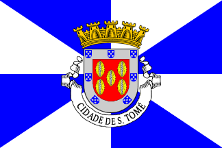
It's a typical Portuguese municipal flag, with the coat of arms centered on a
white and blue gyronny field. These new arms are Gules five cocoa pods Or split
and seeded Argent set palewise and arrayed per quincunx and on a bodure Argent
seven escutcheons Azure each bearing five plates Argent arrayed per quincunx.
Mural crown Or with five visible towers (city rank) and white scroll reading in
black upper case serifed letters "Cidade de São Tomé". The banner should have
silvery and blue tassels and cord, and golden staff with a spear finial.
At
https://www.heraldicacivica.pt/stm-sao_tome.html we
can see Sérgio Horta's account of these arms and flag, drawn in the same
style as contemporary CHAAP artwork. Sérgio gives the following Portuguese
blazon:
Armas - De vermelho, cinco cápsulas de cacau abertas, colocadas
em pala, de cascas de ouro e sementes de prata realçadas de negro.
Bordadura de prata carregado de sete escudetes das Quinas de Portugal.
Coroa mural de ouro de cinco torres. Listel branco com a designação em
caracteres negros "CIDADE DE S. TOMÉ".
Bandeira - Gironada de oito
peças de branco e azul. Cordões e borlas de prata e azul.
Unlike
most other pages, there is no sourcing for this blazon nor an explanation of
the context surrounding this second flag and arms. I presume this design and
blazon were published originally in [lgh66], as an unlegislated (thitherto,
at least) correction to the previous, which had an erroneous silvery mural
coronet.
Almeida Langhans (author of [lgh66]) was at this time the
personal secretary of dictator Salazar, so it's not susprising that his book
alone (published by the Overseas Ministry as a commemorative issue) weighs
as much as a ministerial decree – especially when it corrects a formal error
and, although brazenly replacing a coat of arms with a different one in the
process, does so in an elegant way with a much better design as result.