
Last modified: 2021-08-26 by  klaus-michael schneider
Keywords: portuguesa | sucre | biscucuy |
Links: FOTW homepage |
search |
disclaimer and copyright |
write us |
mirrors
 (2:3)
(2:3)
by Pascal Gross, 26 March 2001
See also:
From <www.municipiosucre.vezla.com>,
information and image of the flag of the municipality of Sucre
(capital: Biscucuy) in Portuguesa state"
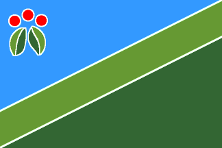
"Franja Superior: Compuesta por un triángulo escaleno de
color azul celeste, ubicado en el sentido contrario a la Franja
Inferior, para significar con ello la idea de protección divina
desde el firmamento. La insertada en la parte superior izquierda
de la franja azul, emerge desde la pureza del blanco, la figura
estilizada de una planta de café, con las mismas tonalidades del
resto del diseno, para simbolizar el sustento vital de los
pobladores. La fuerza expresiva del rojo de las semillas,
representada en tres círculos, nos remite a la gesta libertaria
de nuestros antepasados y a la sangre derramada por los Cambambas
en su afán por perpetuar la raza autóctona de éstas tierras.
Franja Central: De color verde vegetal está constituida por un
rectángulo que se pierde en el infinito como senal de la
esperanza de un pueblo que ha hecho historia con sus hombres y
con sus obras. Desde el punto de vista compositivo, viene a
configurar la idea de la perspectiva geográfica, la cual se
proyecta como la esencia del quehacer cotidiano de la región.
Franja Inferior: Configurada por otro triángulo escaleno de
color verde grama, que simboliza la exuberante vegetación del
pie de monte andino, punto de origen de la vida sucrense. La
inclinación del triángulo, de menos a más, de izquierda a
derecha, es una alegoría de la serranía de Biscucuy, y de la
importancia que tiene la montana en la forma de vida de la gente
trabajadora de este Municipio.
El color blanco que aparece de trasfondo entre los elementos de
la bandera viene a testimoniar la pureza e hidalguía del pueblo
sucrense."
Coat of Arms and its symbolism also available at the same page.
Pascal Gross, 26 March 2001
Attributes and Semiology:
Superior fringe: Composed by a scalene triangle in sky blue,
located in contrary sense to the Inferior Fringe, to mean the
Divine Protection from the firmament. Inserted in the left
superior part of the blue fringe and from the purity of the
white, emerges the stylized figure of a coffee plant, with the
same tonalities of the rest of the design, for symbolizes the
vital sustenance of the residents. The expressive force of the
red one in the seeds, represented by three circles, remits us to
the liberal cause of our ancestors and the blood spilled by the
Cambambas, the aboriginal people of the region, in their desire
to perpetuate the autochthonous race of these lands.
Central fringe: In vegetable green, it is constituted by a
rectangle that gets lost in the infinite as sign of the hope of a
town that has made history with their men and with their works.
From the compositional point of view, it comes to configure the
idea of the geographical perspective, which is projected as the
essence of the daily chore of the region.
Inferior fringe: Configured for another scalene triangle in grass
green for symbolizes the exuberant vegetation of the foot of
Andean mount, point of origin of the sucrensian life. The
orientation of the triangle, from less to more, of left to right,
it is an allegory of the of the Biscucuy Mountains and of the
importance that it has in the form of hard-working people's of
this Municipality life. The white color that appears like
background among the elements of the flag, comes to testify the
purity and nobility of the sucrensian people.
Raul Orta, 4 April 2001