
This page is part of © FOTW Flags Of The World website
Portuguese Banks
Last modified: 2015-09-05 by klaus-michael schneider
Keywords: espirito santo | bes | banco internacional de credito | bic | montepio geral | pelican | m | totta | espirito santo viagens | banco port. investimento | millenium bcp |
Links: FOTW homepage |
search |
disclaimer and copyright |
write us |
mirrors
See also:
Banco Espírito Santo

image by António Martins-Tuválkin, 3 July 2005
In this
page there is a listing of the buisiness operated and owned by
the Espírito Santo financial group, which is based in Portugal
(the core company is the family-operated Banco Espírito
Santo) but has “interests” also in France,
Switzerland, Angola, Cayman Islands, Spain, United States, Macao, Panama,
Brazil and Luxembourg, At least in Portugal, they use as flags the logo of
each outfit in gold on a (very) dark green background.
António Martins-Tuválkin, 3 July 2005
Banco Espírito Santo post-2005 flag

image by António Martins-Tuválkin, 19 Feb 2008
But shortly afterwards, the whole group went through a (IMHO disastrous)
change in its corporate identity - trading the sober gold on dark green
mark for a garish light green. The logo was only slightly altered, but it
is now white with kind of shadow, and the new lettering, modern and round,
is also white. Advertisement gurus called the comissioned shade "future
green"…
Banco Espírito Santo flag with lettering

image by António Martins-Tuválkin, 19 Feb 2008
As before, but beneath logo in yellow initials "BANCO ESPIRITU SANTO".
As for the other dark green flags with golden logos, they seem to be now
out of use, but I haven't yet seen any replacement for them.
António Martins-Tuválkin, 19 Feb 2008
Espírito Santo Viagens

image by António Martins-Tuválkin, 6 Oct 2006
Espíírito Santo Viagens is a travel agency owned by the Espíírito Santo
group, a Portuguese holding dealing mostely with banking
Unlinke the other group company flags, this is not dark green with large
golden logo, but rather very dark blue with logo and lettering in white,
filling up the horizontal middle third of the flag area.
Anyone arriving in Lisbon by train at the Oriente railway station will see
this flag, very large, hoisted atop this travel agency headquarters.
The group's travel agency Espírito Santo Viagens keeps using its oddball
dark blue flag with white lettering - but one of these being quite huge they're probably
waining for it to come to a natural end before a new one has to be made.
António Martins-Tuválkin, 6 Oct 2006 / 19 Feb 2008
Espírito Santo Financial Group

image by António Martins-Tuválkin, 3 July 2005
Banco Internacional de Crédito

image by António Martins-Tuválkin, 3 July 2005
Millenium BCP

image by António Martins-Tuválkin, 10 Jan 2007
Millenium BCP is a network of bank branches operated by Banco Comercial
Português (B.C.P.), a major Portuguese banking corporation. Since its set
up in 2004, amalgamating B.C.P.'s former branch network Nova Rede and
B.P.A.'s (Banco Português do Atlântico, bought by B.C.P. some time
earlier), the Millenium BCP brand identity took over almost all B.C.P.'s
visiblity, and flags are a proeminent part of that visual impression.
The Millenium BCP flag is a ~3:5 medium dark reddish pink cloth with the
commissioned lettering in white: "Millenium" in a sans face underscored,
title cased with a backturned hook protruding from the "M"'s 1st tip and
"bcp" is smaller lower case letters centred bellow the "u" linked to the
underside of the underline. This follows without changes the Millenium BCP
brand identity scheme, used also on liveries, stationary, storefronts,
advertisemnts, etc.
This flag can be seen in the Lisbon HQ of B.C.P. and selected branches.
According to its website < http://www.bcp.pt/23/2334_1.jhtml >, Millenium
BCP has about 1000 branches in Portugal and it is somehow present also in
Venezuela, Switzerland, Great Britain, Poland, Mozambique, Luxemburg,
Greece, France, USA, Spain, China, Canada, Bazil, Australia, Angola, Germany and
South Africa -- perhaps flags can be seen at these locations too.
António Martins-Tuválkin, 10 Jan 2007

image by António Martins-Tuválkin, 11 Nov 2007
Portuguese bank Banco Comercial Português, B.C.P., operates its branch
network under the brand "Millenium BCP" since 2004, its distinct shade of
rosy purple with white commissioned lettering having replaced all previous
corporate identities of the group, and extending to its insurance company
subsidiaries and foreign banking operations (in Poland, Romania and
Canada, where it operated under diverse permutations of the names BCP and
Millenium).
Add to these the United Sates, Greece, Turkey, Angola and Mozambique.
The Canadian filial has been taken over by BMO Bank of Montreal.
A flag is part of B.C.P.'s corporate identity: a ~2:3 rosy purple cloth
with the commissioned logo lettering "Millenium BCP", the main name large
on a line and "BCP" in much smaller lowercase letter below it, offset to
the lower fly and the line extending horizontally to the edged of the
flag.
This flag can be seen hoisted in company facilities and selected banking
branches in many locations in Portugal. The mentioned filials in Poland,
Romania and Canada may use similar flags.
António Martins-Tuválkin, 11 Nov 2007
Médis

image by António Martins-Tuválkin, 16 June 2008
I must say that the only use I saw till now has been tabletop flaglets used in Médis facilities; scarce use of outdoor flags by this company matches the flag use of its parent corporation Millenniumbcp Fortis Grupo Segurador, which is an insurance conglomerate operating in Portugal and owned by Portuguese bank B.C.P. (Banco Comercial Portugues, branded as Millennium BCP) and Dutch insurance corporation Fortis.
Milleniumbcp Fortis and its individual companies, don't have a logo (nor a flag) of their own, and use a white/grey lettering loosely based on the corporate brand of Millennium BCP (banking) Médis is an exception, with its distinct branding with green cross and white lettering on dark blue background. The cross is a typical health "swiss"ť cross, made from five squarish blocks ordred 1:3:1, the middle one modified to a NE disc quadrant, showing the background through the hole. Flag, logo and lettering were designed by Luis Matos.
António Martins-Tuválkin, 18 June 2008
Montepio Geral

image by Jorge Candeias, 9 Dec 2003
Montepio Geral is a portuguese bank (website at
www.montepiogeral.pt/)
whose flag is a very good example in what concerns corporate vexillology.
It all begins in a superb logo. Rooted in the christian tradition, the logo
is a stylization of the common image of the pelican feeding its offspring
from its own chest, present, for instance, in the flag of
Louisiana, USA.
But it’s more than that, for the wings form a wavy "M", the main initial of
the bank.
The origins of this christian logo for a bank, of all possible
corporations, lie in the origins of the bank itself. Montepio
Geral’s history starts in 1840 when an institution called Montepio dos
Funcionários Públicos began its activity, changing to the current
designation 4 years later. This was not a financial institution: it was a
cooperative form of social security for public servants, that provided
financial assistance to its associates in case of accident, desease, old
age, etc.
Still in 1844 this institution created the Caixa Económica de
Lisboa to manage more efficiently the money deposited by the associates,
thus creating a bancary institution and the foundations of what Montepio
Geral is today. (More info at
www.montepiogeral.pt/v10/PT/jsp/montepio/historia.jsp,
in portuguese)
And hence the flag, which is deep blue with the logo in white in the centre
and nothing else. I seem to recall that I once saw a variation of this flag
in white with the logo in blue (lighter than the field of the official flag),
but I’m not sure.
Jorge Candeias, 9 Dec 2003
Montepio
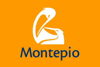
image by António Martins-Tuválkin, 25 Mar 2008
Another recent image change in a Portuguese bank is Montepio Geral:
Sadly but not surprisingly, the plain flag with a bold,
mostly symmetrical design in a contrastive colour reported and praised by
Jorge Candeias was replaced with a much duller flag (though not as bad as
some others are!), using the white logo on yellow (!) of the post-2006
corporate identity (which shortens the brand name to Montepio), with
dark blue lettering. See at the official website:
The pelican motif was kept from the previous logo, now showing in a less
stylized, though still streamlined fashion, showing the heads of parent
and nestling pelicans.
It is a 2:3 plain flag in yellowish orange with white logo above dark blue
lettering "Montepio" set in bold rounded sans-serif letters. This flag is
showing in bank headquarters and major branches, as also in venues where
activities sponsored by the bank are held - as usual for flags of banks
(and of most such companies) in Portugal.
The new logo replaced the previous also in the cobblework of the sidewalk
in front of the bank HQ in Lisbon (and possibly also elsewhere):
, but the original naturalistic version is ever still in use on its doors.
.
When the new logo was to be unveiled, in early October 2006, newly
installed storefront adlights in all branches were wrapped in disposable
covers with the old logo, allowing from overnight change.
Source: company's webpage
António Martins-Tuválkin, 25 Mar 2008
Banco Santander Totta

image by António Martins-Tuválkin, 8 May 2008
The flag of Santander Bank is red and shows the white compound lettering "Santander Totta".
Any other such flags? Santander has compound apellations in Argentina
(Santander Río), Brazil (Santander Meridional), Chile (Santander
Santiago), Colombia (Santander Colombia), Mexico (Santander Mexico, and
Santander Serfín), Peru (Santander Perú), Puerto Rico (Santander Puerto
Rico), Uruguay (Santander Uruguay), and additionally some acquired banks
retained their name (with no suffix addition of "Santander") but changed
to the group's logo, such as British Abbey.
António Martins-Tuválkin, 8 May 2008
Banco Totta

image by António Martins-Tuválkin, 17 Feb 2004
Flag of Banco Totta, a private banking company based in Lisbon,
Portugal. Formerly Banco Totta e Açores, it was reprivatised in
the 1990ies and had its corporate image modified last in 1999. The flag is
one of the elements of it, with white lettering bold on red and dark blue.
It is flown along with the national flag on Sundays
in the bank’s HQ and offices, though usually not in every branch.
António Martins-Tuválkin, 17 Feb 2004
Banco Português de Investimento
![[BPI Bank white flag]](../images/p/pt$bpi.gif)
2:3 image by António Martins-Tuválkin, 18 May 2008
|
![[BPI Bank blue flag]](../images/p/pt$bpi2.gif)
2:3 image by António Martins-Tuválkin, 18 May 2008
|
|
|
Portuguese bank BPI (Banco Português de Investimento) has a 2:3 white flag with its logo on it.
Last summer the bank issued a promotional campaign supporting the
national team competing in the Soccer World Cup in Germany (as many
other companies and institutions did). This included ad panels with the
national flag (Fabretto/FI version), some times attached with too much
zest.
António Martins-Tuválkin, 10 Oct 2006
Portuguese bank BPI has a weird flag use, which
was either recently adopted or just not noticed by me previously: It
uses two flags to represent itself, flown or hoisted in pairs - one
is white with blue letters (as reported), and the other is blue with
white letters; on both the logo with white flower on orange square.
Additionally, there is proof of outdoor use of flags with unmirrored
reverse along with indoor use of flags with reversed
design (i.e. with logo at the fly and readable lettering). This may
be manufacture or design choice, not a spec of this particular flag
bearing entity.
Source: this photo shot in Lisbon HQ balcony
António Martins-Tuválkin, 19 May 2008
Banco Internacional do Funchal

image by António Martins-Tuválkin,
Portuguese banks has been changing their corporate identities a lot in the
last couple of years, and these changes are affecting their flags, too:
The most recent is Banif - Banco Internacional do Funchal, a small bank
originally from Madeira. The new identity includes
a stylized centaur (depicted shooting an arrow, i.e. a Sagittarius) in a
"half shield" outline above the lettering "Banif", set in capitalized
small caps of a sans-serif round edged commissioned font, all white on
indigo (it is called indigo in the official documents, but it is rather
plum or aubergine).
The previous corporate identity was mainly dark blue
and green, with a rotationally symmetrical logo with some 12 or 16 spokes;
and no flag AFAIK.
António Martins-Tuválkin, 17 Mar 2008
back to Portuguese company flags click here


![[BPI Bank white flag]](../images/p/pt$bpi.gif)
![[BPI Bank blue flag]](../images/p/pt$bpi2.gif)
