
Last modified: 2023-06-10 by  zachary harden
Keywords: olympic games | tokyo |
Links: FOTW homepage |
search |
disclaimer and copyright |
write us |
mirrors
![[Flag for Tokyo 1964]](../images/o/oly@s18.gif) image by Zachary Harden, 29 August 2017
image by Zachary Harden, 29 August 2017
See:
![[The Olympic flag]](../images/o/oly@ioc.gif) image
by Juan Manuel Gabino Villascán, July 2005.
image
by Juan Manuel Gabino Villascán, July 2005.
Flag adopted: 1914.
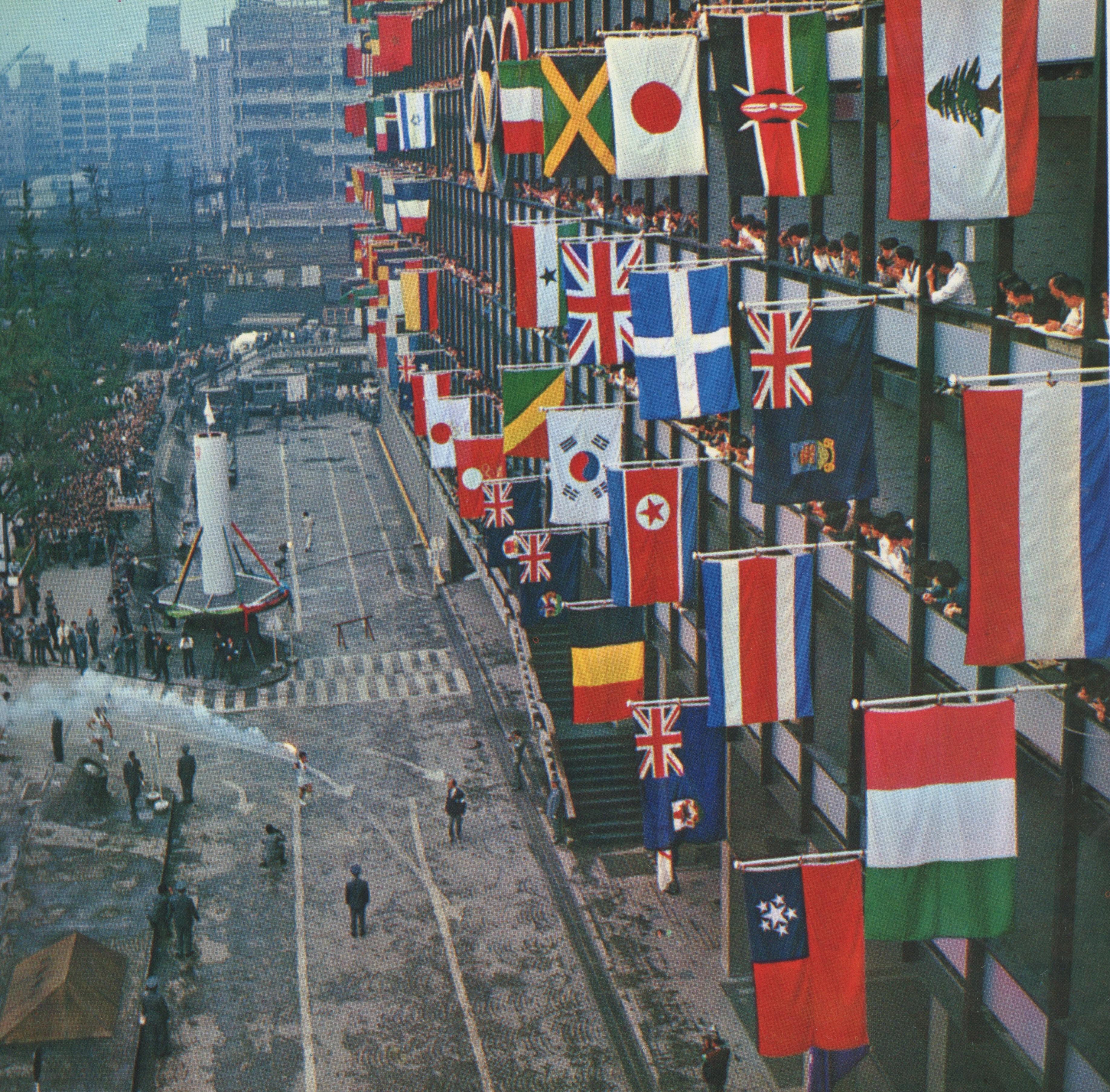
The 1964 Summer Olympic Games (officially styled as the "Games of the 18th Olympiad", 第18回オリンピック競技大会 (Dai Jūhachi-kai Orinpikku Kyōgi Taikai) in Japanese) took place in Tokyo, Japan, from October 10 to October 24. The Games were awarded to Tokyo on May 26, 1959, at the 55th IOC Session in Munich, West Germany, over bids from Detroit, Brussels and Vienna. 93 nations participated, which can be referred to at https://en.wikipedia.org/wiki/1964_Summer_Olympics#Participating_National_Olympic_Committees. This was the first Olympics hosted in Japan, though Tokyo was provisionally awarded the 1940 Games until the events of WWII caused the Games to first go to Helsinki, then eventually cancelled. Before 1964, Tokyo was trying to host the 1960 Games that eventually went to Rome. Tokyo will also be host for the upcoming Summer Games (32nd Olympiad) in 2020.
For the logo of the games, the design is very basic. The Hinomaru (Red sun disc)
that is present on the national flag to this day, is placed above the Olympic
rings that are all gold. Below the rings are the words "Tokyo 1964" in a western
sans serif font (Helvetica Ultra Compressed), also in gold, The design is
credited to Yusaku Kamekura (1915 - 1997) and was officially chosen at the 8th
meeting of the Tokyo Organizing Committee in June of of 1960. The competition
for the logo contest was not open to the public and it was set up by Tokyo 1964
Design Council chairman Masaru Katsumi. The website at
http://brainmag.sendenkaigi.com/post/126991609085/power-of-design-yusaku-kamekura-demonstrated-at
hinted that this was a closed competition, which consisted of Mr. Kamekura,
Takashi Kono, Ikko Tanaka, Kohei Sugiura, Koichiro Inagaki and Kazumasa Nagai
sent three designs each. Some of the proposed designs can be seen at
https://twitter.com/ch1_san_s/status/638667670414462976. After the logo was
chosen, a graphic design manual was created and was applied to every aspect of
the design of the games. Design-wise, it was hailed as a way for Japanese design
to shine post-WWII and every Olympics since 1964 Tokyo (and to add Mexico City
1968 by Lance Wyman) that special details were given to design, logos that
continues to be felt to this day. The 1964 Tokyo logo was a direct influence on
the 1972 Sapporo Winter Games logo (https://www.ndc.co.jp/works/sapporo-olympic_1971/)
and the now-scrapped first logo of the 2020 Games in Tokyo. One story with this
logo was that it was designed in a span of two hours because Kamekura forgot
about the deadline for the logo contest and was reminded about it due to a phone
call the day the logo was supposed to be submitted.
Sources:
http://www.britishmuseum.org/research/collection_online/,
http://design-cu.jp/iasdr2013/papers/1757-1b.pdf,
https://books.google.com/)
For the flag, there was the main logo
flag and a variant of it, along with others used for decorations. The main flag
was Kamekura's logo on white; the variant is where the background was made red
and the Hinomaru was colored white. Both flags still used the gold Olympic rings
and text. Both flags can be seen at
http://ji-sedai.jp/series/research/063_01.jpg during the final torch relay
in Tokyo in 1964.
Zachary Harden, 29 August 2017