
Last modified: 2021-08-24 by  christopher oehler
Keywords: korea | paralympics |
Links: FOTW homepage |
search |
disclaimer and copyright |
write us |
mirrors
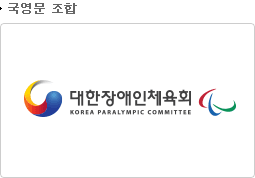
![[Paralympic Korean flag]](../images/k/kr@kpc.jpg) image by Tomislav Šipek, 5 August 2018
image by Tomislav Šipek, 5 August 2018
See also:
The flag of Korea Paralympic Committee is white with logo.
http://m.bokjinews.com/news/articleView.html?idxno=59021
Tomislav Šipek, 5 August 2018
The "대한민국 국가 패럴림픽 위원회 역할을 한다" (English: Korea National Paralympic Committee)
was established on May 12, 2006 It has both Provincial and City Branches (http://www.kosad.or.kr/org/info.asp?gbn=1)
as well as Trial Sports Associations, Disability type Groups, Affiliate
organizations, recognized (independent) groups and previously authorized
cancelled groups (sources:
http://www.kosad.or.kr/org/info.asp?gbn=2 and
https://ko.wikipedia.org/wiki)
that work in a coordinated fashion. It is a special corporation under the
"문화체육관광부" (English: Ministry of Culture, Sports and Tourism)(official website:
http://www.mcst.go.kr/ ) established by "제34조에 의거 2005년 11월 24일 설립된 문화체육관광부 산하
특수법" (English: Article 34 of the Special Act of the Ministry of Culture, Sports
and Tourism, established on November 24, 2005).
Sources:
http://www.koreanpc.kr/kosad/history.asp,
https://ko.wikipedia.org/wiki
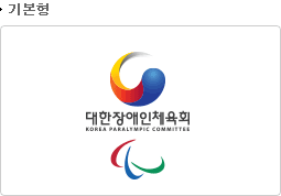
The new Symbol (http://www.koreanpc.kr/images/kosad/ci_img03.gif)
created by the Committee Identity program of Korea Paralympic Committee (KPC)
was designed with the motif of Korean flag. "The symbol is called "도전과 승리와 조화의
불꽃" (English: "The flame of challenge, victory and harmony) and it is based on a
variant of the " 삼색의태극 or 삼태극" (English: tricolored Taegeuk), a popular variant,
which adds a yellow lobe or "pa" (hanja: 巴 Hangul: 파). The yellow is taken as
representing (leading) humanity (over) red and blue, representing earth and
heaven respectively, meaning the endless harmony of the universe and the world.
This version is related to the Buddhist symbol of Gankyil. The 'challenge,
victory and harmony flame', which revolves continuously and dynamically,
symbolizes the vitality of the vision, sympathy, and proliferation of KOSAD
(Korea Disabled Persons Athletic Association (KPC), the nation's sole
representative body in charge of the sports administration of the disabled in
Korea.
There are four depictions of the flag, but I can't tell what they
stand for since I cannot read the Korean text above each one of them, as follows
(text is within the image, so the text cannot be copied):
-
http://www.koreanpc.kr/images/kosad/ci_img0201.gif
-
http://www.koreanpc.kr/images/kosad/ci_img0202.gif
-
http://www.koreanpc.kr/images/kosad/ci_img0203.gif
-
http://www.koreanpc.kr/images/kosad/ci_img0204.gif
A rendition of
the tricolored Taegeuk (plus the black pa and green pa) appeared in the official
logo of the 1988 Summer Olympics accompanied by the five Olympic rings.
Sources:
http://www.koreanpc.kr/kosad/ci.asp and
https://en.wikipedia.org/wiki/Taegeuk#Tricolored_Taegeuk
The colors
in CPMYK are:
Red C: 0% M: 95.00% Y: 99.00% K: 0%
Yellow C: 2.00% M: 14.00%
Y: 100% K: 0%
Blue C: 100% M: 91.00% Y: 4.00% K: 0%
Source:
http://www.koreanpc.kr/kosad/ci_02.asp
The flag in GIF format is
found here:
http://www.koreanpc.kr/images/kosad/ci_img01.gif (source:
http://www.koreanpc.kr/kosad/ci.asp)
It is important to notice that
"the first designated Paralympic logo, created for the
1988 Summer Paralympics in Seoul, was
based on the traditional pa (Hangul: 파; Hanja: 巴), which is the spiral components
making up the Taegeuk symbol. On October 6, 1990, the International
Coordinating Committee of World Sports Organizations for the Disabled (ICC)
was informed that the International Olympic Committee (IOC) requested the five-pa
symbol be altered — the IOC's marketing department considered it too similar
to the Olympic rings. A new symbol created for the International Paralympic
Committee (IPC) in 1991
included six overlapping pa in a circle. In November 1991, the IPC members
voted against the new symbol, retaining the five-pa symbol. However, the IOC
made clear that it would refuse further collaboration with the IPC if the
five-pa symbol remained in place. In March 1992, the Paralympic symbol was
changed to a version utilizing only three pa (yellow, red and blue). This was
not fully adopted until after the 1994 Winter Paralympics
in Lillehammer, Norway, since the Lillehammer Paralympic Organizing Committee
had by then already started a marketing program based on the five-pa version.
The three-pa version remained in place from the close of the Lillehammer
Games through the 2004 Summer Paralympics in Athens, Greece.
Sources:
https://en.wikipedia.org/wiki/Taegeuk and
https://en.wikipedia.org/wiki/Paralympic_symbols#Previous
For additional information go to Korean PC (official website):
http://www.koreanpc.kr/
Esteban
Rivera, 6 August 2018