image by António Martins, 30 Mar 2016

Last modified: 2026-02-28 by antónio martins
Keywords: tarrafal | waves | cloth | lace | national ornament | prison | portal | mountain | martins (pedro rolando dos reis) | chain (green) | chain: 3 links | vila do tarrafal | bull: caboshed | mbull (white) | corn ear |
Links: FOTW homepage |
search |
disclaimer and copyright |
write us |
mirrors

image by António Martins, 30 Mar 2016
See also:
External links:
Tarrafal, the municipality that takes the NNW tip of
Santiago isl., Cabo Verde.
António Martins, 30 Mar 2016
Tarrafal located in the northern part of the island of Santiago in
Sotavento islands of Cabo Verde. The municipal population is around
18 000. Under Portuguese dictator Salazar the Tarrafal Concentration
Camp was built on the plain south of town (Chão Bom) to contain
opponents of the political regime. The logo of Tarrafal
municipality included the dark history of this place.
Jens Pattke, 03 Jun 2012
A tarrafal is a place where throwing fishnets (tarrafas)
are woven or stored.
António Martins, 25 Apr 2016
There is another town with the same name in
São Nicolau island; it is also a mun. seat and it has a flag.
Another Tarrafal, a village in Santo Antão island, is seat of
neither municipality nor commune and probably has no flag.
António Martins, 30 Mar 2016
The flag was designed by architect Pedro Rolando dos Reis
MARTINS (no relation); he was once an inmate of the local
penal colony for political prisoners.
António Martins, 31 Mar 2016
The municipal flag of Tarrafal, as is the case for
other municipal flags, comes in two forms,
differently designed: The flag is blue and the
banner is blue and white.
António Martins, 30 Mar 2016
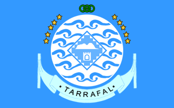
The flag is blue with the municipality logo in center.
Jens Pattke, 03 Jun 2012
It is not clear when exactly these flags and emblem were adopted, but
it has to have been not before June 2007 and not long after (assuming
the publication date of [c9v07] is
accurate).
António Martins, 31 Mar 2016
I found photos of both flags, shown in use in 2014
(photos: 584,
576,
573,
and 580; context
here).
These show the national flag used as a table cloth and youths holding
the municipal flag (upside down on photo
580); on the table the elusive municipal banner can be
seen on the cloth.
(Also on the table, the 10-shapes logo used the
the national tourism board, with a distict color for each island.)
António Martins, 30 Mar 2016 and 24 Dec 2025
A 2012
photo showing of the contemporary mayor standing next to an indoor
pole with both flags — national and municipal —
hoisted on it, the latter upside down; it also shows clearly the three shades
of blue: Dark on the national flag against light and pale on the municipal flag.
António Martins, 24 Dec 2025
The banner is quartered blue and white, in center the
logo of Tarrafal municipality.
Jens Pattke, 03 Jun 2012
The banner is blue and white — differing from that of
Sal by the order of the colors of the banner
(blue-white vs. white-blue) and the shade of blue, which is light
in Tarrafal and a very pale light blue, almost white, in Sal.
António Martins, 30 Mar 2016
I found high quality photos of both flags, shown in
use in 2014 (photos 584
and 580; context
here).
On photo 584, on the table,
the elusive municipal banner can be seen on the cloth — a poor rendition,
with thick white edging all around the emblem.
António Martins, 30 Mar 2016 and 24 Dec 2025
The detailed image of the banner,
in aprox. 25:24 ratio with fringe, rope and tassels, as given by Jens
Pattke on 03 Jun 2012, is not shown in this article
[c9v07], which is illustrated with
photos of flags, tightly cropped to show the central emblem and leaving
their edges off-frame; this design is captioned
«estandarte».
António Martins, 30 Mar 2016
Memória Descritiva dos Símbolos Heráldicos do Município
A presente Memória dos Símbolos Heráldicos leva em consideração o estabelecido no Decreto-Regulamentar nº 8/2000, de 28 de Agosto, publicado no B.O. nº 25-26 I Série, e os Termos de Referência da Câmara Municipal do Tarrafal. Na sua concepção, procurou-se uma ideia fundamental que pudesse ser expressa de uma forma simples, com força suficiente, capaz de caracterizar e individualizar o município, no contexto da sua importância na ilha de Santiago de Cabo Verde.
Simultaneamente, é um poderoso elemento de marketing e das potencialidades do concelho. Como esse símbolo será integrado numa bandeira, a expressão dessa ideia deverá ser apercebida a uma distância de, pelo menos, 30 metros. Uma eventual proliferação de elementos gráficos e de dimensões reduzidas dos mesmos, necessariamente, enfraqueceria a composição estética e a expressão de força que se pretende atribuir a esse símbolo.
A composição do presente Símbolo Heráldico é formada por três áreas:
- A área exterior, formada por ondas do mar;
- A área intermédia, formada pelo desenho de Pano d’Obra Bitcho, e;
- A área central, formada pelo Monte Graciosa e o ex-Campo de Concentração.
O elemento gráfico dominante, as ondas do mar, simbolizam o labor dos pescadores/agricultores, a extraordinária beleza litoral do município e o futuro do seu desenvolvimento, apoiado na indústria turística.
O desenho geométrico, integrado no losango, elemento principal da composição do Pano d’Obra Bitcho, é um símbolo poderosíssimo da História e da Cultura do concelho do Tarrafal. Este Símbolo também representa a assunção plena da herança cultural africana que Tarrafal conserva e desenvolve com muito orgulho.
O ex-Campo de Concentração é representado pela estrutura arquitectónica do seu portão principal, sobre o desenho do Pano d’Obra Bitcho.
O desenho do gigante Monte Graciosa, tendo como característica principal o seu aspecto omnipotente e omnipresente em todo o município, e cujos contornos se assemelham a um elefante deitado, vigiando e protegendo as belas planícies do norte do município e, particularmente, a sua capital, simboliza o esplendor da beleza natural e o orgulho que os tarrafalenses nutrem pelo seu chão-natal. Por ser o elemento principal, foi colocado na zona focal do símbolo heráldico.
A cor azul, o azul-marinho, o alguemarine, a cor do mar na linha costeira do município de Tarrafal, é a cor dominante no concelho, condizendo com o espírito de paz e tranquilidade dos tarrafalenses, é a cor de lugares nos trópicos que atrai visitantes.
O autor dos Símbolos é o arquitecto Pedro Rolando dos Reis Martins, ex-presidiário do Campo de Concentração do Tarrafal.
quoted by Jens Pattke, 03 Jun 2012, from [c9v07]
.gif)
image by António Martins, 30 Mar 2016
The emblem of Tarrafal municipality is white, with a vertically symmetrical pattern of stylized waves in light blue, shown in six rows, converging to the midline; these stand for the importance of the sea for the life and culture of the municipality.
Centered on the round shield, and covering the midpart of the four central wave rows, a lozenge (a square standing on one of its points at 45°) bearing the iconic elephant-shaped outline of «Monte Graciosa» (sic! in [c9v07] — should be Gracioso), an omnipresent landmark that towers over the whole municipal territory, shown above a stylized representation of the main gate of the Tarrafal Penal Colony (an infamous camp for political prisoners, in use in 1936-1954 mostly for ethnic Portuguese and in 1961-1975 for Colonial War prisoners — the designer of the flag was once an inmate here); both charges are white.
The lozenge is thickly edged in light blue and has a denticulated border made of white right-angled triangles poiting inwards, four on each side of the lozenge (or rather six, but those adjoining the corners of the lozenge fuse to form a larger triangle); the field of the lozenge, whereon the mountain outline and the gate are set, is filled with a lacy pattern stylized from the local panu di obra bitxu («pano d’obra bitcho» in [c9v07]) for a kerchief of which the whole lozenge, with its brodering, stands for, symbolizing local crafts and heritage.
António Martins, 31 Mar 2016, based on [c9v07]
The scroll (which shows both on the flag and on the
banner) is an even lighter blue (a midway shade
between light blue and white, since it shows on a background of both
colors in the quartered banner?) and reads
"TARRAFAL" between two round bullet points, all in black
sans-serif capitals; the scroll itself is shaped in an unusual fashion,
its stylized cloth tied to vertical poles on each side — maybe
resembling drying fishing nets, in line with the meaning of
the waves? The scroll is however not covered in
the article [c9v07].
António Martins, 31 Mar 2016
![[flag]](../images/c/cv-71_h.gif)
image by Sérgio Horta and António Martins, 22 Dec 2025 |
(source)
The colonial-era municipal flag is a typical Portuguese
municipal flag, consisting of a 2:3 white over green quartered background
with the coat of arms centered on it. Mural crown Argent
with four visible towers (town rank) and
white scroll reading in black upper case serifed letters "Vila do
Tarrafal". The banner should have silvery and green tassels and cord,
and golden staff with a spear finial. Flag and arms approved by the Overseas
Ministry in Ministerial Decree
(Portaria) n.º 15438 and published in the official journal Diário do
Governo : I Série 144 of 1955.07.01.
António Martins, 22 Dec 2025
At HeraldicaCivica.PT
we can see Sérgio Horta’s account of these arms and flag, drawn in the
same style as contemporary CHAAP artwork; other
sources, such as postage
stamps and the book [lgh66], may differ in details.
António Martins, 22 Dec 2025
![[flag]](../images/p/pt-'wv4.gif)
image by António Martins, 29 Feb 2010
Non-monocolored portuguese subnational flags are
allowed to have armless variations.
Jorge Candeias, 18 Jul 1999
While the current law, adopted in 1991,
doesn’t apply to municipal flags in the colonies, independent in 1975, it
however draws most of its content from the 1930 ministerial dispatch, incl.
the regulation of armless variations allowed for non-monocolor municipal flags.
This 1930 ruling affected all future Portuguese municipal flags, including the
colonial ones.
António Martins, Feb 2026
![[flag]](../images/c/cv-71_h).gif)
image by Sérgio Horta and António Martins, 22 Dec 2025 |
(source)
The arms are quartered the I and IV Argent a maize ear Vert fructed Or and in the II and III Vert a bull caboshed Argent.
Esquartelado. No primeiro e quarto, em campo de prata, uma espiga de milho folhada de verde e frutada de ouro. No segundo e terceiro, em campo verde, encontro de touro de prata realçado de negro. Coroa mural de quatro torres de prata. Listel branco, com os dizeres "VILA DO TARRAFAL". Bandeira - Esquartelada de branco e verde. Cordões e borlas de prata e verde. lança e haste douradas.António Martins, 22 Dec 2025
Anything below this line was not added by the editor of this page.