
Last modified: 2021-08-26 by  klaus-michael schneider
Keywords: education |
Links: FOTW homepage |
search |
disclaimer and copyright |
write us |
mirrors
See also:
 image by Ivan Sache, 9 June 2001
Colegio Champagnat - 2:3 (by default) flag, horizontally divided light
blue-white. The flag is shown on www.voluntad.com.co,
located by Dov Gutterman. The flag is a symbol of life
and grace, placed under Mary's protection. White stands for power
and purity (state of grace). Blue stands for wisdom and infinity.
Blue has been used as Mary's color in religious iconography for
the Middle Ages. White is of course the colour of virginity.
Ivan Sache, 9 June 2001
 image by Ivan Sache, 30 January 2009
A first boys' education institute was founded on 5 October
1908 by Marist Brothers in Sibundoy, Department of Putumayo.
"Normal de Varones de Sibundoy" was created on 6 May
1962 and superseded in 1969 by "Collegio de Bachillerato
Masculino 'Champagnat'". The institute is named after St.
Marcellin Champagnat (1789-1840, canonized in 1999), the founder
of the Marist Order.
The flag of the institute, as shown graphically and described on
the website
of the institute, is horizontally divided blue-white-yellow.
Blue means the presence of the Blessed Virgin in the institute
and represents the Marist community.
White represents peace and justice.
Yellow represents our intellectual resources.
Ivan Sache, 30 January 2009
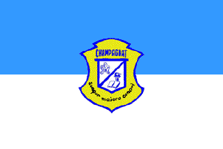 image by Ivan Sache, 5 November 2010
The flag of Instituto Chmpagnat de Pasto, as shown graphically on the
institute's website, is horizontally divided light blue-white - the traditional
Marian and Marist colors, here identified to "the cloak and purity of the
Blessed Virgin" - with the emblem of the institute in the middle.
The emblem of the institute is described as "a [yellow] cartouche in the
heraldic Greco-Roman style, with the name of CHAMPAGNAT [blue letters] on top
and the motto "Semper maoira conari" [black letters], the Latin for "Always
aspire to the best"; the central [white outlined in blue] shield is [diagonally]
divided into two parts, with the Marist "M" monogram on top and the torch,
symbolizing courage and light, and the open book, symbolizing knowledge, science
and study, on bottom[all in blue]."
Source:
http://www.champagnatpasto.com/simbolos.htm
Ivan Sache, 5 November 2010
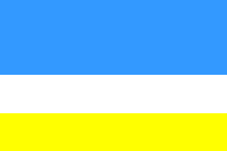 image by Ivan Sache, 4 November 2010
Colegio Champagnat de Popayan was founded in 1932 by the Marist Brothers, who
had settled in Popayan in 1889. The institute is named after St. Marcellin
Champagnat (1789-1840, canonized in 1999), the founder of the Marist Order.
The flag of the institute is described on the Colegio Champagnat's website as
horizontally divided light blue-white-yellow (2:1:1). White and light blue are
the traditional Marian and Marist colors; white and yellow are the colors of the
Holy See. Moreover, white represents ultimate purity, chastity, innocence;
yellow represents light, wisdom, enlightenment and peace; blue represents the
Earth, calm, God's will, force, power and divine protection.
Source:
http://colegiochampapopa.blogia.com/temas/filosofia-institucional-y-simbolos..php
Ivan Sache, 4 November 2010
 image by Ivan Sache, 24 October 2014
Escuela Normal Superior de Charalá (Santander Department) was established on
11 February 1936 by the parish priest José Antonio Quijano. From 1940 to 2006,
the institute was ran by the Dominican Sisters of the Presentation, a
congregation founded in 1695 by Marie Poussepin (1653-1744; beatified on 20
November 1994 by Pope John Paul II). In 1948, the aim of the school was changed
from commerce to teacher's education. Escuela Normal Departamental para
Señoritas was renamed Escuela Normal Integrada de Charalá in December 1991.
Escuela Normal Superior de Charalá was eventually established by Resolution No.
1,230 of 28 October 1999.
The flag is horizontally divided blue-white-blue. Blue recalls the cloak of Our
Lady, Queen and Mother of the Presentation [the Blessed Virgin], her delicacy,
and her humility. White recalls the purity of the Blessed Virgin.
Source:
http://escuelanormalsuperiorcharala.jimdo.com/cultura-institucional/simbolos-institucionales/bandera/
- Institute's website
Ivan Sache, 24 October 2014
 image by Ivan Sache, 14 June 2018
Institución Educativa Chipre originates in Instituto Comanday (for boys) and
Liceo Chipre (for girls), established by Order No. 11 issued on 14 November
1966. The two institutes were merged to form Instituto Chipre by Decree No. 147,
issued in March 1971 by the Government of the Department of Caldas.
IE Chipre was eventually established as the merger of Instituto Chipre, Escuela
Julio Zuluaga, Escuela Camilo Torres and Centro Educativo La Palma.
Source: IE Chipre
website
The flag of the institute is horizontally divided blue-gray-white-gray-blue
(1:1:2:1:1) with the institute's monogram, composed of the interlaced letters
"C" and "H", in the center.
Blue represents water and moving energy.
White represents wisdom lit by knowledge.
Gray represents struggle, compromise and tenacity.
Source:
IE Chipre website
Ivan Sache, 14 June 2018
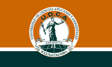 image by Ivan Sache, 01 December 2014
UDCA ("Universidad de Ciencias Aplicadas y
Ambientales" - University of Applied and Environmental
Sciences) succeeded on 22 November 1995 (Decree No. 5446 of the
Ministry of National Education), as a university,
"Corporación Universitaria de Ciencias Aplicadas y
Ambientales" (University Corporation of Agronomic Sciences,
UDCA), recognized on 22 November 1995 (Decree No. 5446 of the
Ministry of National Education), which itself had succeeded
"Corporación Universitaria de Ciencias Agropecuarias"
(University Corporation of Agronomic Sciences), recognized on 20
May 1983 (Decree No. 7392 of the Ministry of National Education).
The flag of UDCA, as shown graphically and described on the UDCA
website, is horizontally divided orange-dark green, the two
fields being separated by a thin white stripe, with the emblem of
UDCA in the middle. Orange and green represent the applied and
environmental sciences, respectively, while the white stripe
represents the horizon.
The emblem of UDCA shows the green allegory of Wisdom, captioned,
in Latin, "SAPIENTIA", surrounded by an orange ring
charged with the letters "U.D.C.A." in green. The
emblem is surrounded by a white ring outlined in orange, charged
with the name of the university and "BOGOTA /
COLOMBIA", all in green. Orange represents joy, energy,
interaction, quality and knowledge. Green represents balance,
sustainability, the natural environment, calm and freshness.
This new emblem keeps the colours and meaning of the old one, but
with increased intensity, strength and expression.
Ivan Sache, 27 December 2008
Photo:
http://www.udca.edu.co/es/saludo-del-rector-egresados.html
Ivan Sache, 01 December 2014
 image by Ivan Sache, 25 November 2014
Institución Educativa Ciro Pupo Martínez was established in La Paz
(Cesar Department) by Departmental Ordinance No. 30 of 30 November 1968.
The flag of the institute is presented in the Institutional
Educational Project as horizontally divided green-red.
Green is a symbol of love for the natural environment and the reflect
of a heart filled with aspirations.
Red is a symbol of optimism, elation and sacrifice. It is also a
symbol of life as a daily struggle to reach goals.
Ivan Sache, 25 November 2014
 image by Ivan Sache, 17 October 2018
IE Ciudad Boquía was established in 1996 in borough Ciudad Boquía, Pereira (Risaralde
Department). Named for the niece of cacique Calarcá (Pijaos tribe, Quimbaya
culture), Ciudad Boquía was inaugurated on 28 June 1991.
The flag of IE
Ciudad Boquía is diagonally divided (per bend) white-blue with the school's coat
of arms in upper fly.
White represents peace and harmony. Blue is a reflect
of the quest for a better society.
The coat of arms represents the quest
for knowledge through justice, love and education.
https://fiamneingles.wordpress.com/nuestra-institucion-2/
School website
Ivan Sache,
17 October 2018
 image by Ivan Sache, 16 December 2020
Colegio Integrado de Ipiales (INEDCI) was established by Departmental Decree
No. 541 issued on 23 August 1977 as the merger of Colegio Feminino Ciudad de
Ipiales, founded by Ordinance No. 6 issued on 19 October 1961, and Colegio
Nocturno Ciudad de Ipiales, funded by Resolution No. 169 issued in September
1968.
The symbols of INEDCI ar prescribed in Chapter 1.5 of the Manual de
Conviviencia.
The flag is rectangular, featuring three colors arranged
horizontally. The first stripe is red, the second, central stripe, is white, and
the third stripe is blue. The stripes have the same height. In the flag's
center, in the white stripe, is placed the institution's coat of arms.
Red is a symbol of impulse, transformation, change, love, sacrifice and
leadership capacity. It is the symbol of the force of all members of the
educational community who struggle and will struggle for the advance of the
institution.
White is the sum of all the rainbow's color. A symbol of vigor
and purity, it can awake creativity, as a symbol of peace, respect for life and
human dignity.
Blue mediates disputes, increases the sense of belonging in
front of the surroundings, denotes harmony, spiritual growth, and satisfaction.
It is associated with high ideals and durable values.
The coat of arms is
vertically divided. In the left part is featured on a blue (azure) background a
hand holding a burning torch. In the right part is featured on a red (gules)
background an ink-pot and a quill. In the lower part is featured an open book
with the institution's date of foundation. In the upper part, a white scroll is
inscribed with the motto reading "God, Motherland and Work". The outer ornaments
are argent (silver).
The torch represents the contribution of the
educational community, hope and commitment to work towards a common objective.
It denotes deep liberty and love for the institution and people who have forged
our essential values.
The ink-pot and quill, as symbols of the writers
and poets' talent, re the expression of literature, which is used to developed
capacity of analysis and sense of critic and a deep knowledge of the world that
surrounds us.
The open book is a symbol of reading, an activity that
starts in the younger age and is maintained all along the life. In front of a
book, a reader feels free to interpret and enjoy. In the book's central part is
inscribed the school's year of foundation (1952).
https://inedci.edu.co/manual-de-convivencia/
INEDCI, Manuel de
Conviviencia
Ivan Sache, 16 December 2020
 image by Ivan Sache, 10 July 2014
Colegio Mixto Ciudadanos del Futuro (Citizens of the Future) was
established in 1988 in La Libertad borough (Bosa, Bogotá) by Nubia Esperanza
Sandoval Ramos and Ricardo Martínez. After the rejection of the proposed name
of Colegio Psicópedagogico El Libertad, the institute was named Colegio Mixto
Pequeńos Ciudadanos (Small Citizens) and eventually renamed Colegio Mixto
Ciudadanos del Futuro in 1996.
The flag of the institute is red with a
white triangle placed along the hoist and charged with the institute's
emblem. Red is a symbol of love and life. White is a symbol of light,
surpassing and knowledge. The emblem of the institute is circular, as a
symbol of unity and greatness. The golden border (red on the drawing) is a
symbol of the cardinal virtues: justice, force, temperance and prudence.
The torch with the radiating rays is a symbol of surpassing
http://www.colegiomixtociudadanosdelfuturoltda.edu.co/paginas/jt/simbolos.php
Ivan Sache,
10 July 2014
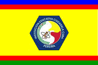 image by Ivan Sache, 10 October 2014
Institución Educativa Ciudadela Cuba was established in Los Cristales de Cuba
borough, part of the municipality of Pereira (Risaralda Department) by
Departmental Resolution No. 2,382 of 30 December 2002, as the merger of Colegio
Ciudadela Cuba (est. by Resolution No. 966 of 31 December 2001 and Escuela
Naranjito.
The flag of the institute is yellow with a pair horizontal stripes at the top
and bottom, blue-red and red-green, respectively, and the institute's emblem in
the middle. Yellow is a symbol of prosperity and success. Red is a symbol of
work, social struggle, liberty, and emancipation. Moreover, yellow and red are
the colours of the flag of Pereira. Blue is a symbol of communication. Green is
a symbol of optimism and aspiration to a progress future.
The symbol of the institute is a collective construction of the educational
community, obtained through a contest. The symbol is made of a central disk made
of the flag of Pereira and a dove with spread wings. The atom represents
science. The disk is bordered on the left by a green branch of coffee with ripe
berries.
Source:
http://fr.slideshare.net/guvaga83/manual-de-convivencia-2014-30266797 -
Institute's Etiquette Guidebook
Photo of the flag:
http://pati73.wordpress.com/2011/06/24/historia-del-colegio-ciudadela-cuba-2/
Ivan Sache, 10 October 2014
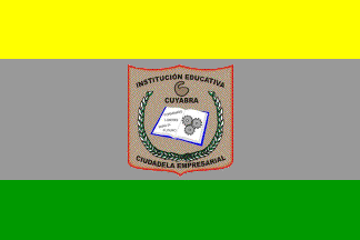 image by Ivan Sache, 18 September 2014
Institución Educativa Ciudadela Empresarial Cuyabra is located in the Miranda
borough, part of the municipality of Armenia (Quindio Department).
The flag of the institute is horizontally divided yellow-gray-green (1:2:1) with
the institute's emblem in the middle.
Source:
http://www.ieempresarialcuyabra.edu.co/index.php?option=com_content&view=article&id=90&Itemid=208
- Institute's website
Ivan Sache, 18 September 2014
 image by Ivan Sache, 16 September 2014
Institución Educativa Ciudadela Siglo XXI (lit., Citadel of the 21st Century)
was established in 2001 in Florencia (Caquetá Department).
The flag of the institute is horizontally divided green-yellow-white with the
institute's emblem in the middle. Green represents agroforestry taught at the
institute, and aspiration to interact with the natural environment in a
protective and durable manner. Yellow is a symbol of spiritual, intellectual,
and natural vegetal resources. White is a symbol of aspiration to personal,
institutional, municipal, regional, national, and international peace.
The emblem of the institute is bordered by two green rings, which represent
union, the educational community surrounded by a vivid natural environment,
and the dreams of the children, teenagers, and adults. The name of the institute
is written on a white background symbolizing peace and harmony. The central disk
is yellow, inscribed with the interlaced, green letters "C" and "E", for "Ciudadela
Educativa". The three green stars represent the three seats of the institute.
Source:
http://www.ciudadelasigloxxi.edu.co/index.php/quienes-somos/simbolos-institucionales
- Institute's website
Ivan Sache, 16 September 2014
 image by Ivan Sache, 27 November 2014
Institución Educativa Ciudad de Asís was established on 13 January
2003 in Puerto Asís, as the merger of Colegio Ciudad de Asís and
Escuela Central de Varones.
Orfelinato de la Sagrada Familia was established on 28 February 1914
by Franciscan nuns. The orphanage-school was transformed by Resolution
No. 23 of 13 June 1969 into a Colegio Feminino, directed by Sister
Carmen Elvira Burbano, and subsequently renamed Colegio Ciudad de
Asís. Escuela Urbana de Varones was established in 1917 by Friar
Estanislao de Les Corts, and renamed Escuela Central de Varones in 1975.
The flag of the institute is horizontally divided white-blue-green.
White is a symbol of science and peace.
Blue represents the sky and the rivers.
Green represents the climate and the abundant, characteristic
vegetation, as well as aspiration to progress.
Source:
http://www.ieciudaddeasis.edu.co/index.php?option=com_content&view=article&id=58&Itemid=55
Ivan Sache, 27 November 2014
 image by Ivan Sache, 19 October 2014
Colegio Ciudad de Cali was established by Resolution No. 463 of 27 November
1989 in the Ciudad de Cali borough, part of the town of Bogotá. The school was
founded by María del Carmen Moyano de León.
The flag of the institute is presented in the institute's Etiquette guidebook as
horizontally divided white-blue.
Source:
http://colegiociudaddecali.edu.co/manualc.pdf - Institute's website
Ivan Sache, 19 October 2014
image by Ivan Sache, 6 March 2017
Institución Educativa Ciudadela Nuevo Occidente originates in the secondary
seat of Institución Educativa Santa Margarita, known as Las Flores, inaugurated
on 25 January 2009 by President of the Republic Uribe. Institución Educativa
Ciudadela Nuevo Occidente was recognized on 28 June 2011. The symbols of the
institute are prescribed in Article 7 of the institute's Constitution.
The flag of the institute is horizontally divided yellow-white-black with a blue
triangle placed along the hoist and the institute's emblem
placed in the
middle of the white stripe.
The triangle represents the three main dimensions
of human being: cognitive, affective-spiritual, and expressive. Interrelated,
these
three dimensions shall be developed with the same intensity.
The
rectangle represents the way to excellence, paved with the institutional
colours.
Blue represents the institute's creative ideal to educate individual
people who would positively impact society.
Yellow represents the light
provided to every student, expected to become a great citizen in the future.
White represents the purity of the heart and the mind of the students.
Black
is a symbol of force.
The emblem of the institute is divided into three
quarters.
1. (Upper left) The "metrocable" is the means of transport mostly
used by the members of the educational community and the general emblem of the
Ciudadela Nuevo Occidente Sector, whose urbanizations are also featured. The
quarter represents the location of the institute.
2. (Upper right) The
sun-shaped sunflower recalled the origin of the institute, established as Las
Flores (Flowers). It also refers to the institutional philosophy of the
institute, where the light provided by the sun is reflected on the student's
mind.
3. (Lower) The book, quill and dove represent a trio of significant
skills powering the educational work. The book represents science, the quill
represents creativity, and the dove represents peace.
The shield is outlined
by a border inscribed with the institute's name and motto "FORMAMOS CON QUALIDAD
HUMANA LOS CIUDADANOS DEL MAŃANA" (We teach with human value the citizens of the
future).
https://drive.google.com/file/d/0BxePJ8Plsoc3X3M3N01HTWstcDQ/view?idmenutipo=1077&tag=col
- Institute's Constitution
6 March 2017
 image by Ivan Sache, 18 September 2014
Institución Educativa Ciudad Florida is located in Florida (Valle Department).
The flag of the institute is horizontally divided white-red-blue with a green
triangle placed along the hoist.
Source:
http://evidenciastecnicosistemas.blogspot.fr/2013/02/escudo-y-bandera-de-la-institucion.html
- Institute's unofficial blog
Ivan Sache, 18 September 2014
 image by Ivan Sache, 16 September 2014
Institución Educativa Ciudad Itagüí was established in Itagüí (Antioquia
Department) by Resolution No. 1,146 of 5 July 2003, as the merger of Escuela
Mixta El Tablazo (inaugurated on 22 January 1979) and Escuela María Bernal
Molina.
Source:
http://www.ieciudaditagui.edu.co/ - Institute's website
The flag of the institute is presented in Article 1.10.1 of the institute's
Etiquette Guidebook as square, horizontally divided golden yellow-pure
white-king blue-light gray. Golden yellow is a symbol of the inner light that
invites us to growth, to respect, to day after day affirmation, to aspiration to
become better. Pure white is a symbol of union, purity, tolerance, harmony, and
equity in thoughts, acts and words. King blue is a symbol of intelligence,
dreams, knowledge, and truth orientating our objectives. Light gray is a symbol
of prudence, neutrality, sincerity, and knowledge.
Source:
http://master2000.net/recursos/menu/314/1720/mper_arch_10385_manual_de_convivencia.pdf
Ivan Sache, 16 September 2014
 image by Ivan Sache, 13 December 2020
Institución Educativa Ciudad Mocoa was established in Mocoa (Putumayo) by
Resolution No. 157 issued on 3 February 2003, succeeding Colegio Ciudad Mocoa,
which had been established by Resolution No. 59 issued on 22 July 1992.
http://ieciudadmocoa.edu.co/
School website
The flag of IE Ciudad Mocoa is diagonally divided
white-blue from the upper hoist to the lower fly, with the school's coat of arms
all over.
White represents the educational community's humility and
purity, always booting student's surpassing. White also represents work, will
and sense of belonging to the institute, as well as peace everyone should search
for the sake of the progress of Colombia. White emphasizes also the true and
sincere compromise accepted by all to lift underdevelopment that handicaps the
school, the municipality and the country.
Blue represents the forest's
pure air, the numerous watercourses that irrigate the municipal territory, which
we should protect and preserve. Blue represents the horizon the students have to
build to fulfill their dreams.
http://ieciudadmocoa.edu.co/iemocoa/index.php/deporte/bandera
School
website
The coat of arms features circles and semicircles in the colors
of the flag, and an owl, as the symbol of wisdom and knowledge in the center,
symbolizing the philosophy of the institute, in search of an integral,
value-based education.
The motto "CULTURA Y PROGRESO" [Culture and Progress]
highlights everyone's forces joined to build an autochthonous cultural
identification, without forgetting technological progress and the scientific
advances of the new century. The shield is surrounded by heliconia branches,
representing the beauty and felicity of the Putumayo region and a symbol of
Colombian Amazon.
http://ieciudadmocoa.edu.co/iemocoa/index.php/deporte/escudo
School
website
Ivan Sache, 13 December 2020