 klaus-michael schneider
Keywords: error | armillary sphere | wheel (yellow) | bordure |
Links: FOTW homepage | search | disclaimer and copyright | write us | mirrors

Last modified: 2024-11-23 by  klaus-michael schneider
Keywords: error | armillary sphere | wheel (yellow) | bordure |
Links: FOTW homepage |
search |
disclaimer and copyright |
write us |
mirrors
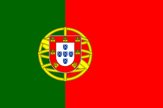
The official design that ever existed is the one still in use, with two parts of green on the hoist and three parts on the fly, and always with the coat of arms (centred on the partition line, half the flag’s height in diameter). Given the relatively complexity of these specifications, however, simplifications and incorrect versions abound, though.
António Martins-Tuválkin, 2 Jan 2002
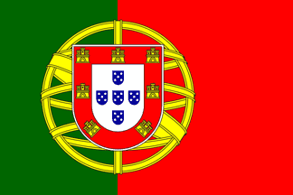
Incorrect depiction of the Portuguese national flag with extra large emblem. This can of course be due to mismeasurement or over innovative designers, but in most cases of actual cloth flags of this design we're witnessing, what was once a regular flag that got damaged somehow (usually wind ripped at the fly) and whose owner decided to trim around in order to spare the relatively expensive and hard-to-create emblem patch.
Usually this is done on flags with a hoisting sleeve for a handheld staff. I've seen myself several of these, and heard accounts that these were once much more common, before cheap printed flags on synthetic cloth became common place. To be found usually at sporting events or political rallies, their users are usually private citizens without big concerns for protocol.
António Martins-Tuválkin, 11 Feb 2016
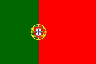
Incorrect depiction of the Portuguese national flag with extra small emblem. The same concerns and conditions apply as those for the big-emblem version; this design arises when the owner of a smaller flag decided to add extra green and red cloth around to enlarge it - again this is worth the trouble because the emblem is easily deemed to complex or expensive to embroider or patch on.
All this reminds me of the first flag I ever manufactured of actual cloth (and I did manufacture many): It was a ~20×30 cm² hand waver and was made
for the 10 November 1993 soccer game against Portugal (see: here - why did I decide to render my sartorial support to the visiting team instead of to my own country? Not only because I do favour the underdog, but also because sewing along three ribbons of cloth is (or was, back then) way simpler than secure a printed or embroidered patch with the Portuguese national emblem.
António Martins-Tuválkin, 11 Feb 2016
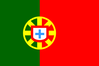
I got this from a toy packaging with multi-language instructions: the Portuguese national flag in a fair enough arrangement of both main panels (approx. 2:3 instead of the frequent mistakes 1:1 or 1:2), but quite amiss about the central emblem:
In place of the armillary sphere a wheel like contraption, with a circular rim and eight rays converging to the center; on it a shield, indeed white and bordered red but without the castles and with the 1+2+1 escutcheons replaced by a single couped cross.
This is an acceptable simplification, perhaps even satisfactory for the non-portuguese and the non-vexillologist/heraldrist. But the same packaging had also a Spanish national flag with a lot more of accurate detail (the only obvious mistake being in the Leon quarter).
This means that whoever could find clipart a decent Spanish national flag could not found for a portuguese one — the Portuguese Government made a mistake in 1911 by accepting for the new national flag such an overtly complex design (and, unlike the Spanish case, unsimplifiable), by never supporting and publicizing clear specifications, they have been worsening that mistake ever since.
António Martins-Tuválkin, 20 Oct 2003
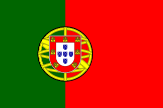
And here's he again caught next to incorrect versions of the national flag, this time with the U.S. Department of State to be blamed for the error: Paulo Portas, Minister of Foreign Affairs of Portugal visiting his homologous U.S. official, State Secretary Hillary Rodham Clinton, on 27 September 2011, in Washington, D.C. Two flags of each country are shown in the background, presumably provided by the Department of State, and the flags of Portugal, identical, show a thick black fimbriation all around the central emblem. Photos of this scene were widely published in social and mass media in Portugal at the time. (These flags exhibit a further detail error: Open doors, shown red, on the castles - that will be treated separately, when we analyze detail heraldic errors.)
Sources: this photo and English WIKIPEDIA
António Martins-Tuválkin, 21 Feb 2016
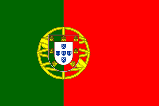
Another incorrect version of the Portuguese national flag: The bordure is vertically divided green and red (per pale Vert and Gules), along with the background -- this hoisted for years now, at the elite historical Hotel Avenida Palace, in Lisboa!
António Martins-Tuválkin and Santiago Dotor, 3 Mar 2005
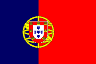
This is not as much an usual error, even though it might happen as a typographical accident that creates an image of the national flag of Portugal with blue for green: Not as a human error due to the specs complexity, as in towers for castles, or as in 2/3 instead of 2/5 for the width of the hoist side panel), but merely as a happenstance. Further note that green is the simplest colour of the national flag of Portugal, used only for one element (i.e. conceptually, even if no visually).
This alternative version of the national flag of Portugal, replacing with blue (intentionally a very dark shade - FotW/FIAV's, see here and B+++ , the green on the hoist side panel, was circulated among members and supporters of P.N.R., a Portuguese far right party, around the end of the 2000s, having been used in demonstrations and other public events - both depicted on posters and stickers as well as in the cloth (at least one printed nylon flag). It was however not really popular, even among that crowd, and lies now in obscurity. (Inf. subject to corr. from the proponent.)
On top of using the colour of P.N.R. itself (which in turn got them from some Spanish far right factions), the replacement of green is the elimination of the "new" colour introduced in 1910-1911, seen as bourgeois and masonic (curiously more so than red, used f.i. on the royal flag - replaced by the green presidential flag), and as the restoring of the blue hoist side panel of the pre-1910 kingdom's flag (leaving aside the fact that that flag had been, back in 1830, not less "revolutionary"), colour which in 1910-1911 had been replaced by green as "national colour", f.i. on naval positional flags.
This version of the flag is/was intended not as much as a flag of P.N.R. as a proposal for a new national flag, or at least a symbol of national "renewal" (as in the party's name). Given this party's scarce results in the elections, 27,269 votes among 5,408,805 voters in 2015, that's half one per cent), even when defending "popular" causes such as repression of immigrants or of adepts of non-traditional sexuality, changing the national flag, a potentially polemic subject in any demographics, was never listed among the party's goals or promises.
António Martins-Tuválkin, 12 Feb 2016
qna!3.gif)
I saw this once on TV: our president in front of a flag with the bezants replaced by… triangles!, with those at the edges pointing to the centre, suggesting a saltire… unbelievable.
Jorge Candeias, 27 Nov 1998
The disposition of charges was just like in the actual escutcheon, 5 triangles in total, and disposed 2:1:2. The triangles in the edges were rather narrow, and the central triangle was more wide than high, but seeming to occupy more or less the same area as the others. A bit less perhaps.
Jorge Candeias, 20 June 2009
Ten years later I want to believe that such sightings become less frequent, but I'm not so sure. Erroneous detail of inescutcheon, cp. with the real thing here.
António Martins-Tuválkin, 19 June 2009
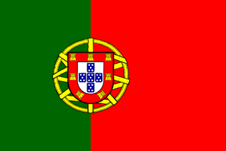
Some of the incorrect versions became widely popular in the early 2000s, as new technical and commercial possibilities open up in the areas of printing (inc. large format, vinyl, textile - even baking!) and advertisement, demanding high "quality" (i.e., resolution) outputs and vectorial matrices. This increased the visibility of the few available vectorial versions, more or less modified by reusers. One was originally uploaded to Sodipodi.COM by a user named "Apache", from unknown provenance. It shows several more or less important mistakes in the design of the armillary sphere, towers instead of castles, inescutcheons too big, and lacks the thin white edging on the shield.
This formed the base for many versions, some with new errors further accumulated, as the one we show here. Today I am sending the original version with idealized colour shades and proportions.
António Martins-Tuválkin, 8 Feb 2016
![[wrong flag]](../images/p/pt!cdr!.gif) image (exported) by António Martins-Tuválkin, 24 Oct 2002
image (exported) by António Martins-Tuválkin, 24 Oct 2002
Grotesquely incorrect representation of the Portuguese national flag from the clipart of CorelDraw, thus becoming widely used, even in Portugal, albeit the mistakes.
António Martins-Tuválkin, 24 Oct 2002
![[wrong arms]](../images/p/pt!cdr).gif)
![[wrong castle]](../images/p/pt!cdr)c.gif)
![[wrong PT flag reverse]](../images/p/pt!aplq.gif) 2:3, image by António Martins-Tuválkin, 10 June 2008 |
![[wrong PT flag reverse]](../images/p/pt!aplq!.gif) 2:3, image by António Martins-Tuválkin, 1 Nov 2023 |
Regardless of the accuracy of the design itself (concerning ratios, shades and arms depiction details) the Portuguese national flag can suffer from yet another kind of incorrect representation, that of its reverse:
So far so good, but if the flag is manufactored by applying a coat of arms' patch onto a ground of two sewn cloths (as it often is), and lacking a special, mirrored appliqué for the reverse (which is seldom available for smaller sizes), one ends up with a reverse in which the green/red background shows counterchanged (see leftb image above) through the gaps of the armillary sphere and the ecliptic has its upper end at the fly side, green on red. If one would use instead an appliqué with "holes", so that the background can be seen through, even so a special mirrored appliqué for the reverse must be made, or else the ecliptic has still its upper end at the fly side(see right iamge above), even if the counterchanging effect is avoided.
António Martins-Tuválkin, 10 June 2008
![[wrong flag (PT) with white edge]](../images/p/pt!wb.gif) image by António Martins-Tuválkin, 24 Nov 2016
image by António Martins-Tuválkin, 24 Nov 2016
An official majestically waves a cheap plastic flaglet with an untrimmed white edge, all around and sleaved upside down on the handheld staff. Its shade of green is also too light and the exact design of the arms (a variant of the original image by Mario Fabretto, one of the least incorrect versions popular before 2004) includes towers (looking like triumphal arches with filled aperture) instead of castles on the bordure, and an extra-wide white edging around the shield.
Source: this photo, showing the Vice-Prime Minister Paulo Portas delivering a speech
António Martins-Tuválkin, 24 Nov 2016
![[wrong flag (PT) with white edge]](../images/p/pt!varms.gif) 2:3 image by Zachary Harden, 28 Nov 2016
2:3 image by Zachary Harden, 28 Nov 2016
What I found today while checking FOTW-FB...took the cake. Paulo Jorge Martins reported on 28th November 2016 that the European Handball Federation released their group stage setup for the EHF Cup for this coming tournament. However, how they depicted the national flag was that the coat of arms was entirely in the green section. Attached is my recreation of the depiction.
Zachary Harden, 28 Nov 2016
![[wrong flag (PT) in b/W]](../images/p/pt!bw.gif) 2:3, image by António Martins-Tuválkin, 23 Dec 2023
2:3, image by António Martins-Tuválkin, 23 Dec 2023
In 2013, as part of the celebrations of the 39th Carnation Revolution anniversary (April 25th), an art installation was set up in one of the majestic buildings of the Allies Avenue in Oporto, sponsored by its current tennant, AXA Insurance. It was authored by Paulo Mendes and featured a "giant" national flag of Portugal with its elements rendered in greyscale, hoisted at half mast on one of the slanted poles of the building´s main balcony. This installation was titled "Portuguesa Monochrome" and the chosen colour scheme embodied literally the metaphoric "greyness" ("cinzentismo") as seen by the artist and many Portuguese of the same age and socio-cultural demographic cohort (+1!) at the time. An identical flag had been on display as part of an installation by the same author, titled "Sem Título" (so blasé!) in Guimarães the month before.
The exhibition of this greyscale in Guimarães didn´t go well, with it being stolen/removed presumably by outraged patriots, and in Oporto its display was cut short by AXA Insurance, who removed its support stating unclear reasons; it however remained hoisted throughout the full day of April 25th, having been seen and photographed by many passers-by. The story was covered by this online newspaperin its culture supplement P3.
It should be made clear once again that the Portuguese Constitution, while enshrining the flag as a national symbol, also recognises a wide latitude of free speech to citizens, which include all forms of what could be called flag desacration, and that all supplemental legislation (such as the often invoked Law-Decree 150/87) have failed to have any effect in legal cases against "desacrators", who are either cleared of charges or charged only with unrelated minor felonies such as theft, vandalism, or arson.
Purely symbolic actions, using one´s own acquired or manufactored flags, as in several recent cases of intentional upside-down hoisting or this greyscale flag, obviously cannot be charged in Capone-style processes. In this case in Oporto 2013, it was merely one private party (Axa) denouncing a contract with another private party (the artist).
In general, public opinion in Portugal doesn´t care much about flag desacration, especially not when it´s merely symbolic like this, and only a few die-hard fist-shakers present formal complaints that will go their dull way in court. Likely this is what scared Axa, the negative publicity — they know who are their clients, I guess.
António Martins-Tuválkin, 23 Dec 2023
![[Portugal sou eu flag]](../images/p/pt!pse.gif) image by António Martins-Tuválkin, 2 Dec 2023
image by António Martins-Tuválkin, 2 Dec 2023
The "Portugal sou eu!" campaign was launched in 2011 to promote domestic consumption (that is the official claptrap — in truth it was a way for the Passos Coelho cabinet to subsidize his Reaganomics pals at A.E.P., but I digress) and its logo, in use at least since July 2014, features a stylised letter "P", the country name´s initial ,and its FIA symbol, that doubles as an even more stylised flag, with the stem of the letter making up the flag pole and the bowl standing for the cloth. See the official logo image
More info is available at the official website. This logo is meant to be "uma marca ativa e identitária da produção nacional".
The "flag cloth" as part of the logo shows a stylisation of the national flag that would be a vertically divided green/red background with a large white disc on the partition, its diameter taking up the whole of the flag´s height, and on it a solid dark yellow Iberian shield outline.
Although based on the national flag, the logo seems to come in two versions: green too light, and red too dark, see examples: here and here.
The official version has it in medium red (correctly matching the national flag) and medium green (not so).
This campaign is ongoing, one can see this thing on all kinds of packaging and promo material in strores and ads, and that its slogan means "Portugal — that´s me" (and nor merely the blander ´I am Portugal´ which would be rather "Eu sou Portugal".
back to previous page click here.
back to Portuguese national flag click here.