Last modified: 2026-08-21 by martin karner
Keywords: qiryat motzkin | kiryat motzkin | iriyat qiryat motzkin | ship | water tower |
Links: FOTW homepage |
search |
disclaimer and copyright |
write us |
mirrors
![[Municipality of Qiryat Motzkin (Israel)]](../images/i/il-qimot.gif) image by Dov Gutterman | 2:3     Emblem adopted 30th October 1958 |
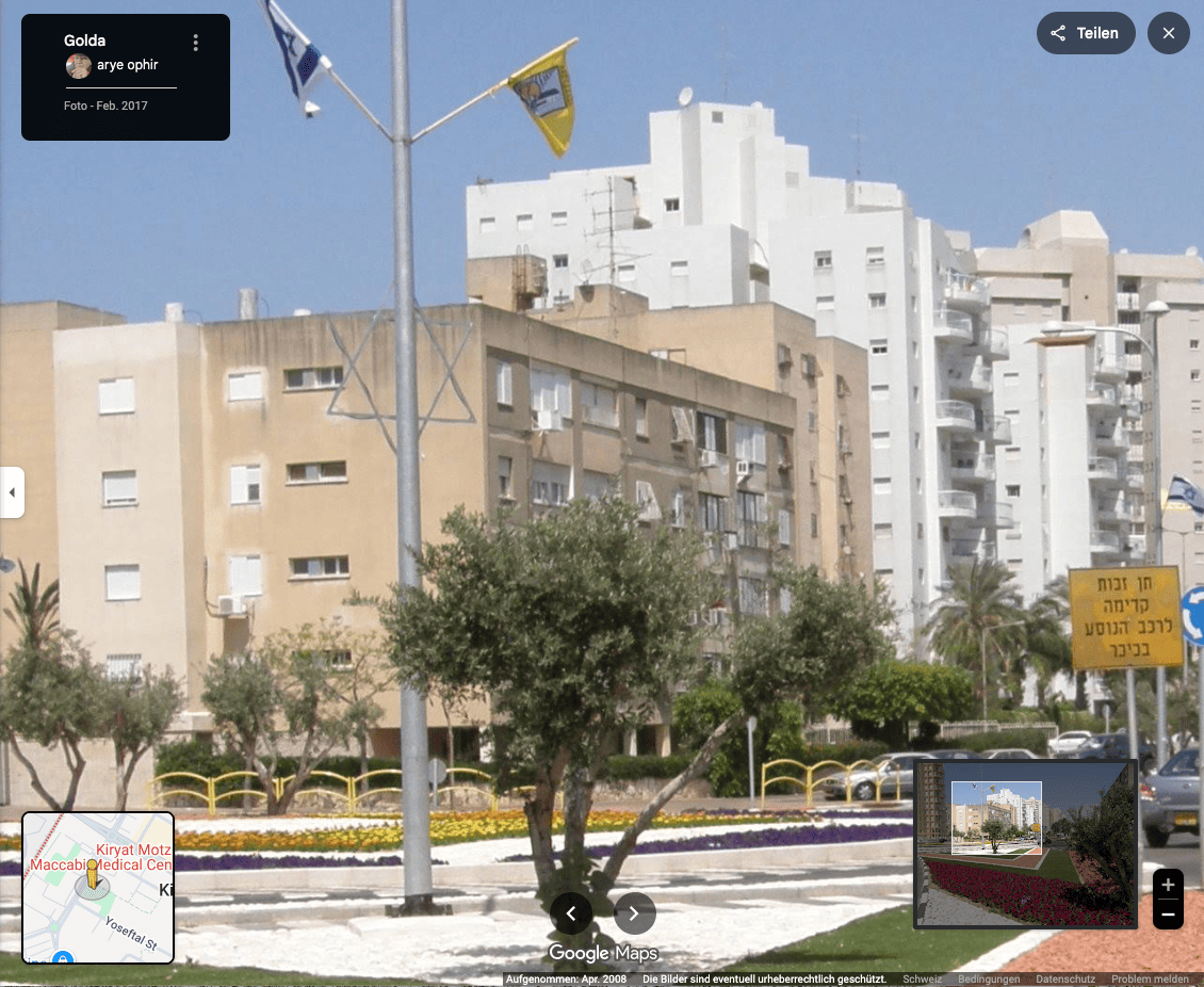
♦ photo
See also:
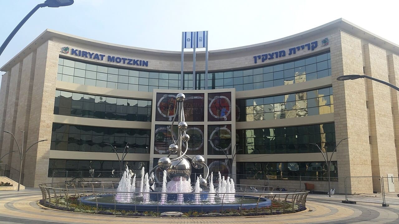
The city of Qiryat Motzkin (12 km north of Haifa) uses as flags a blue logo and
inscription of the city name on many different backgrounds. The
one on the city hall is white but in the streets you can see also
yellow, orange and blue.
Dov Gutterman, 15 April/15 May 1999
Qiryat Motzkin still uses many backgrounds but with the logo
in natural colors on the white and yellow bedsheets. The one of
the city hall was replaced to a yellow one.
Dov Gutterman, 11 July 2001
Qiryat Motzkin is situated in Zevulun Valley (Haifa Bay), west
of the road between Haifa and Acco (just north of Qiryat Haim). It was established in
1934, became a municipality in 1976 and has 40'000 inh. It is
named after Arie Leib Motzkin, a Zionist
leader. In spite of showing a boat on its emblem, Qiryat Motzkin
is not on the coast and it probably represents the Biblical tribe of Zevulun. The water
tower still exists as does the lamp with nine lights on its top
symbolizing Hannuka.
Previously many different colour backgrounds were spotted, most
of them with only an outlined version of the emblem, but in my
visit on 1 September 2001 all flags on all municipal buildings
had a yellow background, probably adopted as the local colour.
The hoist is on the right (sinister hoist) and the
reverse side is mirrored.
Sources: author's own observation and photos, 1
September 2001; this
webpage [retrieved].
The municipal emblem was published in the official gazette (Rashumot),
YP 631, 30 October 1958.
Dov Gutterman, 6 September 2001
According to my Biblical Encyclopedia the tribe of Zebulun lived after Jacob's
blessing "on the beach of the Great Sea"
(Genesis 49:13) and had easy access to
the Mediterranean ports.
Although the Zebulunites were cut off from the sea by the Aser
tribe and from the lake of Galilee by the tribes of Naphtali and
Issaschar, the Zebulunites could easily reach rich market towns
like Sidon. The ages-old international trade route, the 'Road of
the Sea', lay across the Zebulun territory.
Jarig Bakker, 6 September 2001
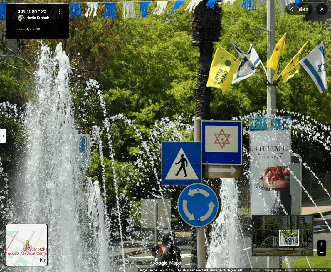
All flags are now only with yellow background. I don't know if
there is any connection with this being the color of the mayor's
list (Motzkin Neto) in the last local elections ... or the other
way around. However, I can determine that dark shade of yellow
(gold) is the municipal colour, loosing the previous multi-color
past. The emblem is in natural colors.
Dov Gutterman, 7 May 2003
According to the municipal
website [partially retrievable], the emblem was designed by Avrahan Nisati, a local
art teacher, and was adopted on council meeting of 16 June 1946.
Dov Gutterman, 3 May 2005
![[Municipality of Qiryat Motzkin (Israel)]](../images/i/il-qimot1.gif) image by Dov Gutterman
image by Dov Gutterman
The coat of arms of Kiryat Motzkin, the official emblem of the town and the local council, was adopted following its redesign in March 2012. In addition, the town has a branded logo that was designed in March 2017.
![[new logo]](../images/i/il)qimot-lg.jpg)
(source)
From Hebrew Wikipedia:
In 2012, the town's coat of arms was redesigned once again – for the fourth time – with the
aim of creating a design that was "more suited to the 21st century". The coat of arms was given a
more modern graphic design whilst retaining the key motifs from the town's previous coats of arms. The new
design was criticised both for the numerous changes to the city's coat of arms and for its irrelevance, in
that it depicts a ship and the sea as a symbol of immigration to Israel – which usually takes place
by air – and furthermore, Kiryat Motzkin has no access to the sea.
(Translated with DeepL.com)
![[CoA]](../images/i/il)qimot.jpg)
(adopted 1956 | source)
From Hebrew Wikipedia:
The emblem consists of a blue shield bearing a landscape scene comprising several elements:
Zebulun shall dwell by the seashore; he shall be by the shore of ships, and his border shall extend to Sidon. (Genesis 49:13)At the top of the emblem is a crown in the shape of the branches of the menorah, symbolising light and the State of Israel. At the bottom is a scroll bearing the name of the city.
On 23 January 1946, the proposal to design a coat of arms for Kiryat Motzkin was first put forward.
Members of the local council decided that the central motifs would be the water tower – the first
building constructed in the council area – the sea and a ship, symbolising immigration to the Land of
Israel, and a menorah, symbolising a connection to Judaism. A number of proposals were received, from
which the design by Avraham Nisti was selected and approved on 16 June 1946.
The emblem has undergone several changes over the years, being updated in 1956, in the 1970s and in 2000.
In total, the emblem has undergone three major revisions, all of which retain the emblem's structure and
central motifs, with minor design changes.
(Translated with DeepL.com)
![[old logo]](../images/i/il)qimot-old.jpg)
(source)
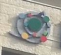
♦ photo (town hall) (detail) source
♦ photo (flag with logo)
In March 2017, a new branded logo was adopted for the town, intended to gradually transform its emblem once again.
From Hebrew Wikipedia:
In 2017, a modern logo and accompanying design language were adopted. The logo consists of several circles
that encircle and intersect one another, creating the appearance of a galaxy. The logo features several
elements that symbolise the town: