
Last modified: 2026-10-24 by  zachary harden
Keywords: shiga | nagahama | kanji: naga |
Links: FOTW homepage |
search |
disclaimer and copyright |
write us |
mirrors

image by Tomislav Šipek, 04 March 2014
See also:
The flag of the city of Nagahama is already presented here, but that is the
old flag, before 2006. The new flags are in white and green variants.
Sources:
http://fujii-yuji.com/03-picture/pic201201.htm
http://commons.wikimedia.org/wiki/File:Flag_of_Nagahama,_Shiga_(variant).png
Tomislav Šipek, 04 March 2014
The city emblem and the flag were adopted on Feb 13th 2006 by Notice No 1 and
2. The white flag has a green and blue two color city emblem in the center. The
white gourd is a horse insignia of the first owner of Nagahama castle Hashiba
Hideyoshi. The three blue twisted waves symbolize Lake Biwa and merged a city
and two counties. The flag proportion is 2:3.
Nozomi Kariyasu, 12 May 2014
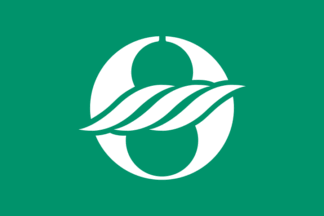
image by Tomislav Šipek, 04 March 2014
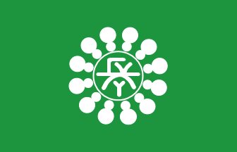
image by Eugene Ipavec, 19 January 2006
Nagahama city adopted its emblem: 25 August 1947; adoption date of flag: 30 June 1979
by Notice No 32 (link in Japanese)
Flag proportion: 2:3
colour of field: light green
colour of emblem: white; diemeter of emblem: 42/100 length of flag; a stylized kanji Naga 長.
Nozomi Kariyasu, 16 January 2006
The emblem consists of a stylised kanji naga 長 (long, leader)
inside a circle. Around the circle are twelve shapes made of a small
circle joined to a larger circle, with the smaller circle on the inside.
As far as I can gather from the Japanese, the shapes have something to do
with Toyotomi Hideyoshi (Lord of Nagahama), and their number (12) is
something to do with the Nagahama Hikiyama Festival (the date/number of
days?).
The emblem's position on the flag is centred vertically and 1/40 of the
length towards the hoist.
Jonathan Dixon, 27 February 2006
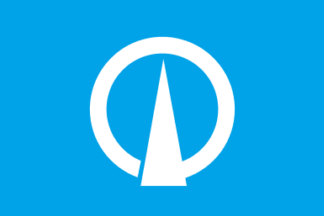
image by Tomislav Šipek, 11 March 2014
The flag of the former town of Azai was blue with mark. The town is now, from
2006, part of the city of Nagahama.
Source:
http://fujii-yuji.com/03-picture/pic200601.htm
Tomislav Šipek, 11 March 2014
The character ア“A” in katakana has been stylized to symbolize the town's drive for development.
Nozomi Kariyasu, 08 October 2026
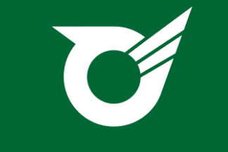
image by Tomislav Šipek, 11 March 2014
The flag of the former town of Biwa was green with mark. The town is now,
from 2006, part of the city of Nagahama.
Source:
http://fujii-yuji.com/03-picture/pic200601.htm
Tomislav Šipek, 11 March 2014
The character び“bi” in hiragana is stylized to symbolize the town's harmony and rapid development.
Nozomi Kariyasu, 08 October 2026

image by Tomislav Šipek, 11 March 2014
The flag of the former town of Kohoku was blue with mark. The town is now,
from 2010 part of the city of Nagahama.
Sources:
http://fujii-yuji.com/03-picture/pic200610.htm
http://fujii-yuji.com/03-picture/pic200612.htm
Tomislav Šipek, 11 March 2014
The design is based on the hiragana character こ“ko”; the two spheres at
the center represent the ripples of Lake Biwa, while the surrounding
elements symbolize the town’s harmony and development.
The town’s name is written in kanji in white at the bottom.
Nozomi Kariyasu, 09 October 2026

image by Tomislav Šipek, 11 March 2014
The flag of the former town of Nishiazai was blue with mark. The town is now,
from 2010, part of the city of Nagahama.
Source:
http://yamakado.cocolog-nifty.com/blog/2009/10/index.html
Tomislav Šipek, 11 March 2014
The kanji character “西” (west) has been stylized to symbolize the town's
peace and development.
Nozomi Kariyasu, 09 October 2026

image by Tomislav Šipek, 11 March 2014
The flag of the former town of Torahime was green with mark. The town is now,
from 2010 part of the city of Nagahama.
Source:
http://fujii-yuji.com/03-picture/pic200701.htm
http://fujii-yuji.com/03-picture/pic200601.htm
Tomislav Šipek, 11 March 2014
The characterとら“tora” (tiger) in hiragana has been stylized to represent
a jewel, while the circle and arcs symbolize a cooperative society and
express a wish for the town's prosperity.
The town’s name is written in white kanji at the bottom.
Nozomi Kariyasu, 09 October 2026

image by Tomislav Šipek, 11 March 2014
The flag of the former town of Yogo was blue with mark. The town is now, from
2010, part of the city of Nagahama.
Source:
http://ameblo.jp/my-you/archive5-200912.html
Tomislav Šipek, 11 March 2014
The design incorporates the katakana characterヨ“Yo,” symbolizing the
cooperation and harmony among the three former villages of Yogo, Hanyu,
and Kataoka, which have merged.
Nozomi Kariyasu, 09 October 2026
