
Last modified: 2026-10-24 by martin karner
Keywords: kiryat bialik | iriyat kiryat bialik | text: hebrew (blue) |
Links: FOTW homepage |
search |
disclaimer and copyright |
write us |
mirrors
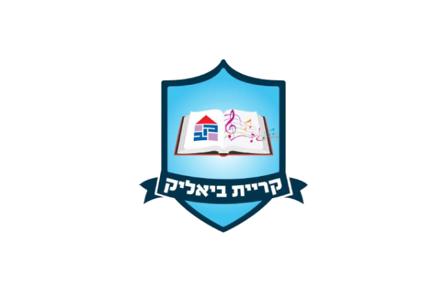 image by Martin Karner
♦ photo source (loc. by William Garrison, 24.9.2024)
See also:
 image by Ivan Sarajcic | 2:3    Emblem adopted 4th August 1998 |
The city's semi-official flag is a blue-white-purple emblem in
the shape of a house which includes the Hebrew initials of the
city name on a white bedsheet. A motion to change the emblem is
now under discussion at the city council. The motion gained a
strong support and few suggestions have already been made.
Kiryat Bialik is a municipality in the
Zevulun Valley (Emeq Zevulun) on the side of the road
between Haifa and Acre, 12 km north of Haifa.
It was founded in 1934 and named after the Israeli national poet H.N. Bialik
[town sign, 1937 source].
It received the legal status of city in 1976. Population 35'000.
Dov Gutterman/Jarig Bakker, 18 May 1999
The flag is 2:3. The municipal emblem was published in the
official gazette (Rashumot), 'Publications Gazette'
section (Yalkut HaPirsumim), YP 4668, 4 August 1998.
Dov Gutterman, 24 May 1999/4 September 2001
 image both by Dov Gutterman | 2:3  |
 2:3 |
I stumbled on an old flag of Kiriat Bialik. I do not know what
the original background was – maybe light blue, maybe white
– it now looks like something grey ... I drew the two possible versions.
Dov Gutterman, 16 October 2001
 image by Ivan Sarajcic | 2:3 |
Passing through Kiryat Bialik's local tennis courts I came
across an orange variant of the municipal flag. This is the only
place that I saw it (usually the white variant is used) so either
it is an old one or a special order for the tennis centre.
Dov Gutterman, 17 December 2001
 image by Ivan Sarajcic | 2:3 |
The Municipality of Kiryat Bialik starts to use also a new variant
side by side with the common white one. The new one is green.
Dov Gutterman, 7 April 2004
.png)
(source)
From Hebrew Wikipedia:
It consists of a shield with a blue frame and a light blue field featuring an illustration of a book; on the right-hand side are musical notes, and on the left-hand side is the old town's coat of arms, a design of the letters "K" (qof) and "B" (bet) – the initials of the town's name – in the shape of a house. The musical notes symbolise Kiryat Bialik's aspiration to be "the capital of Israeli literature and poetry" and the fact that it is named after Israel's national poet, Chaim Nachman Bialik. At the bottom of the emblem is a parchment bearing the city's name. [...] "As a modern, revitalising city, which in the coming years will have a population of around 100'000, we have decided to update the old city emblem for the present day. At the same time, in the new emblem we have taken care to give a place of honour to the previous emblem, which was shaped like a house, as one of our aims was to emphasise the fact that the city has made education and culture its guiding principles." (Mayor Eli Dokorsky)
(Translated with DeepL.com)
kirbial_old.png)
(source)
From Hebrew Wikipedia:
The town's first coat of arms was adopted in 1935, shortly after its foundation, and was used for the first 81 years of its existence. In 2016, a competition was held to design a new coat of arms for the town; 24 designs were submitted, from which Orgad Amar's proposal was selected.
(Translated with DeepL.com)
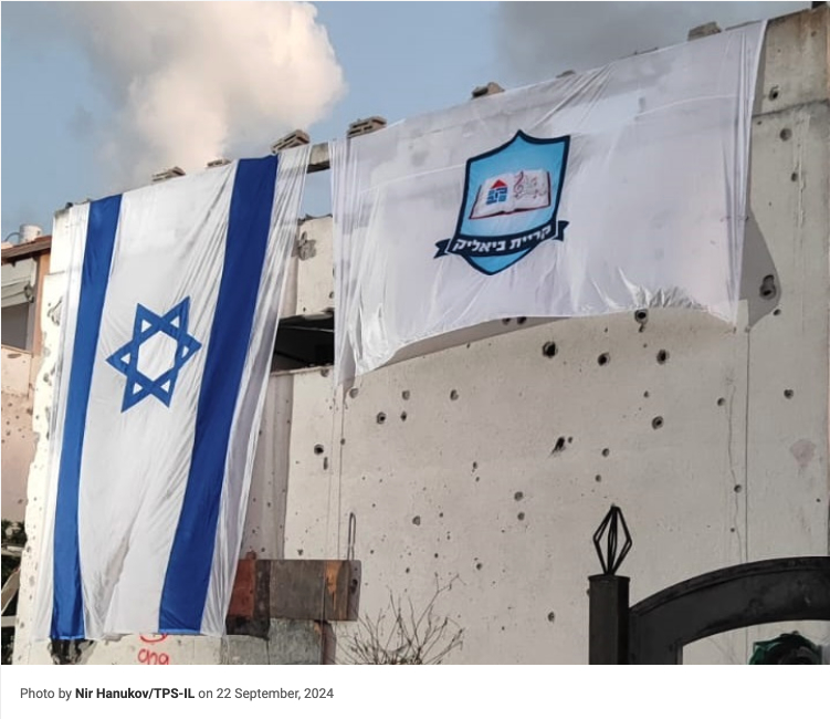


kirbyalik1.png)
kirbyalik2.png)
