image by Gleki, 02 Oct 2017 (exported from lojban.org)

Last modified: 2017-12-24 by antónio martins
Keywords: lojban | arrow cross | rings: 2 | venn diagram | cartesian coordinate plane |
Links: FOTW homepage |
search |
disclaimer and copyright |
write us |
mirrors

image by Gleki, 02 Oct 2017 (exported from
lojban.org)
See also:
External links:
loj.gif
(light blue background), at the official site in a folder with
several language flags (reported 04 Jun 1999)Lojban_logo.svg
(transparent background), at the Wikimedia Commons since 15 Dec 2006
(reported 2010)venn_emboss.gif
(monochrome), at the official site
(reported 10 Sep 2004)Lojban (first known as Loglan) was created in 1955 in
University circles not to became “real” language, but to test
the Whorf-Shapir hypothesis. It’s another experiment that turn out
just too good as today exists an unexpected large number of speakers
(about 100 plus over a thousand “enthusiasts”).
António Martins, 04 Jun 1999 and 10 Sep 2004
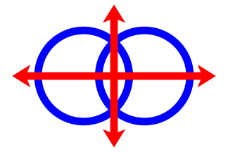
The Lojban flag depicts two dark blue interlocked rings on white
background with a red arrow cross superimposed on them. It is a
Venn diagram (set intersection) and a cartesian referential.
António Martins, 10 Sep 2004 and 02 Oct 2017
A history of the
symbol, in English, informs that it was created for a 1990 competition,
winning by a «large majority of positive votes among the
35-40 ballots received», as announced on March 1991 in
Ju'i
Lobypli 14; it was designed by Guy Garnett.
António Martins, 02 Oct 2017
In an online
lojbanist discussion forum, we learn that this logo/flag is not
consensual nor widely used.
António Martins, 10 Sep 2004 and 07 Nov 2005
While still not in widespread and exclusive use among Lojbanists (as
much as it can be gleaned from online Lojbanist emblematics image galleries
such as this or
these
two),
it can be said that the Venn/Descartes symbol is the logo of Lojban
(cf. this article)
and indeed that the flag bearing it is the flag of the language.
António Martins, 02 Oct 2017

image by António Martins, 04 Oct 2017
A Lojban flag online
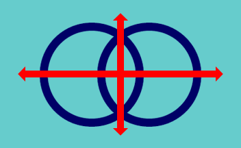
at the official website shows a light blue background.
António Martins, 10 Sep 2004
That image is still online 12 years later, although not included in the
pages any more. There is a reason for this unusually colored logo:
An early
2000s discussion re “Alternate Lojban flag proposals by Jeff
Tupper” includes as option B (it goes up to M…), the one least
divergent from the original, this very design: the
usual logo but on ligh blue background.
António Martins, 03 Oct 2017
Besides the acquamarine/cyan background replacing white, this variant
shows shorter thinner arrows with less pronounced, unubarbed arrowheads,
and larger, darker rings.
António Martins, 04 Oct 2017
Anything below this line was not added by the editor of this page.