Last modified: 2014-06-29 by klaus-michael schneider
Keywords: a. rigaud nogueira | lozenge | armillary sphere | coat of arms: escutcheons |
Links: FOTW homepage |
search |
disclaimer and copyright |
write us |
mirrors

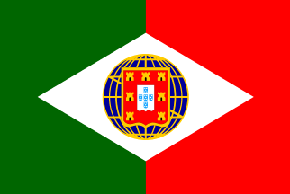
This one was made by A. Rigaud Nogueira and consists of a green-red vertical bicolour, both fields of equal size, with a white lozenge centered and cherged with his view of the portuguese coat-of-arms-to-be: a blue globe (in fact a mix between a globe and an armillary sphere) with golden (see bellow) meridian and parallel lines, supporting a portuguese shield of the samnitic or french kind.
Note: The original image is not clear about this colour. It could be silver, or even something else, because it’s a really dark, nearly black shade. Very far from gold. However, the castles in the arms are of exactly the same shade. This led me to the assumption that the shade in question was the result of some degradation with time (my source is a modern reproduction of the original image, 90 years old) of the kind of strange colour that sometimes was used to the representations of golden devices.This is a typical representative of the “red’n’green” faction in the
1910 flag debate, the «most republican among
republicans», so to speak, and the lozenge and the globe seem to show some
brazilian influence, which is nothing to be surprised
about, since there has always been a large flux of people between both countries
and the fact that the Brazil was by then already a republic
could have influenced many of our republicans of the time into a fondness for
Brazil, it’s symbols and institutions.
Jorge Candeias, 21 Mar 2001