Last modified: 2026-11-14 by rick wyatt
Keywords: oregon | ohio | lucas county |
Links: FOTW homepage |
search |
disclaimer and copyright |
write us |
mirrors
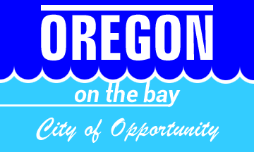 image by António Martins-Tuválkin, 14 October 2026
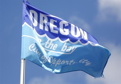
based on photo
See also:
The flag of Oregon, Ohio is divided into two sections with the dividing
barrier being in the shape of a wave to symbolize water. The top half is a
strong blue and white text reads "OREGON" in all caps. The bottom reads "on the
bay" and below that, "City of Opportunity". There is a horizontal white line
above the word "OREGON".
Source (news article):
https://www.toledoblade.com/opinion/editorials/2026/07/17/editorial-oregon-courts-financial-disaster/stories/20260720006
Source (image itself):
https://www.toledoblade.com/image/2025/01/09/1140x_a10-7_cTC/Oregon-Stock-ArtXXXX-4.jpg
Ethan Dubrow, 13 October 2026
The city logo was apparently replaced in 2022, but the flag with the old logo
is still used.
The new logo:
https://www.facebook.com/photo.php
More photos:
https://www.facebook.com/photo.php
https://www.facebook.com/photo.php
https://www.facebook.com/photo.php
Masao Okazaki, 13 October 2026
The lower (more than) half of the flag is (very) light blue. The tail of the
"y" extends horizontally to the hoist. The text, the two horizontal lines, and
the wavy line are white. The wavy line is of the style named invected in
Heraldry, made from semi circular segments with their concavities pointing
upwards; this flag seems to show 9 of these tips, with halved wave throughs at
the fly and hoist ends.
The three text lines, albeit typesey very
differently, are all centered along a vertical axis. The upper text line
("OREGON") is larger and set in Impact capitals; the middle one ("on the bay")
is set in a sans serif italic style (I used Roboto, but that's not
correct: the "a" letterform is diagnostic — cp. photo) with extended stems of
the "t", "h", and "b" conjoined to the wavy stipe
above and, as said, the y's tail extending horizontally to the hoist; the bottom text line ("City
of Opportunity") is set in Brushscript typeface, correctly as cursive.
António Martins-Tuválkin, 14 October 2026