
Last modified: 2021-08-25 by rob raeside
Keywords: cayey |
Links: FOTW homepage |
search |
disclaimer and copyright |
write us |
mirrors
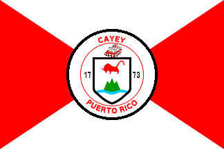
image by Blas Delgado Ortiz, 2 September 2001
See also:
Cayey - The flag derives its design and colors from the Coat
of Arms, which is in the center of the flag and has four
triangles pointing to it, two of them white, and the other two
red.
Blas Delgado Ortiz, 9 April 2001
The official flag has a solid black ring encircling the Coat
of Arms, not a dotted ring as presentedin the LexJuris image.
Blas Delgado Ortiz, 2 September 2001
yy.gif)
image by Nelson Román, 12 July 2004
Coat of Arms of the city of Cayey. Cayey is known as
"Ciudad de las Brumas" (City of the Hazes). It is also
known as "Ciudad del Torito" and The
"Coqui Dorado" City.
Juan Colón De Jesús, 9 June 2001
The Coat of Arms has a three tip mountain, a red bull, and a
waving blue stripe representing the abundant water in the zone
and also in reverence to the primitive Matron of the town of
Cayey. The shield is topped with the silver lamb symbol of San
Juan of Puerto Rico, and a red book. The colors red and gold
symbolize the Spanish tradition and it's founder. The green color
represents the landscapes and Cayey mountains. The black color
indicates antiquity, solemnity and seriousness. The shield is a
creation by Dr. J.J. Santa Pinter, associated professor of the
Colegio Universitario de Cayey.
Source: <www.linktopr.com>.
Nelson Román, 12 July 2004
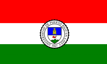
image by Juan Colón De Jesús, 27 january 2006
upryy.gif)
Shield
image by Juan Colón De Jesús, 27 january 2006
Emblems of the University of Puerto Rico in Cayey, Puerto Rico
from <www.cayey.upr.edu>:
The shield - "cut Shield, in blue, on the whole a porch of
four launching slips mounted of a window, or; in base, argent,
bull of gules, in mountain end of three hills, vert." The
blue color of the superior part of the shield invokes the name of
Cayey, that means according to the most authorized opinion of the
experts "water place". It also means the always blue of
Cayey, being this one predominant color, thus grants own
personality to the represented being. The golden porch reproduces
the relief characteristic of the entrances of the main buildings
of the Institution, where the gold means the imperecedero value
of received education and the made academic excellence. The
opened wings of the door mean that the School is open to all
those that they want to benefit with oportunidaddes academic that
offers. The window makes reference to the clear vision that the
estudiantado one receives from the knowledge acquired by the
professors with sights, also, to the future. The four degrees
indicate the academic program of four years conducive to the
bachelor title. The silver-plated field (or target) of the
inferior part of the shield indicates the honesty of the efforts
made by the academic community. The red bull, next to the green
mountain, is taken from the shield of the town of Cayey, adopted
by the Honorable Municipal Assembly by means of the Municipal
ordinance number 2, Series 1971-72 of date 15 of June of 1972.
The bull makes reference to the called tip the Torito, with which
we honored the original tradition of the Institution that began
to use the streamlined form of the bull in the used form, as well
as the sport equipment that is called "the Toritos de
Cayey". The three hills are in favor of the Torito, the Cat
and the hill Santa indicate the location of the School in Cayey
between green cayeyanas mountains due to the fluvial and aquatic
wealth of the zone. We used three hills instead of three tips to
distinguish the institutional shield of the town of Cayey. The
positioning of the modified cayeyanos heráldicos symbols in the
base indicates that the School is located in Cayey.
The seal - "all surrounded of a double circle with the
inscription University of Puerto Rico in Cayey, base UPR
between" 19 "and" 67 ", saber, outer circle
formed by chain links." Put the shield in the described
circle they constitute the seal of the School where
"1967"indica date and "UPR" it means that the
School is an academic dependency of the University of Puerto
Rico. The black color (saber) of the letters and the date
indicate seriousness and formality of the academic work made in
the Institution. The outer circle surrounded by chain links talks
about to the effort common of all the members of the academic
community in the estates of administration, teaching staff,
estudiantado, personal administrative of operation and
maintenance. The shield serves to identify to the Institution,
whereas the seal is used to authenticate documents sent by the
School. Its designs, created by Dr J. J. Santa-Pinter, member of
the Faculty and the Académie Internationale d'Héraldique, in
collaboration with Mr. Santiago Snows, was adopted by the
Together Schoolboy by means of its Certification Number 14,
series 1974-75.
The flag - The official flag of the School consists of three
horizontal strips: red, white and green, in this order, located
in the center the shield of the School. All bordered by the
customary yellow flecos, its size is the prescribed one in the
proportion of 3 of stop by 5 of wide. Creation of Dr J.J.
Santa-Pinter, University professor and member of the "North
American Vexillological Association", was adopted by the
Together Schoolboy in resolution approved by the Together
Schoolboy by means of its Certification 23 Number series 1978-79.
The colors red, white and green are the colors that have come
using from the beginning of our Mater Soul, specially in sport
activities and uniforms. Such colors were also adopted to
comprise of tincture of the shield and seal of the School. The
red one means love to the Mother country and the studies; the
target, sincerity and honesty, and the green one, the cayeyano
atmosphere and the hope as symbol of faith in the future of our
youth.
Juan Colón De Jesús, 27 january 2006