
Last modified: 2020-10-03 by  christopher oehler
Keywords: norway | equinor | energy |
Links: FOTW homepage |
search |
disclaimer and copyright |
write us |
mirrors
![[Equinor ASA company flag]](../images/n/no$equnr.gif) image by Randy Young, 27 July 2020
image by Randy Young, 27 July 2020
![[Equinor ASA company flag]](../images/n/no$equinor.jpg) located by Esteban Rivera, 26 July 2020
located by Esteban Rivera, 26 July 2020
Cropped image from the original, located here: https://smp.vgc.no/v2/images/d0acf369-070b-463a-934d-b5f48e2f9954?fit=crop&h=800&w=1200&s=e90449fa3d4a3cee41850a9bab38e160f2527c02
(source: https://e24.no/boers-og-finans/i/lAy6pM/equinor-reduserer-utbyttet-med-nesten-70-prosent).
See also:
The flag is a horizontal white background with the logo (https://www.equinor.com/etc.clientlibs/statoil/clientlibs/clientlib/resources/images/page/equinor-logo.svg) in the middle.
Esteban Rivera, 26 July 2020
This [above] is the corporate flag following the company's name change to Equinor in 2018. The flag has the corporate logo in red centered on a white field. The logo features the word "equinor" in red, lowercase, rounded lettering, with a red six-pointed emblem stretching from above the "or" in the name toward the upper fly corner.
Randy Young, 27 July 2020
Oil was discovered on the Norwegian continental shelf (NCS) in 1969. Then the government appointed an organisation committee to study how the Norwegian state should participate in the petroleum industry. This body decided that the government should establish a holding company to participate in NCS licences without any operational activity. However, the Borten coalition collapsed in 1971, primarily as a result of internal tensions particularly the question of EU membership. The government opted for a tripartite model based on a division between three functions:
Also, parallel to this, there were two other Norwegian oil companies established to ensure that petroleum competence was established in the country. These other two companies were Saga Petroleum and Norsk, completing the model, with one state owned company (Statoil), one semi-private company (Norsk Hydro) and one fully private company (Saga) (in the end all three companies ended being merged into what is known today as Equinor, Saga being acquired by Norsk Hydro in 1999).
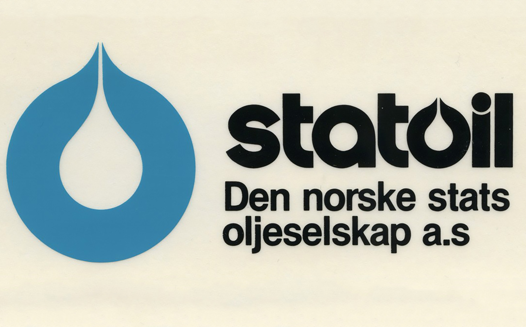
Den Norske Stats Oljeselskap A/S (Aksjeselskap) (English: The Norwegian State Oil Company Ltd.) was founded as a limited company owned by the Government of Norway on July 14, 1972 by a unanimous act passed by the Norwegian parliament. Its statutory general meeting took place on September 18, which is regarded as the date of the company's foundation. It is currently a fully integrated company and it is also currently the world's largest offshore operator in the oil industry. The logo for this company was known as the "StatOil drop" (a white drop inside a blue circle):
![[Statoil 1972 company flag]](../images/n/no$statoil1972.gif) image located by Esteban Rivera, 26 July 2020
image located by Esteban Rivera, 26 July 2020
Cropped image from the original located here:
https://statfjord.industriminne.no/wp-content/uploads/sites/4/2019/11/Statoil-logo-den-norske-stats-oljeselskap.jpg,
source: https://statfjord.industriminne.no/en/2019/11/11/statoil-as-a-red-thread-in-norways-oil-model/
(however, no flag is known to display such logo yet).
In 1986 the company changed the colors of its old logo, resulting in a new corporate image, featuring a new stylized logo (http://www.statoil.com/STATOILCOM/SVG00990.nsf/images/leftframe/$FILE/logo.gif (currently unavailable, accessible only through here: https://web.archive.org/web/*/http://www.statoil.com/STATOILCOM/SVG00990.nsf/images/leftframe/$FILE/logo.gif)). And also this derived into a new flag:
![[Statoil 1986 company flag]](../images/n/no$statoil1986.jpg) located by Esteban Rivera, 26 July 2020
located by Esteban Rivera, 26 July 2020
Cropped image from the original located here:
https://newsimg.bbc.co.uk/media/images/39562000/jpg/_39562489_flag203statoil.jpg,
source: http://news.bbc.co.uk/2/hi/business/3849147.stm.
The company was privatised on June 18, 2001 when the stock was listed on open trade markets and changed its name to Statoil ASA (Allmennaksjeselskap) (English: State Oil Public Limited Company).
Later, Statoil merged with the oil and gas division of the 102-year-old Norsk Hydro ASA (Allmennaksjeselskap) (English: Norweigian Hydro Public Limited Company)(established on December 2, 1905) (official website: http://www.hydro.com/), changing its name to StatoilHydro ASA (Allmennaksjeselskap) (English: State Oil Public Limited Company). A merger proposal was announced on December 18, 2006. Under the rules of the EEA (European Economic Area), the merger was approved by the European Union on May 3, 2007 and by the Norwegian Parliament on June 8, 2007. This brought about a new logo:
![[StatoilHydro ASA 2007-2009 company flag]](../images/n/no$statoil2007-2009.gif) located by Esteban Rivera, 26 July 2020
located by Esteban Rivera, 26 July 2020
https://www.brandeps.com/logo-download/S/Statoil-Hydro-logo-vector-01.svg,
source: https://www.brandeps.com/search?s=Norsk%20Hydro.
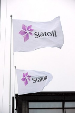
This name change was effective November 2, 2009 (other sources mention October 1, 2007 when the deal was authorized). That is: the company's name was StatoilHydro ASA for the 2007-2009 period. This resulted in a new logo and new corporate visual identity: "our new logo, the star, is inspired by the starry skies of the north. It symbolizes our highest aspirations: continued focus on the Norwegian continental shelf, international growth, and active and targeted work to develop effective new energy solutions, Reidar Gjærum, Senior vice president Corporate communication in Statoil explains. "By choosing the magenta-coloured star as our new symbol, we make explicit our origins and our desire to cross new frontiers on our journey forward. We're also making a clear statement that the world can still look towards the north to discover future energy solutions" (sources: http://www.statoil.com/en/About/History/Pages/GuidingStarAcrossNewFrontiers.aspx and https://www.underconsideration.com/brandnew/archives/magenta_star.php). The company's new logo was designed by Scandinavian Design Group (official website: http://www.sdg.no/"). For this a new type font was created, named Statoil Sans, designed by Melkeveien and Chester Jenkin (source: https://sdg.no/work/statoil).
The flag is a horizontal white background with the logo (http://www.statoilhydro.com/statoil_logo.png, currently unavailable, accessible only through https://web.archive.org/web/*/http://www.statoilhydro.com/statoil_logo.png in the middle, as seen here:
![[StatoilHydro ASA 2009-2018 company flag]](../images/n/no$statoil2009-2018.jpg) located by Esteban Rivera, 26 July 2020
located by Esteban Rivera, 26 July 2020
Cropped image from the original located here:
https://www.newsinenglish.no/wp-content/uploads/2012/08/0060960-New-Identity-Photo-%C3%98yvind-Hagen-Statoil-e1346060452316.jpg,
source: https://www.newsinenglish.no/2015/10/14/statoil-may-move-many-jobs-abroad/
researched by Esteban Rivera, 26 July 2020
"On March 15, 2018, Statoil announced that its board of directors proposes to change the name of the company to Equinor, subject to approval by shareholders at the Annual General Meeting to be held on May 15". "After the Annual General Meeting approved our name change (retroactively) on May 15 (2019), we began the process of implementing our name change as quickly and cost-effectively as possible" (sources: https://www.equinor.com/en/about-us/our-history/about-our-name-change.html and https://en.wikipedia.org/wiki/Equinor). That is: the company adopted its new name (in its current form) Equinor and of course a new visual identity. The name change comes from putting together "equi" for equilibrium and equality, and "nor" as a proud recognition of the home country. The company's North Star identity was evolved to capture the ethos of Equinor: rotated north, to give purpose and direction, and made lighter and more open to reflect the company's straightforward, transparent ethos. A custom typeface was created as well. The new brand launched across the world on March 15, 2018. (sources: https://www.equinor.com/en/news/15mar2018-statoil.html, https://www.superunion.com/work/equinor/" and https://www.underconsideration.com/brandnew/archives/new_name_and_logo_for_equinor.php). The rebranding was in charge of Superunion (official website: https://www.superunion.com/).
Sources:
For additional information go to (official website):
http://www.equinor.com/ (currently unavailable, accessible only through here:
https://web.archive.org/web/*/www.statoil.com),
http://www.statoil.com/,
http://www.statoilhydro.com/ (official website, currently unavailable, accessible only through here:
https://web.archive.org/web/*/www.statoilhydro.com)
Esteban Rivera, 26 July 2020
![[Statoil flag using 2009 logo]](../images/n/no$stato.gif) image by Randy Young, 27 July 2020
image by Randy Young, 27 July 2020
This is the Statoil flag using the 2009 logo. The flag has the name "Statoil" in dark grey lettering from the center of the white field toward the fly, with a pink six-pointed emblem stretching from the "S" toward the hoist.
![[Statoil flag using 1986 logo]](../images/n/no$sttol.gif) image by Randy Young, 27 July 2020
image by Randy Young, 27 July 2020
This is the Statoil flag using the 1986 logo. The flag has the company logo appearing as a blue liquid drop within a gold drop above the word "STATOIL" in white capital letters, all on a blue field.
Randy Young, 27 July 2020