
Last modified: 2024-09-21 by rob raeside
Keywords: british railways |
Links: FOTW homepage |
search |
disclaimer and copyright |
write us |
mirrors
Other sites:
Introduction
The government authority that regulated
railways in the United Kingdom was at first "The Board of Trade, the first
government department to assume responsibility for railways. Its Railway
Department was created in 1840 but some records predate this office. When the
Ministry of Transport was created in 1919 it absorbed all of the Board of Trade
functions regarding railways.
Source:
https://www.nationalarchives.gov.uk/help-with-your-research/research-guides/railways/
The industry in general, evolved from individual and private small
railway links starting as early as the 1560s, to the railway boom of the 1840s
(dubbed "Rail Mania", especially in 1846, where 272 Acts of Parliament were
proposed railway lines) and the three final stages that occurred during the XXth
century, namely "separation" (open market competition) (before 1923) (when up to
120 different railway companies existed in the country) to "amalgamation"
(grouping into the "Big Four", together with minor companies) to "unification"
into the British Railways (1948-onwards until the privatisation and split in the
mid 1990s).
Several important Acts in this early era include:
Railway Regulation Act 1844:
http://www.railwaysarchive.co.uk/docSummary.php?docID=58 and
https://en.wikipedia.org/wiki/Railway_Regulation_Act_1844
Regulation of
Railways Act 1868:
https://www.legislation.gov.uk/id?title=Regulation+of+Railways+Act+1868 and
https://en.wikipedia.org/wiki/Regulation_of_Railways_Act_1868
Light
Railways Act 1896:
https://www.legislation.gov.uk/id?title=Light+Railways+Act+1896 and
https://en.wikipedia.org/wiki/Light_Railways_Act_1896
Source:
https://en.wikipedia.org/wiki/Railways_Act#United_Kingdom
"Big Four"
was a name used to describe the four largest railway companies in the United
Kingdom in the period 1923ľ1947. The name was coined by The Railway Magazine in
its issue of February 1923: "The Big Four of the New Railway Era".
The Big
Four were:
Great Western Railway (GWR)
London, Midland and Scottish Railway (LMS)
London & North Eastern Railway (LNER)
Southern Railway (SR)
The companies were formed as a result of the Railways Act 1921,
in a process known as "The Grouping" (of the railways), which came into effect
on January 1, 1923. A number of joint lines remained outside the Big Four,
continuing to be operated jointly by the successor companies.
On January
1, 1948 the companies were nationalised to form British Railways as a result of
the Transport Act 1947.
Source:
https://en.wikipedia.org/wiki/Railways_Act_1921 and
https://en.wikipedia.org/wiki/Big_Four_(British_railway_companies)
British Railways
British Railways (BR), which from 1965 traded as
British Rail, was the state-owned company first by its parent company,
British Transport Commission (BTC) (1948ľ1962) (which also included various
bus companies, ports, canals, and road haulage firms, along with the
already publicly-owned London Passenger Transport Board (LPTB) which had
overseen London Transport since 1933) created under the Transport Act of 1947
and
effectively active since January 1, 1948. Originally a trading brand of the
Railway Executive (a Division of the) British Transport Commission, it became
an independent statutory corporation in 1962 designated as the British
Railways Board (BRB) (1963ľ October 2001) created under the Transport Act of
1962 and effectively
active since January 1, 1963, that operated most of the
overground rail transport in Great Britain between 1948 and 1997. It was
formed from the nationalisation of the "Big Four" British railway companies
and lasted until the gradual privatisation of British Rail (when British Rail
divested all of its operating Railway functions and British Railways Board is
still responsible for non-operational railway land, the disposal of which is
handled through Rail Property Ltd, a wholly owned subsidiary), in stages
between 1994 and November 1997, mainly due to the Railways Act 1993.
In 1993 the
government produced a White Paper entitled 'New opportunities for the
railways: the privatisation of British Rail' which proposed the privatisation
of the British Railways Board. These proposals were passed into law in the
form of the Railways Act 1993, and entailed the disintegration of the British
Railways Board's activities into 100 separate parts, each one to be sold or
franchised separately. Engineering functions and rolling stock were sold,
train operation was franchised, and ownership of the infrastructure, such as
track, signalling and stations, was passed onto a new organisation, Railtrack.
On privatisation, responsibility for track, signalling and stations was
transferred to Railtrack (which was later brought under public control as
Network Rail) and that for trains to the train operating companies. Railtrack
was formed as a separate company which became operational on April 1, 1994,
and was privatised in 1996 (it existed until about October 2002 when it was
succeeded by Network Rail). In 2002, after experiencing major financial
difficulty, most of Railtrack's operations were transferred to the
state-controlled non-profit company Network Rail. The first passenger
franchises were let in February 1996 (Great Western and South West Trains),
and three principal rail freight companies were sold to English, Welsh and
Scottish Railway in the same year. The Office of Passenger Rail Franchising
(OPRAF) was also established by the Railways Act 1993, in which it was set
out that the Franchising Director's responsibilities included negotiating and
awarding passenger rail franchises on the basis of competitive tendering, and
monitoring ongoing performance. In July 1999, OPRAF operated under the title
the Shadow Strategic Rail Authority (SSRA). The SSRA was set up to provide
strategic planning, and to promote rail travel and freight transport with the
aim to encourage private investments in the railways. In effect the SSRA
combined the roles of the British Railways Board (BRB) and OPRAF pending
Parliament's approval of the new Railways Bill, which would abolish both the
position of Director of Passenger Rail Franchising and OPRAF, and would
establish the Strategic Rail Authority (SRA) as its successor body. Following
the Transport Act 2000 the SRA came formally into being by shedding its
'shadow' status. Its key role is to promote and develop the rail network and
to encourage integration. In addition to the provision of strategic
direction, the SRA has responsibility for consumer protection, investment
projects, and managing rail franchises. The SRA is currently involved in the
process of replacing all the passenger rail franchises that are due to expire
by 2004; and in an effort to increase the train operators' incentive to
invest in the railways, the SRA has created new long term franchise contracts
of up to 20 years. The remainder of Railtrack was renamed RT Group plc and
eventually dissolved on 22 June 2010.
Sources:
http://ndad.ulcc.ac.uk/datasets/AH/britrail.htm
and https://en.wikipedia.org/wiki/Railtrack
http://www.brb.gov.uk/brb.htm,
http://www.dft.gov.uk/rhc/history.asp,
https://www.railwaysarchive.co.uk/documents/BTC_NewOrg1948.pdf,
https://www.nationalarchives.gov.uk/railways/,
https://www.britannica.com/topic/British-Railways,
https://en.wikipedia.org/wiki/History_of_rail_transport_in_Great_Britain,
https://en.wikipedia.org/wiki/Railway_Mania,
https://en.wikipedia.org/wiki/British_Transport_Commission,
https://en.wikipedia.org/wiki/Railway_Executive_Committee,
https://en.wikipedia.org/wiki/British_Railways_Board,
https://en.wikipedia.org/wiki/British_Rail
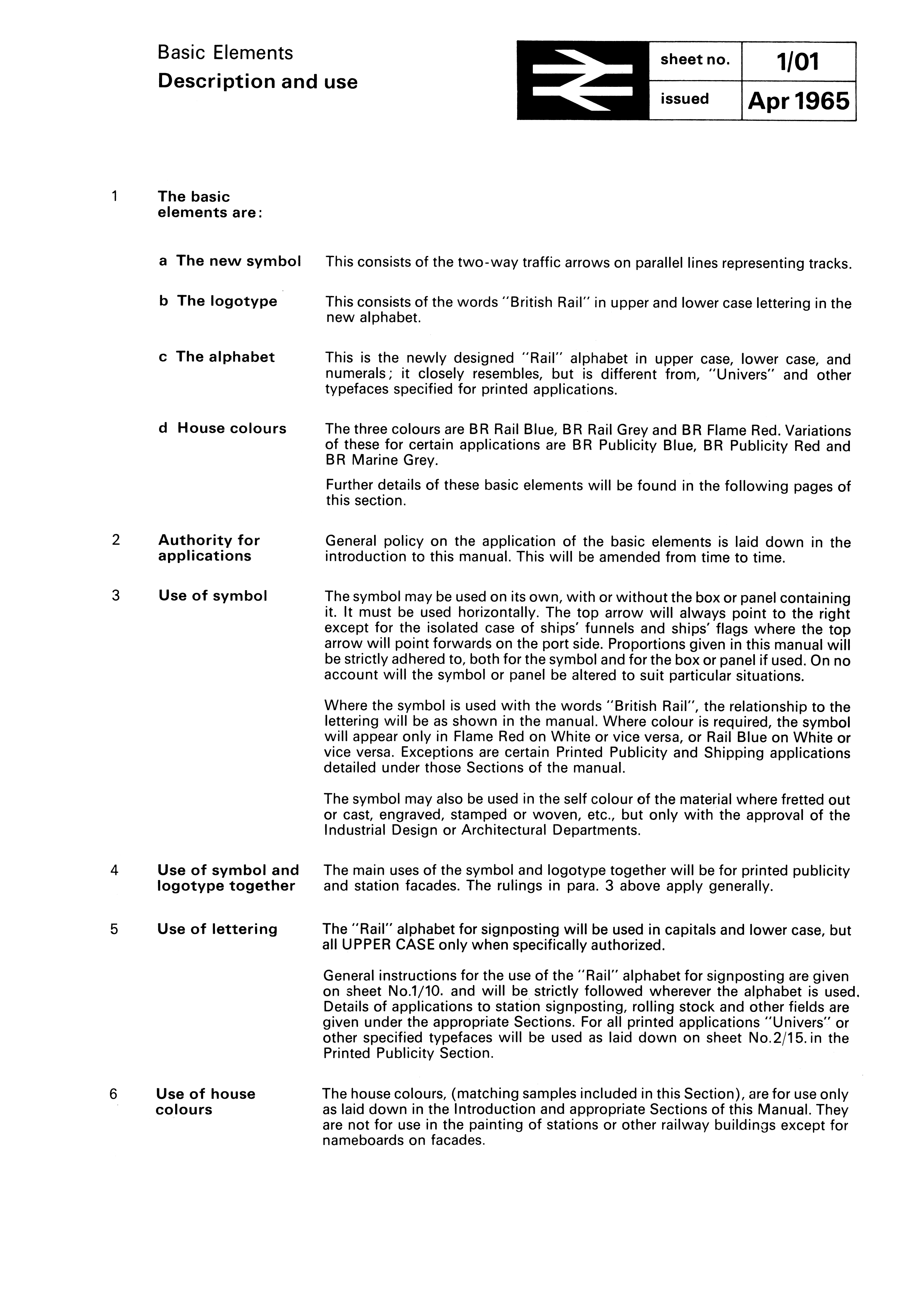
As for branding itself
however, following nationalisation in 1948 British Railways began to adapt
the corporate liveries on the rolling stock it had inherited from its
predecessor railway companies. Initially, an express blue (followed by
GWR-style Brunswick green in 1952) was used on passenger locomotives, and
LNWR-style lined black for mixed-traffic locomotives, but later green was
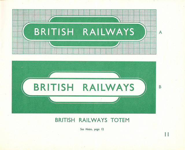
more widely adopted. There was also a logo dubbed "sausage" (or "hot dog")
(or totem) in which the name was used over a background in green and white
(alternating both colors in font type and background alike). A new logo began to
be used since 1949. Development of a corporate identity for the organisation was hampered by
the competing ambitions of the British Transport Commission and the
Railway Executive. The Executive attempted to introduce a modern Art
Deco-style curved logo which could also serve as the standard for station
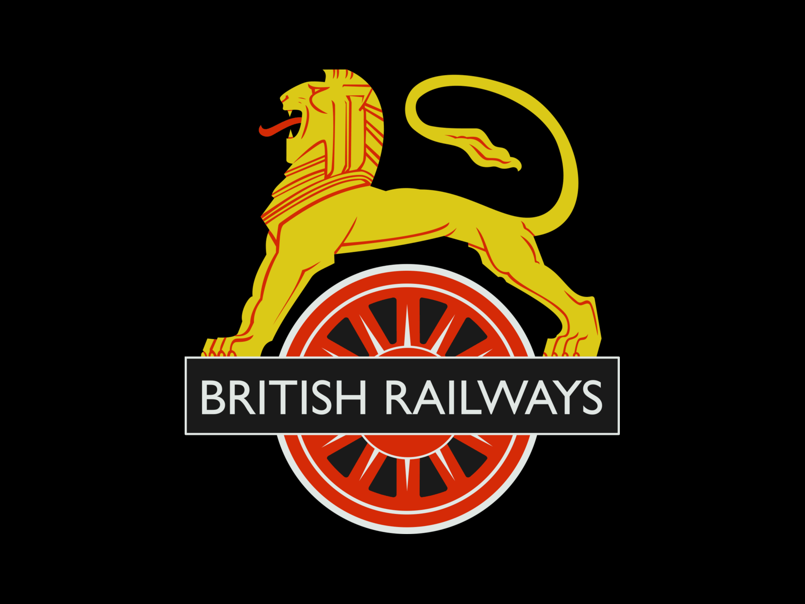
signage totems. BR eventually adopted the common branding of the BTC as its
first corporate logo, a lion astride a spoked wheel, designed for the
BTC by Cecil Walter Thomas (a British sculptor and medallist) (other sources
mention Abram Games instead, a British Graphic Designer); on the bar overlaid
across the wheel, the BTC's name was replaced with the words "British
Railways". This logo, nicknamed the "Cycling Lion", was applied from 1948 to
1956 to the sides of locomotives, while the oval style was adopted for
station signs across Great Britain, each coloured according to the
appropriate BR region, using the Gill Sans font first adopted by London and
North Eastern Railway (LNER) in 1923.
Sources:
https://en.wikipedia.org/wiki/British_Rail,
https://en.wikipedia.org/wiki/British_Rail#Branding,
https://en.wikipedia.org/wiki/British_Rail_corporate_liveries,
https://en.wikipedia.org/wiki/Cecil_Thomas_(sculptor),
https://en.wikipedia.org/wiki/Abram_Games,
http://www.abramgames.com/
and
https://en.wikipedia.org/wiki/Gill_Sans
Esteban Rivera, 24 July 2020
![[British Railways]](../images/g/gb_re.jpg) image located by Esteban Rivera, 24 July 2020
image located by Esteban Rivera, 24 July 2020
The "sausage", "hot dog" or totem logo (cropped image from
the original, located here:
https://thebeautyoftransport.files.wordpress.com/2015/01/4039876127_c543a59b58_z.jpg,
(source).
"Under its former chief executive (Frank Pick) London Transport had
already developed an both a strong corporate image and brand; this being
based around the London Transport roundel and consistent application of
Johnston Sans typeface across their systems. Subordinate to the British
Transport Executive, the Railways Executive oversaw British Railways who came
into being without having a corporate identity of its own. With the
nationalisation of the railways in 1948, the newly-created British Railways
adopted Gill Sans (by Eric Gill) for its corporate identity; the typeface
being used on its rolling stock, signage (including stations and signal
boxes), rolling stock lettering, posters, publicity and timetables. This was
encompassed in British Railwaysĺ design guide" (source:
https://www.bloodandcustard.org/#LionandWheel).
Esteban Rivera, 24 July 2020
![[British Railways]](../images/g/gb_btc.jpg) image located by Esteban Rivera, 24 July 2020
image located by Esteban Rivera, 24 July 2020
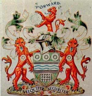
BTC Coat of arms (cropped
image from the original, located here:
https://www.heraldry-wiki.com/heraldrywiki/images/1/1a/Britishtransportcommission.jpg,
(source).
Description as follows: "Derived from the British Transport Commission
Crest this comprised a gold /yellow lion stretching over a railway wheel,
which in turn had a ĹBritish Railwaysĺ nameplate across its centre. The
Lion-on-Wheel emblem was reversible meaning the lion always faced forwards on
steam locomotives. However, most diesel and electric locomotives had a cab at
each end so the lion faced to the left on these; meaning the lion on the
sixfoot side of the locomotive did not face direction of travel." (source:
https://www.bloodandcustard.org/#LionandWheel)
Esteban Rivera, 24 July 2020
![[British Railways]](../images/g/gb_btc2.jpg) image located by Esteban Rivera, 24 July 2020
image located by Esteban Rivera, 24 July 2020
BTC Coat of arms
(stylized version of the above image) (cropped image from the original,
located here:
https://i0.wp.com/www.btphg.org.uk/wp-content/uploads/2015/03/Crest.gif,
(source)
Esteban Rivera, 24 July 2020
![[British Railways]](../images/g/gb_btc3.jpg) image located by Esteban Rivera, 24 July 2020
image located by Esteban Rivera, 24 July 2020
BTC coat of arms
(variant from an auction house) (cropped image from the original, located
here:
https://d25awfn7k3cact.cloudfront.net/image-store/lots/143/203.jpg,
(source). In essence,
it is the same coat of arms as the previous two, adding the pennant above in grey
background displaying three symbols (a hound, a wheel and the lion holding
the wheel, representing all modes of transportation ruled by the BTC at the
time, which included various bus companies, road hauliers, ports and canals,
publicly-owned London Passenger Transport Board (LPTB) which had (since 1933)
overseen London Transport). Picture caption reads: "British Transport
Commission Coat of Arms from 1956, issued by the College of Arms London and
signed".
Esteban Rivera, 24 July 2020
![[British Railways]](../images/g/gb_br2.jpg) image located by Esteban Rivera, 24 July 2020
image located by Esteban Rivera, 24 July 2020
BR "cycling lion" logo (located here: https://cdn.retours.eu/nl/47-huisstijl-spoorwegen/enlarge/british_railways_cycling_lion_logo.png, https://retours.eu/en/47-railway-corporate-style)
"British Railways' standard liveries, brochure - July 1949. It took The
Railway Executive (British Railways) some time to decide upon 'standardised'
liveries for the newly nationalised railways but in 1949 they agreed upon
schemes for locomotives, multiple units, coaching stock and a vast variety of
other vehicles both rail and road. This brochure, issued by the Railway
Pictorial & Locomotive Review, gives a fascinating insight into the corporate
identity the Executive adopted. The cover shows the heraldic 'crest', or
"totem" the Executive designed (known commonly as the 'hungry' or 'starving
lion'!)" (cropped image from the original, located here:
https://www.flickr.com/photos/36844288@N00/8078166153/in/album-72157631748077347).
Esteban Rivera, 24 July 2020
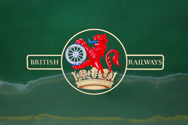
![[British Railways]](../images/g/gb_br3.jpg) image located by Esteban Rivera, 24 July 2020
image located by Esteban Rivera, 24 July 2020
"Lion-and-Wheel emblem" (also known as
Ferret-and-Dartboard) (new BR oval style logo) (cropped image from the
original, located here:
https://thebeautyoftransport.files.wordpress.com/2015/01/8679581188_86e16dbd3b_z.jpg,
(source).
"In 1955 the BTC launched its report titled ĹModernisation and
Re-equipment of British Railwaysĺ commonly known as the Modernisation Plan;
this included the replacement of steam locomotives in favour of diesel and
electric traction. Accordingly, the BTC revised corporate identity resulting
in the Lion-and-Wheel emblem. 1956 saw the use of ĹDĺ prefixes on diesel
locomotives and the decision to replace the Lion-on Wheel (Ĺunicycling lionĺ)
crests with the Lion-and-Wheel (ĹFerret-and-Dartboardĺ). However, many steam
locomotives survived with their Ĺunicycling lionĺ into the 1960s and
withdrawal. The description of the logo is as follows: "(it) was essentially
a lined circle surrounding a red lion sejant-rampant sitting in a crown
holding a wheel. In turn this was placed between lined boxes ľ the left
stating ĹBritishĺ and right, ĹRailwaysĺ"(sources:
https://www.bloodandcustard.org/#LionandWheel and
https://thebeautyoftransport.com/2015/02/18/lions-and-wheels-british-railways-lion-emblems-1949-1964).
There are conflicting reports on the use of the earlier logo since for example
FOTW states that it was in use in the period 1949-1965, while
other sources dispute such claim, stating it existed (and/or was in use)
between 1948-1969 (https://collection.sciencemuseumgroup.org.uk/people/cp3862/british-railways), and other sources mention 1949-1964 (https://thebeautyoftransport.com/2015/02/18/lions-and-wheels-british-railways-lion-emblems-1949-1964/). Furthermore there's even a source that mentions that the BTC had its own
coat of arms granted in 1956, and then transferred to the BRB in 1963 (https://www.heraldry-wiki.com/heraldrywiki/index.php/British_Transport_Commission) which would imply the use of an "old" corporate logo as early as 1963 and
then a new logo being used afterwards. That last part being said, the "new
logo" - that is, the "double arrow" logo - was then to be the new visual
identity and the work of (at least) one (maybe two) years prior to its formal
unveiling in 1965.
Esteban Rivera, 24 July 2020
![[British Railways]](../images/g/gb_brw2.jpg) image located by Esteban Rivera, 24 July 2020
image located by Esteban Rivera, 24 July 2020
"British Railways
shipping house flag and railway totems, 1948/49. Part of a brochure
describing the nationalised "British Railways" standard liveries, this page
show the house flag used for BR's extensive shipping interests as well as the
familiar 'hot dog' totem, used for station signs as well as a BR corporate
mark, along with the London Transport roundel - LT being part of the British
Transport Executive along with BR." (cropped image from the original, located
here:
https://www.flickr.com/photos/36844288@N00/8078166153/in/album-72157631748077347)
Esteban Rivera, 24 July 2020
![[British Railways]](../images/g/gb_brw2a.jpg) image located by Esteban Rivera, 24 July 2020
image located by Esteban Rivera, 24 July 2020
This graphic compilation in b/w illustrates the early
logos used since 1948 until 1964 in chronological order from top to bottom
(cropped image from the original, located here:
https://www.flickr.com/photos/36844288@N00/8078166153/in/album-72157631748077347)
"During the early 1960s another report, dubbed the "Beeching Report"
(for its author Dr Richard Beeching) in 1963, was officially called ĹThe
Reshaping of British Railwaysĺ which recommended several actions for
profitability, which was to bring about yet another change in corporate
image. At the time it was "one of the biggest industrial rebranding
exercises ever undertaken, and supposedly signposting a bold future, the 1965
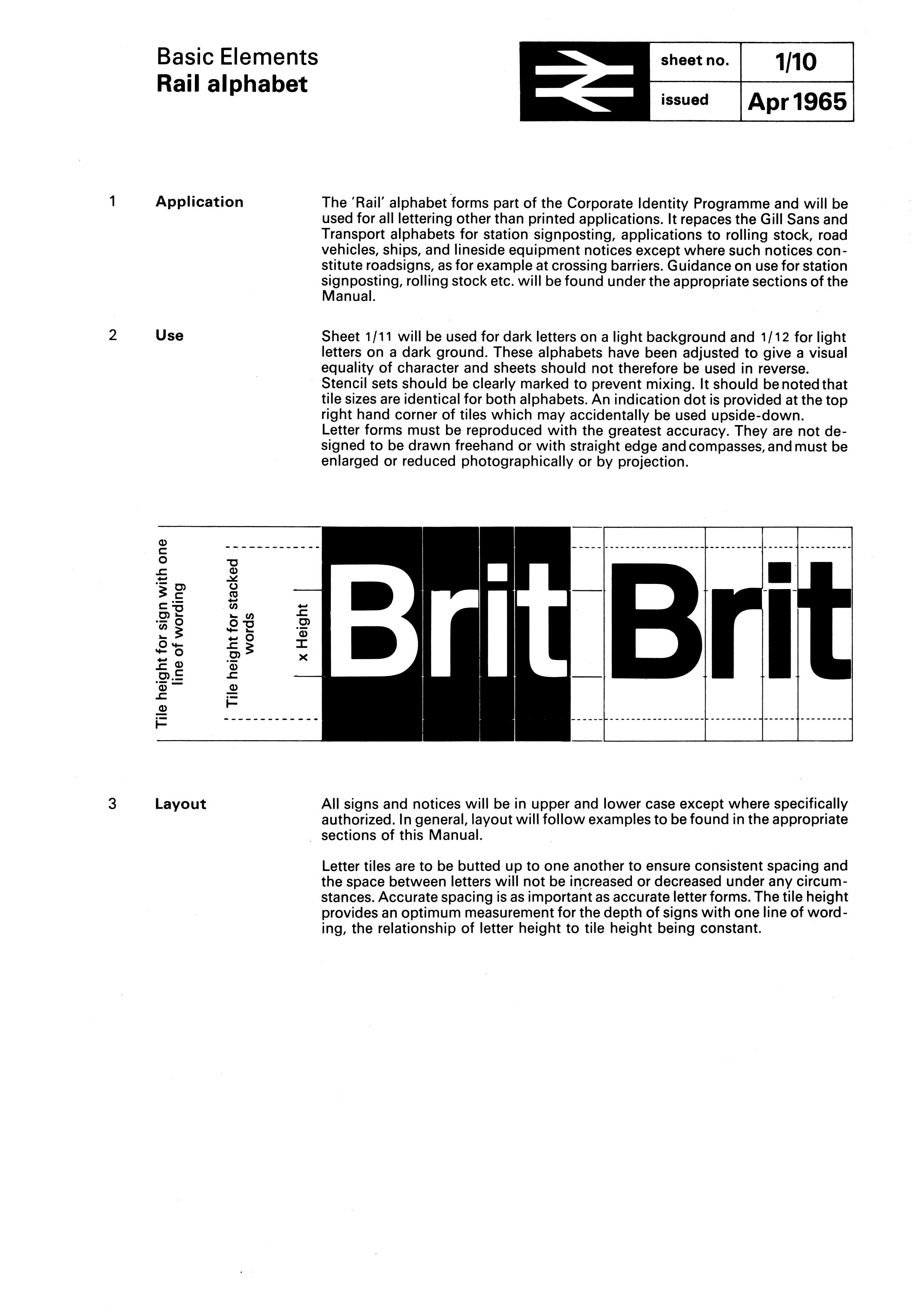
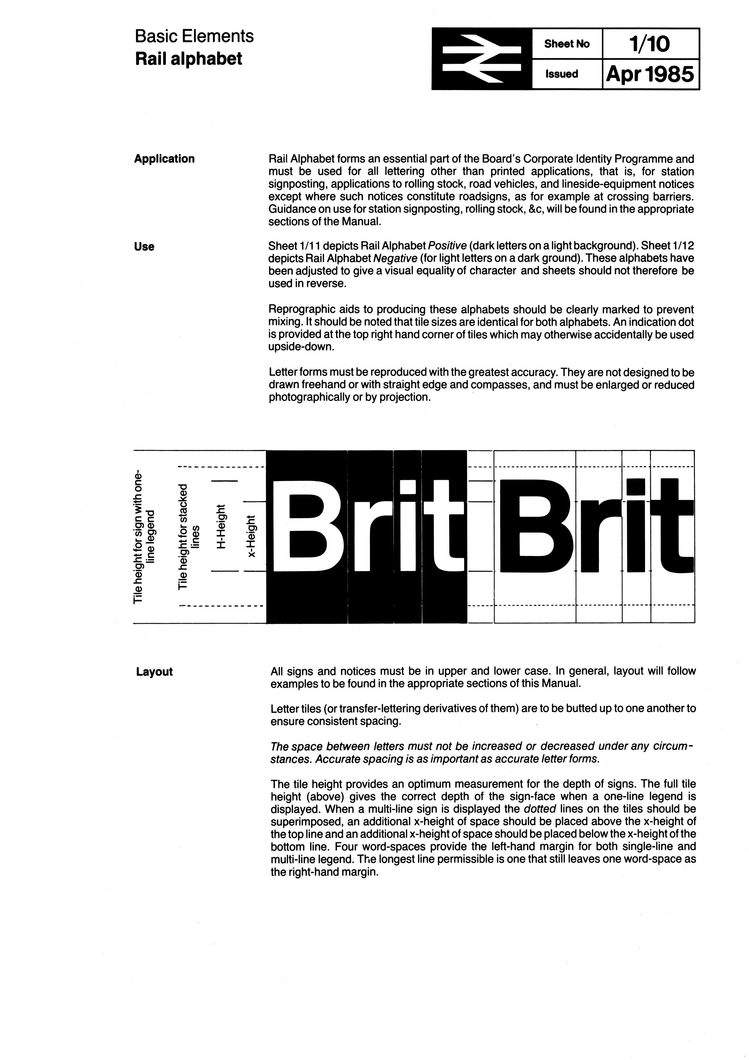
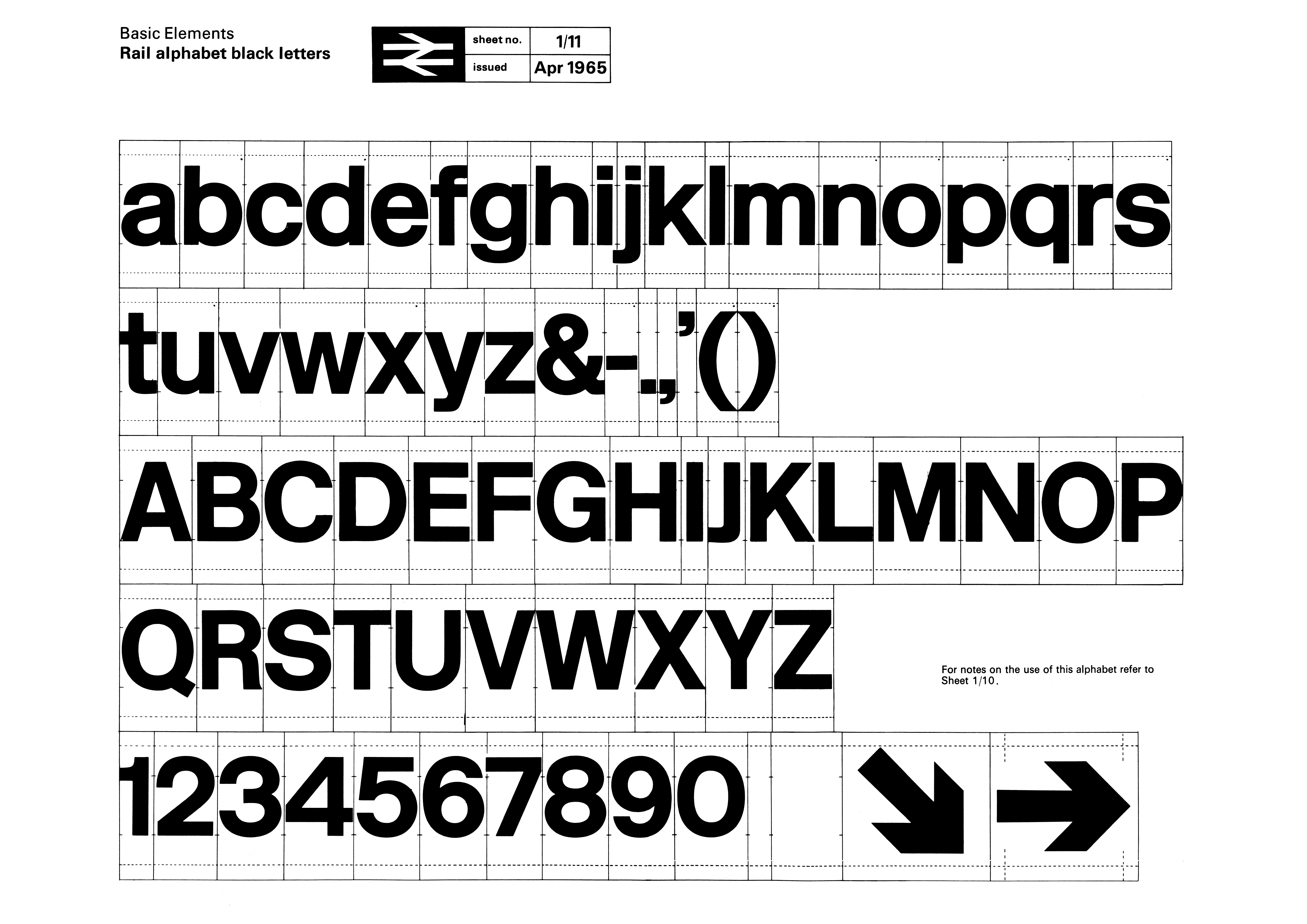
rebranding introduced the blue liveries, the famous double arrow logo (symbolising
the direction of travel on a double track railway) and a new typeface, ĹRail
Alphabetĺ (1965 manual,
1985 manual), which was also
adopted by the NHS and
the British Airports Authority. The double arrow logo survived the demise of
British Rail and is employed as a generic symbol denoting railway stations
under the National Rail brand. "The Rail Alphabet was a variant of Helvetica,
adapted by Jock Kinneir and Margaret Calvert for optimal readability at
stations"
Sources:
https://retours.eu/en/47-railway-corporate-style,
https://en.wikipedia.org/wiki/Jock_Kinneir and
https://en.wikipedia.org/wiki/Margaret_Calvert
In the early 1960s the obsolete emblems were used less and less; in most
cases plain words were applied on printed matter. With the elimination of the
old regions British Railways was ready for further standardization. In order
to develop a modern corporate identity the Design Research Unit (DRU) was
commissioned in 1964. It was one of the first British design studios that
combined architecture with graphic and industrial design.
The Design
Research Unit (DRU) was one of the first generation of British design
consultancies combining expertise in architecture, graphics and industrial
design. It was founded by the managing director of Stuart Advertising Agency,
Marcus Brumwell with Misha Black and Milner Gray in 1943. It became well
known for its work in relation to the Festival of Britain in 1951 and its
influential corporate identity project for British Rail in 1965. The BR
Corporate Identity Manual issued in 1965 was originally designed by Angela
Reeves (source:
https://darrenwall.co/british-rail-corporate-identity-manual).
A new logo constituted the starting point of the house style. DRU
created some 50 design variants, from which the British Railways Board's
Design Panel finally picked two: one incorporating two circles and an arrow,
and one consisting of parallel lines and double arrows.
After the first
design had leaked out prematurely, the second one was selected. This 'two-way
track symbol', soon known as the double arrow, was designed by DRU's
25-year-old Gerry Barney. Along with the new logo the name was shortened to
British Rail."
Sources:
https://www.nationalarchives.gov.uk/railways,
http://www.doublearrow.co.uk,
https://www.bloodandcustard.org/#LionandWheel
and
https://retours.eu/en/47-railway-corporate-style
Regarding the
logo and visual identity of British Railways, "the British Rail current
"double arrow" logo is formed of two interlocked arrows showing the direction
of travel on a double track railway and was nicknamed "the arrow of
indecision" (modern source, though not the original explanation of the
expression: "Blue Diesel Days" (book) by Paul Shannon, published in 2007,
http://www.ianallanpublishing.com). It is now employed as a generic symbol on street signs in Great Britain
denoting railway stations, and as part of the Rail Delivery Group's (RDG)
jointly managed National Rail" being a true icon. The new (and current)
British Rail corporate identity and first modern logo (the interlocked
arrows) was issued available since January 1965 as this poster shows:
https://www.logodesignlove.com/images/classic/british-rail-identity.jpg
(Source). This logo
was in use in the period January 1965-1994.
Sources:
https://en.wikipedia.org/wiki/British_Rail and
https://en.wikipedia.org/wiki/Design_Research_Unit
Images below carry the following notice: "Copyright British Rail
Corporate Identity Manual and Information Sheets Copyright ę Secretary of
State for Transport 2011. All materials on this website are reproduced with
the permission of the Department for Transport. Reproduction of any part of
this website without prior permission is prohibited. Please note the British
Rail ('double arrow') symbol is a registered trade mark in the name of the
Secretary of State for the Department for Transport. See Using the Double
Arrow Symbol (http://www.nationalrailguidelines.co.uk/download.php?filename=pdfs/NR012.pdf) for further information (by ATOC and Rail Delivery
Group, RDG)".
Esteban Rivera, 24 July 2020
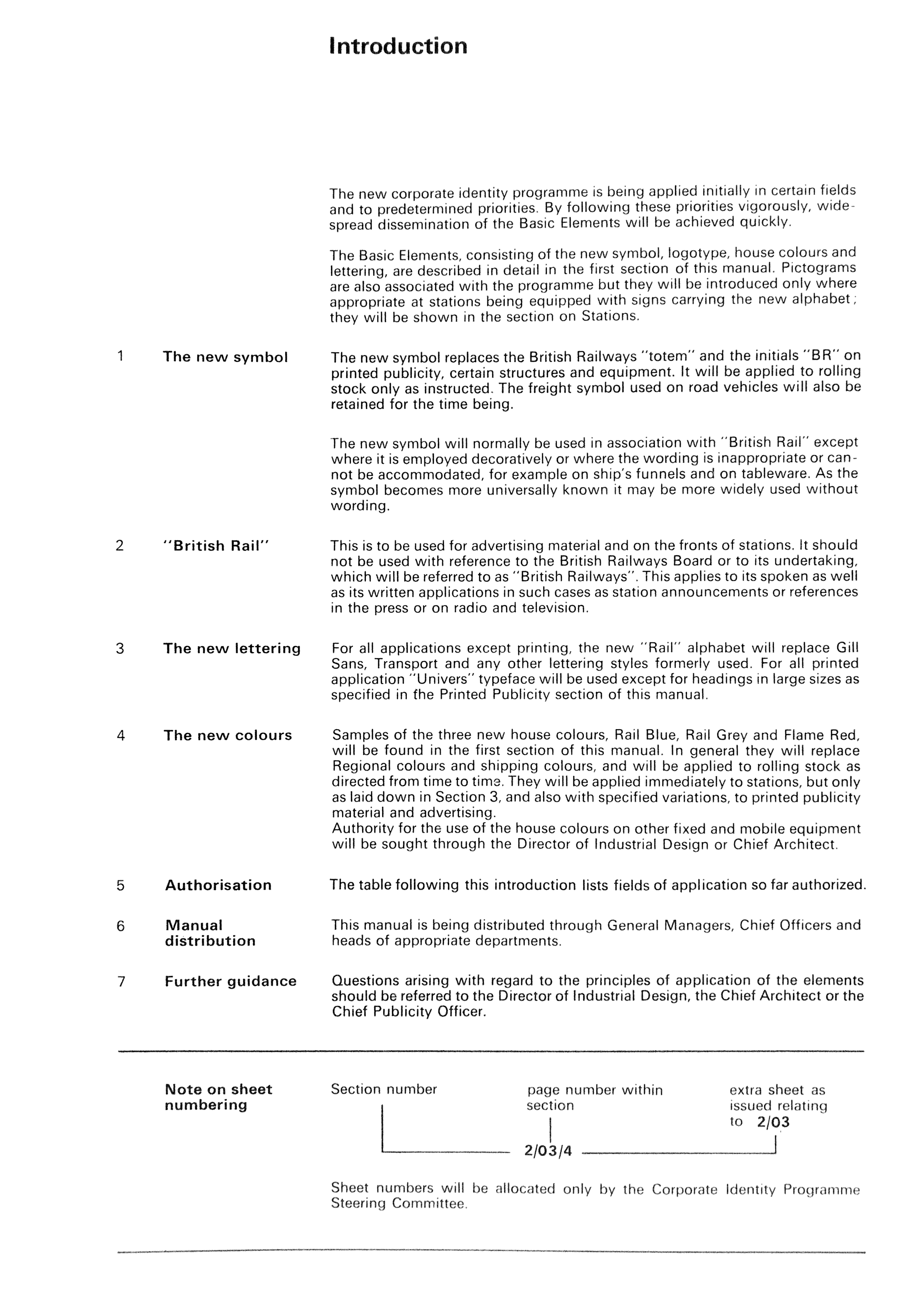
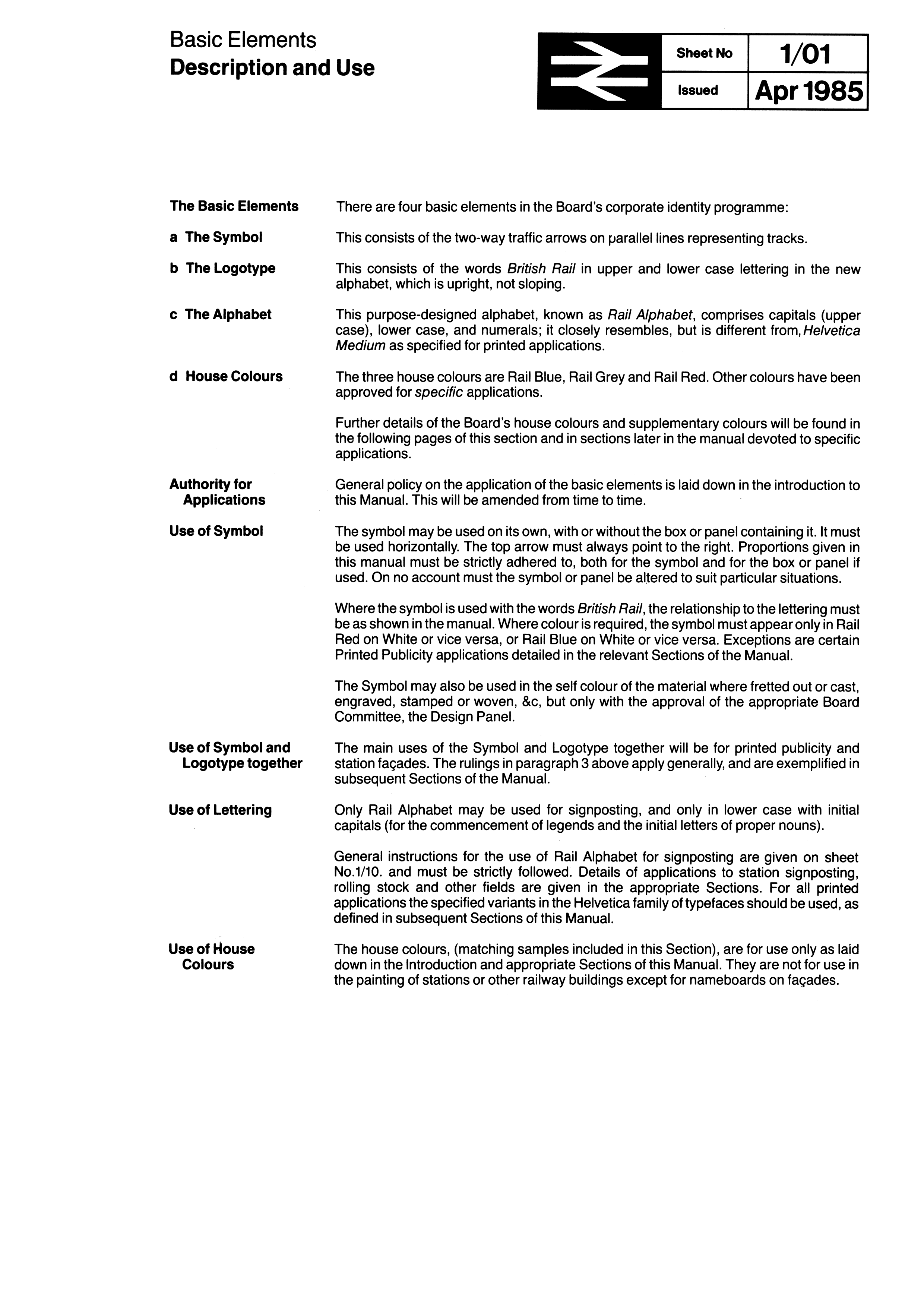
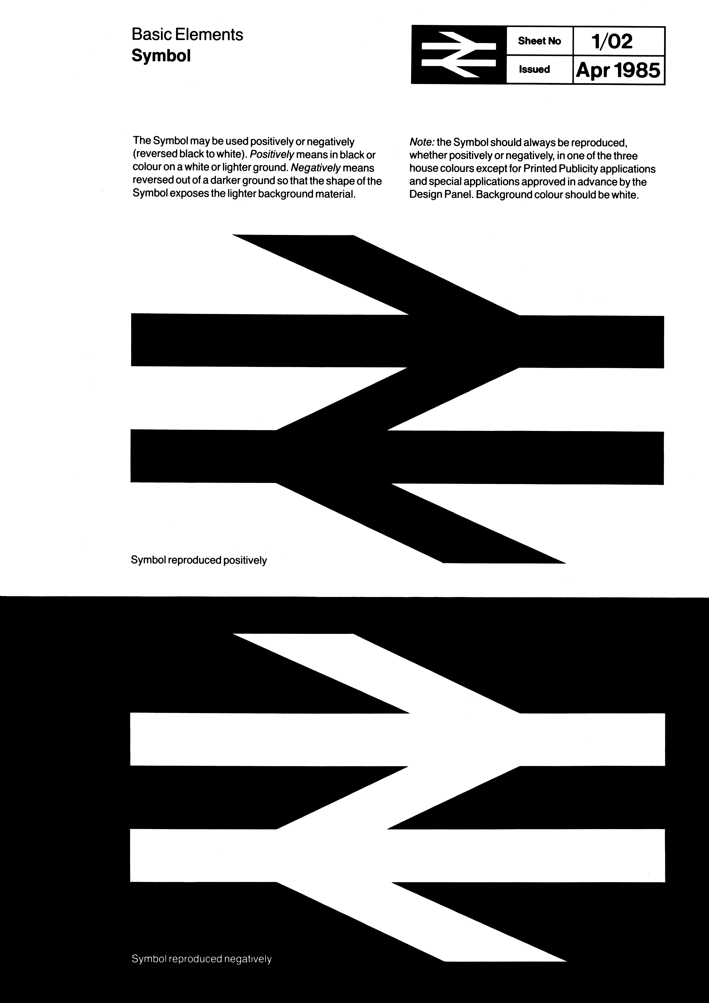
The British Rail
Corporate Identity Manual comprised four volumes, using the MULT-O 23-ring
binder system. The four binders were issued in three installments: Binder 1
(not numbered), issued in July 1965, contained information on Basic Elements
(symbol, logotype, lettering and colour). Binder 2, issued in November 1966,
contained guidance on Printed Publicity plus some additional sheets for
insertion into Binder 1, and future insertion into Binders 3 and 4, which
were issued together in April 1970, together with additional sheets for the
first two binders. Binders 3 and 4 contained information on architecture and
signposting, rolling stock, lineside equipment, road vehicles, ships, liner
trains, uniforms, stationery, miscellaneous and appendices (including an
index) although two sections were ultimately to remain empty" (all images are
from the following source: http://www.doublearrow.co.uk/manual.htm):
![[British Railways]](../misc/gb_br-1965-0.gif)
![[British Railways]](../misc/gb_br-1965-1.gif)
![[British Railways]](../misc/gb_br-1965-2.gif) images
located by Esteban Rivera, 24 July 2020
images
located by Esteban Rivera, 24 July 2020
[click on images for
larger versions]
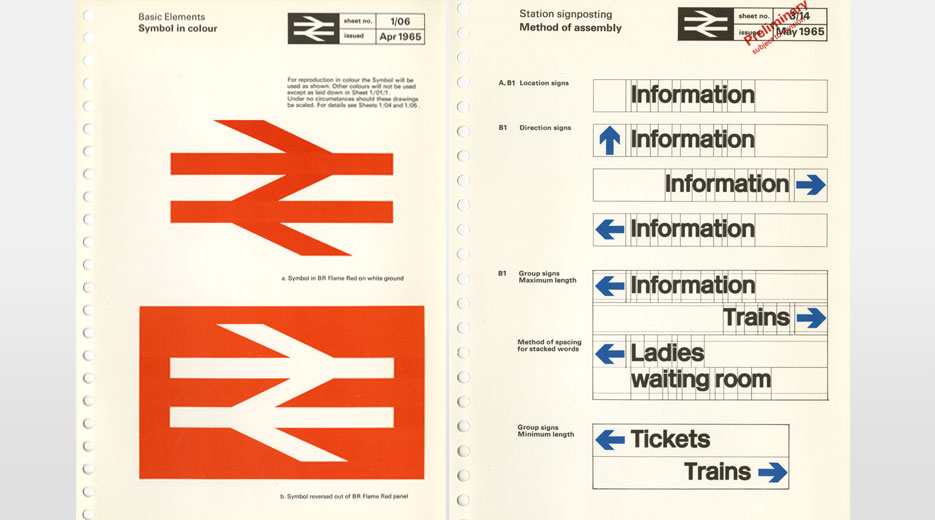
Basic elements (logo description) (Manual issued
on April 1965).
Original images:
http://www.doublearrow.co.uk/manual/Introduction.1965-04.gif
http://www.doublearrow.co.uk/manual/1_01.1965-04.gif
http://www.doublearrow.co.uk/manual/1_01.1985-04.gif
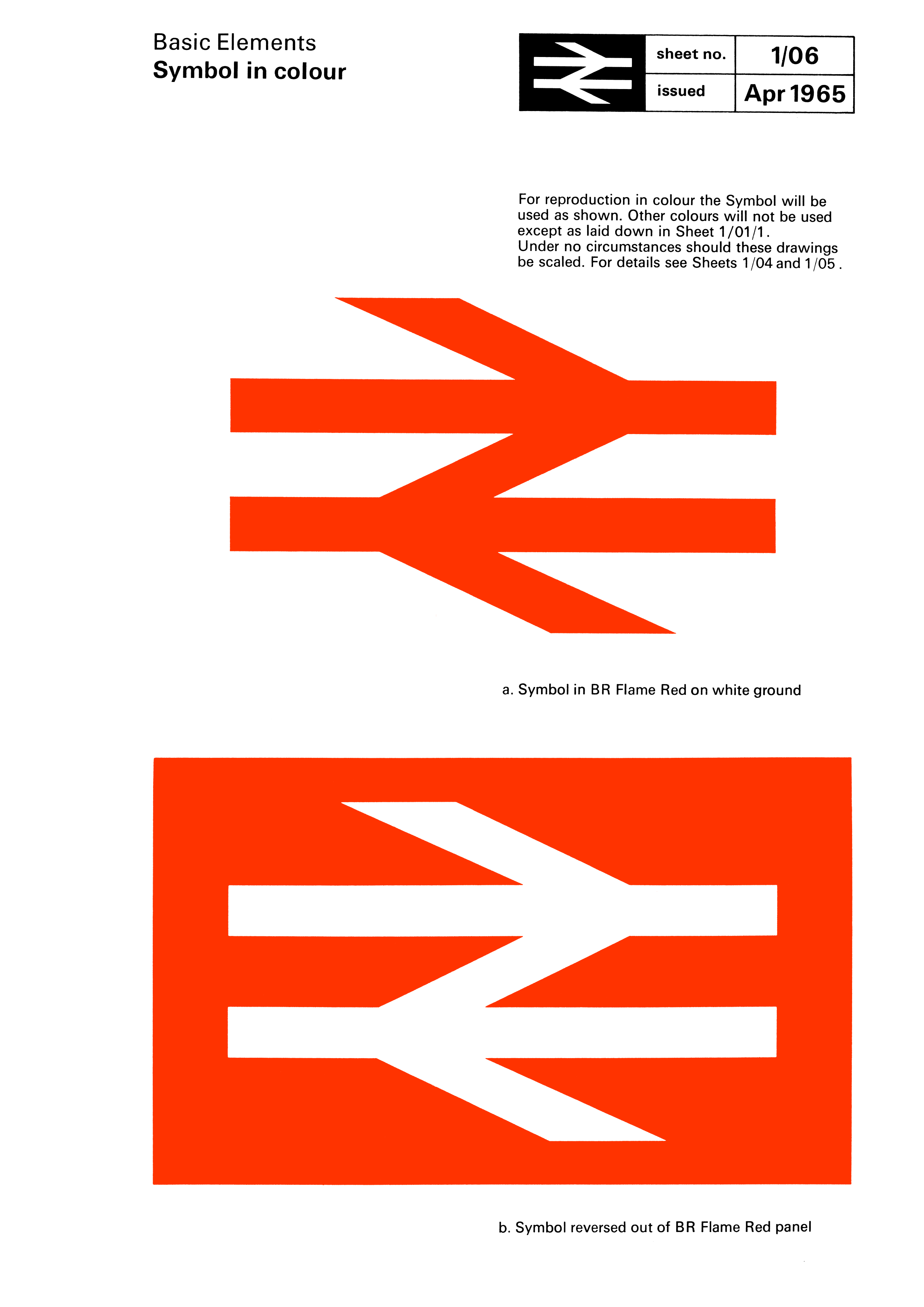
![[British Railways]](../misc/gb_br-1965-3.gif)
![[British Railways]](../misc/gb_br-1965-4.gif)
![[British Railways]](../misc/gb_br-1965-5.gif)
![[British Railways]](../misc/gb_br-1965-6.gif) images
located by Esteban Rivera, 24 July 2020
images
located by Esteban Rivera, 24 July 2020
[click on images for
larger versions]
Basic elements (symbol image
b/w,
color, Manual issued on
April 1965)
Basic elements (symbol image
b/w, Manual issued on
April 1985)
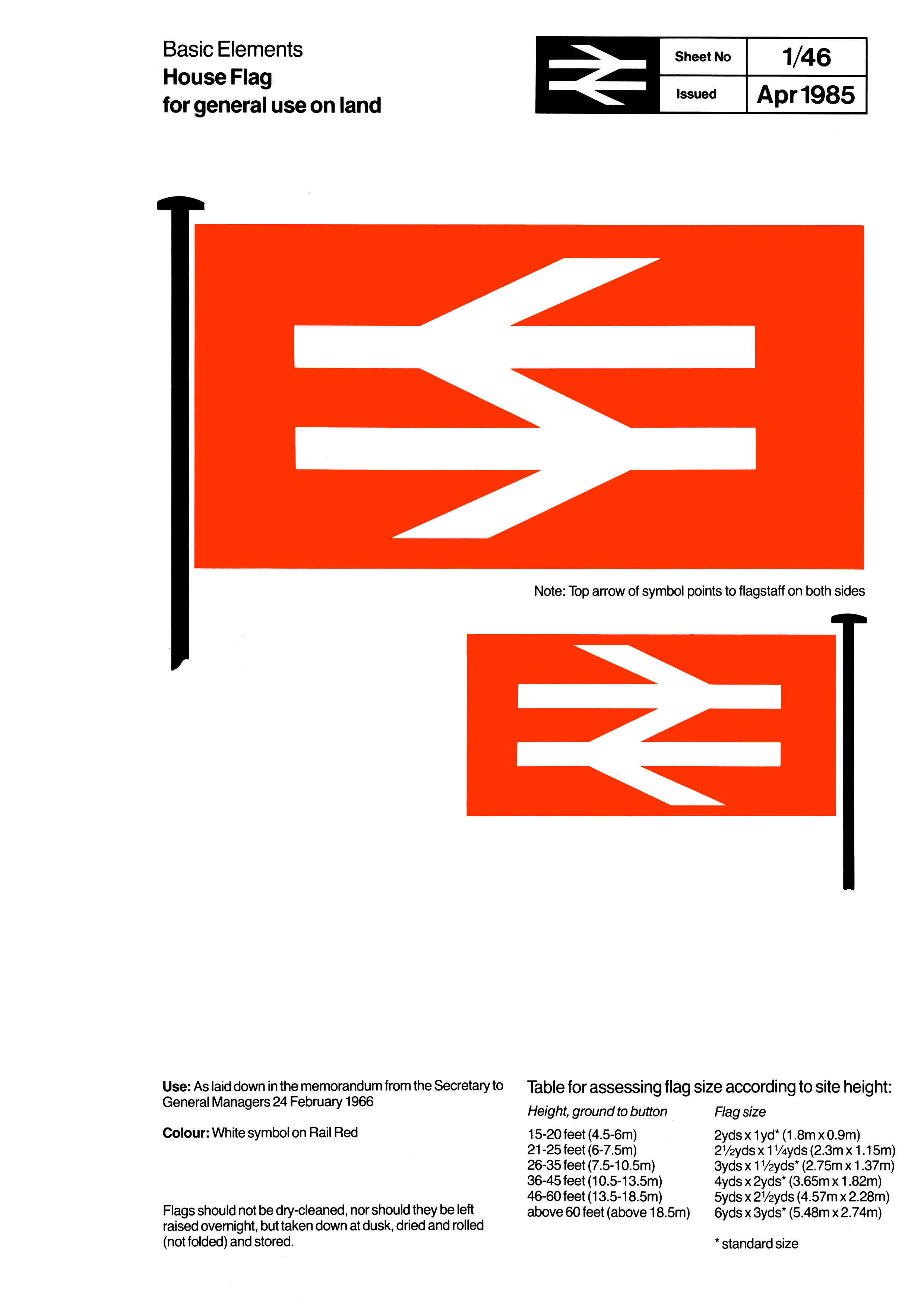
House Flag (first version, featuring obverse and
reverse) (Manual issued on April 1965)
![[British Railways]](../misc/gb_br-new-7.gif)
![[British Railways]](../misc/gb_br-new-8.gif)
![[British Railways]](../misc/gb_br-new9.gif) images located by Esteban Rivera, 24 July 2020
images located by Esteban Rivera, 24 July 2020
[click on images for
larger versions]
House Flag (blue
variant) (http://www.doublearrow.co.uk/manual/7_11.1966-01.gif, featuring obverse and
reverse) (Manual issued on January 1966)
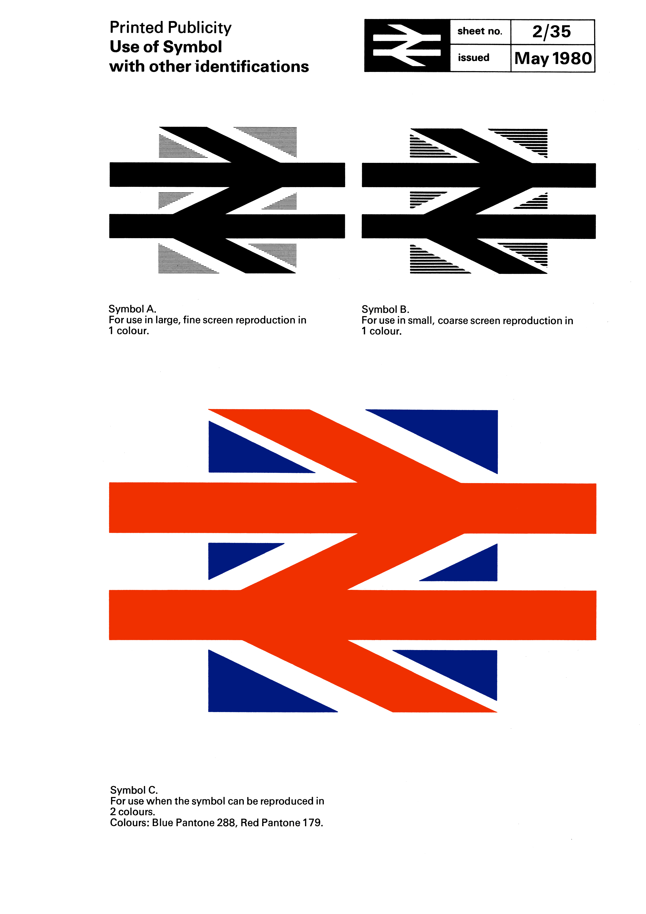
Symbol (logo) in UK
colors (bottom image) (http://www.doublearrow.co.uk/manual/2_35.1980-05.gif, Manual issued on May 1980). This particular image served as the front
cover for a design case study in the book British Rail Design Book, by James
Cousins (1987) edited by the "Danish Design Council", as seen here:
http://page-spread.com/british-rail-design/ and here:
https://www.flickr.com/photos/wallacehenning/albums/72157632653230111
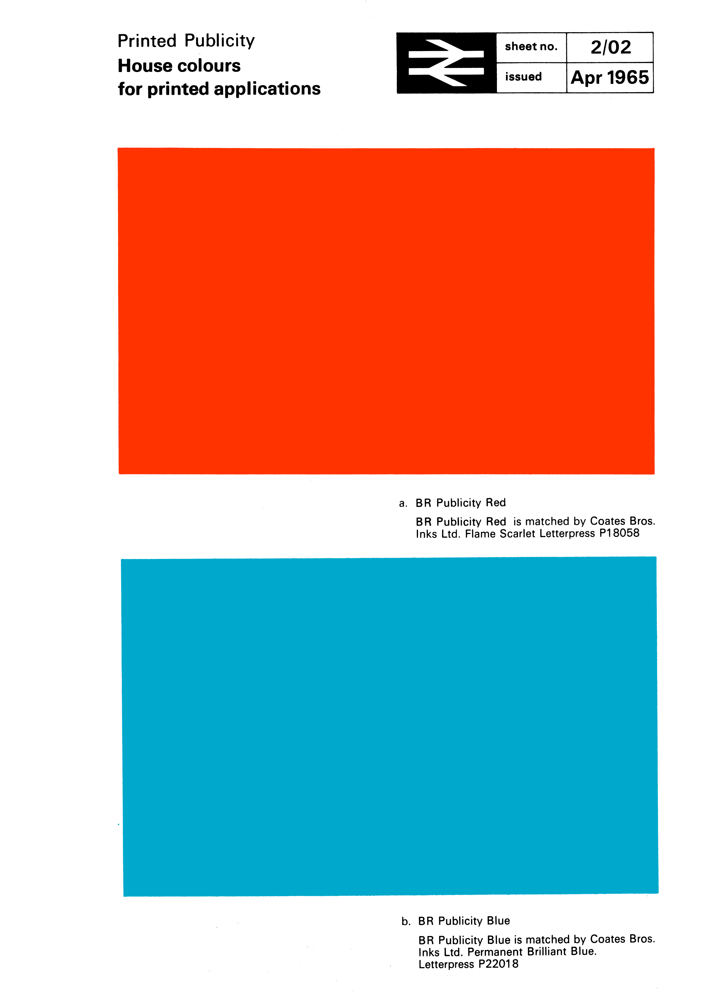
Color codes for "Rail blue" (BR Publicity Blue, the official name,
is matched by Coates Bros. Inks Ltd. Permanent Brilliant Blue. Letterpress
P22018) and "Rail red" (BR Publicity Red, the official name, is matched by
Coates Bros. Inks Ltd. Permanent Brilliant Blue. Letterpress P18050) (http://www.doublearrow.co.uk/manual/2_02.1965-04.gif, Manual issued on
April 1965)."
Also, there are (partial) corporate identity manuals dated
April 1965, as seen here:
https://www.nationalarchives.gov.uk/images/railways/18_BRCIM.jpg
(source) which show the symbol (logo)
and font type (http://www.doublearrow.co.uk/manual/1_11.1965-04.gif?LMCL=ZrhR_Z).
Additionally there are online scanned images of all the Corporate Identity
Manuals here (all from this source:
https://www.flickr.com/photos/wallacehenning/albums):
- BR Corporate
Identity Manual:
https://www.flickr.com/photos/wallacehenning/albums/72157661010159720
- BR
Corporate Identity Manual Volume 1:
https://www.flickr.com/photos/wallacehenning/albums/72157627448626336
- BR
Corporate Identity Manual Volume 2:
https://www.flickr.com/photos/wallacehenning/albums/72157627338354424
- BR
Corporate Identity Manual Volume 3:
https://www.flickr.com/photos/wallacehenning/albums/72157627214086555
- BR
Corporate Identity Manual Volume 4:
https://www.flickr.com/photos/wallacehenning/albums/72157627338416980
"Following the 1994 privatisation of British Rail, the new infrastructure
owner Railtrack Ltd adopted Gill Sans as its corporate typeface for its press
releases and report covers including its annual reports. Even then, a further
irony was the disappearance of Railtrack Ltd (in favour of Network Rail
Infrastructure Ltd - NRIL) although some operators have since used Gill
Sans."
Source: https://www.bloodandcustard.org/#LionandWheel
Under the
Transport Act 2000 the Office of Passenger Rail Franchising was abolished and
the majority of BRB's functions were transferred to the Strategic Rail
Authority's wholly owned subsidiary BRB (Residuary) Limited. With the
dissolution of the SRA under the Railways Act 2005, BRB (Residuary) became a
wholly owned subsidiary of the Secretary of State for Transport. While the
Transport Act allowed for BRB to be abolished. BRB (Residuary) Ltd (BRBR) was
abolished with effect from September 30, 2013.
Esteban Rivera, 24 July 2020
Strategic Railway
Authority (SRA)
The Strategic Rail Authority was a non-departmental public
body in the United Kingdom set up under the Transport Act 2000 to provide
strategic direction for the railway industry. It came into effect on February
1, 2001. The Director of Passenger Rail Franchising and the British Railways
Board were both abolished and their functions transferred to the Strategic
Rail Authority. It was abolished by the Railways (Abolition of the Strategic
Rail Authority) Order 2006,
its functions being absorbed by the Department for Transport or the Office of Rail Regulation (now the Office of
Rail and Road).
The Office of Rail
Regulation on July 5, 2004 by the Railways and Transport Safety Act 2003 (http://www.legislation.gov.uk/ukpga/2003/20/contents)
Sources:
http://www.brb.gov.uk/home
https://en.wikipedia.org/wiki/BRB_(Residuary)_Limited
http://www.sra.gov.uk/sra/about/default.tt2
https://web.archive.org/web/20030401091934/http://www.sra.gov.uk/sra/
and
https://en.wikipedia.org/wiki/Strategic_Rail_Authority
https://en.wikipedia.org/wiki/Department_for_Transport
https://en.wikipedia.org/wiki/Office_of_Rail_and_Road
Additional sources
and resources include:
Railways Archive (includes Acts of Parliament,
accident reports, publicity material, financial & economic reports, strategy
documents, technical documents, white papers and more):
https://www.railwaysarchive.co.uk/
National Archives - Railways:
https://www.nationalarchives.gov.uk/railways/
National Archives - Railway
workers information prior to 1947:
https://www.nationalarchives.gov.uk/help-with-your-research/research-guides/railway-workers/
National Archives - Railways' records of private railway companies before
they were nationalised in 1947:
https://www.nationalarchives.gov.uk/help-with-your-research/research-guides/railways/
National Railway Museum: http://www.nrm.org.uk (which redirects to its
current website: https://www.railwaymuseum.org.uk/)
Locomotion, part of the
Science Museum Group (SMG) - formerly the National Museum of Science and
Industry (NMSI): https://www.locomotion.org.uk/
Railway Heritage Committee
(RHC) (1996 - March 31, 2013) (succeeded by the Railway Heritage Designatory
Advisory Board):
http://www.dft.gov.uk/rhc/
Railway
Heritage Designatory Advisory Board (RHDAB) (April 1, 2013 - onwards):
https://www.sciencemuseumgroup.org.uk/about-us/railway-heritage-designation-advisory-board/
"Britainĺs Railways, a Short History":
http://www.railwayforum.com/Educational/british_railways_from_1948.htm
British Railways Board - Administrative History (retrieved from National
Digital Archive of Datasets (NDAD)):
http://ndad.ulcc.ac.uk/datasets/AH/britrail.htm
Railway Heraldry (part of the Science Museum Group (SMG) featuring many
railways Coats of Arms:
https://collection.sciencemuseumgroup.org.uk/search/categories/railway-heraldry
RETOURS railway history and design, article: "Spearheading Design Corporate
Identities for European railway companies" (https://retours.eu/en/47-railway-corporate-style)
British Transport Police
History Group (BTP History Group): preserving the history of railway, dock
and canal policing: https://www.btphg.org.uk/
Boocock, Colin (2000):
"Railway Liveries BR Traction 1948-1995". Ian Allan: Shepperton, Surrey
Haresnape, Brian revised by Boocock, Colin (1989): "Railway Liveries BR Steam
1948-1968".
Ian Allan: Shepperton, Surrey Jackson, Tanya (2013): "British
Rail: The Nationĺs Railway". The History Press: Stroud, Gloucestershire
Lawrence, David (2016): "British Rail Designed 1948-97". Ian Allan:
Addlestone, Surrey
Esteban Rivera, 24 July 2020