
Last modified: 2021-05-21 by  klaus-michael schneider
Keywords: education |
Links: FOTW homepage |
search |
disclaimer and copyright |
write us |
mirrors
![[Flag of Colombia]](../images/c/co.gif) (2:3)
(2:3)  image by Željko Heimer, 20 May 2001
See Also:
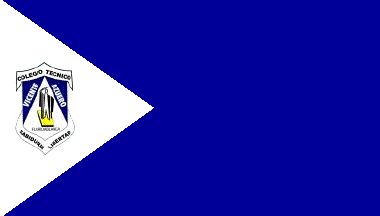 image by Ivan Sache, 10 November 2010
Colegio Vicente Azuero, based in Floridablanca (Department of Santander), was
created on 12 February 1979 by Decree No. 012. By Decree No. 12461 of 28 October
2002, Instituto Juan Pablo I, Instituto Andres Bello and Instituto Rio Frio were
incorporated to Colegio Vicente Azuero, which was renamed Colegio Técnico
Vicente Azuero. The institute is named for the Colombian lawyer, politician and
journalist Vicente Azuero Plata (1787-1844).
The flag of Colegio Técnico Vicente Azuero is blue with a white triangle placed along the hoist and
charged with the emblem of the institute.
The emblem of Colegio Técnico Vicente Azuero is made of a shield with a white
triangle pointing upwards flanked by two blue triangles pointing downwards,
charged with the white writing "VICENTE" (left) and "AZUERO" (right). The white
triangle is charged with a silhouette seemingly wearing a toga, standing on a
yellow book or stand, and the black writing "FLORIDABLANCA". The shield is
surmounted by a white scroll charged with the black writing "COLEGIO TECNICO".
Another white scroll placed below the shield is charged with the black writing
"SABIDURIA" (left, "Knowledge") / "LIBERTAD" (right, "Liberty").
Source:
http://www.colvicenteazuero.com/micolegio/micolegio.php?txtId_contenido=14
Ivan Sache, 10 November 2010
Blue is a symbol of depth, greatness and immensity. White is a symbol of
spirit, of immaculate soul and pure thoughts.
The emblem has a
traditional, heraldic shape, but also a modern shape meaning struggle and
honour. It features a person raising the right arm, as a symbol of high and
noble ideals, which are obtained through knowledge and science, represented by
the book.
A photo of the flag is available on the institute's website -
http://www.colvicenteazuero.com/eventos/galeria/533_941.jpg
Ivan
Sache, 10 July 2014
 image by Ivan Sache, 29 September 2014
Institución Educativa Victor Zubiría was established in 1974 in Colosó (Sucre
Department) by the Franciscan Missionary Sisters of Mary Help of Christians, a
congregation founded by St. Maria Bernarda Bütler (1848-1924; canonized on 12
October 2008 by Pope Benedict XVI). The institute is named for the local
educationalist Víctor Manuel de Zubiría Rossi (1873-1958).
The flag of the institute is horizontally divided green-white-blue (1:2:1).
Green is a symbol of hope, natural environment, and fields. White is a symbol of
poverty, peace, and personal force. Blue is a symbol of transparency, space,
liberty, and rivers.
Source: http://inevizu.galeon.com/
- Institute's blog
Ivan Sache, 29 September 2014
 image by Ivan Sache, 05 September 2017
Liceo Victoria Regia was established in 2003 in Mocao (Putumayo) by Olga Daza
Díaz and Nubia Daza Díaz. The name of the institute was coined by William Daza
Díaz, who maintains links with the sacred world of plants and spirits. The yagé
shamanic beverage (aka ayahuasca) inspired him the name of the biggest species
of water lily, native to the Amazon river. Originally named "Victoria regia"
in 1807 by John Lindley, the Queen Victoria's water lily is now known as "V.
amazonia" (Poepp.) J.C. Sowerby, based on an earlier description of the
species.
Source: Institute's website
The flag of Liceo Victoria Regia is horizontally divided green-yellow. Green
represents the power of the natural environment and its greatness. Yellow
represents knowledge, health and tenderness.
Source: Institute's
website
Ivan Sache, 05 September 2017
 image by Ivan Sache, 15 September 2014
Institución Educativa Villa del Socorro is located in Medellín (Antioquia
Department).
The flag of the institute is horizontally divided blue-white-green. Blue is a
symbol of peace, peaceful social interaction, sincerity, and solidarity.
White is a symbol of tranquility, calm, fraternity, solidarity, and peace.
Green is a symbol of hope, natural environment, and harmony.
Source:
http://ievilladelsocorro.jimdo.com/informacion-institucional/simbolos/ -
Institute's website
Ivan Sache, 15 September 2014
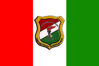 image by Ivan Sache, 29 January 2019
Institución Educativa Técnico Comercial Villa del Sur is located in Cali
(Valle del Cauca Department).
The flag of IETC Villa del Sur is
vertically divided red-white-green with the school's coat of arms in the center.
http://www.ievilladelsur.edu.co/nuestros_simbolos.htm?i=1
Ivan Sache, 29 January 2019
 image by Ivan Sache, 7 January 2009
"Colegio Eucarístico de Bogotá 'Villa Guadalupe'"
was founded on 20 January 1941 by nuns of the congregation of the
Mercederian Sisters of the Blessed Sacrement led by Mother María
de la Eucaristía Carmona. Founded on 20 March 1910 in Mexico
City by María del Refugio Aguilar Torres, Guadalupe Hernández
and María Olivares as "School of the Blessed
Sacrament", the congregation was canonically approved on 12
November 1922 by the archbishop of Mexico City as "Sisters
for the Blessed Sacrament Apostolate", and eventually
approved on 22 July 1948 by Papal "decretum laudis",
under its present name. The congregation has today 60 houses, 7
of them being located in Colombia.
Source: <www.orderofmercy.org>.
The flag of the institute, as shown and described on the website
of the institute, "to be used with elegance and pride
during the community events", is horizontally divided
white-dark red ("vino tinto", lit., "red
wine").
White represents purity, reflecting an ideal of virtue and
integrity, to be reached through rectitude, honesty and loyalty.
Dark red represents a deep meaning of Eucharist (as the wine
shared by Jesus with the disciples during the Last supper) :
sacrifice and love to get liberation through solidarity.
Ivan Sache, 7 January 2009
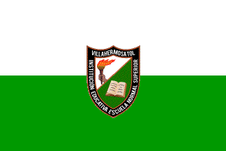 image by Ivan Sache, 23 October 2014
Escuela Normal Superior de Villahermosa (Tolima Department) was originally
established as Colegio del Rosario, renamed Colegio Oficial para Señoritas in
1935, and transformed into Escuela Normal Rural by Decree No. 962 of 21 December
1944. Escuela Normal Superior de Villahermosa was eventually established in
1996.
The flag of the institute is horizontally divided white-green with the
institute's emblem in the middle.
Photo:
http://www.normalsuperiordevillahermosa.edu.co/images/phocagallery/VisitaAcreditacion/thumbs/phoca_thumb_l_IMG_6079.JPG
Ivan Sache, 23 October 2014
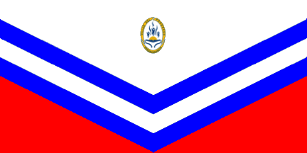 image by Ivan Sache, 4 August 2018
Institución Educativa Distrital Colegio Villas del Progreso was established
in 1993 in borough Villas del Progresso, Bosa, Bogotá.
The flag of the
school is prescribed in Article 6 of the Manual de Convivencia, as follows.
The flag emphasizes sense of belonging and institutional responsibility. Its
colors represent:
White: Considered as the color of peace, it is associated
with kindness, purity, freshness and perfection. This indicates that children,
as sources of purity and kindness, register with the school to increase and
progress, in search of perfection (in all its meanings), or, at least, for
improvement in all aspects. Children and teenagers represent freshness and
vitality of their age class, and have the energy required to be educated in the
school to obtain good or better results.
Red: Symbolizes value,
willingness, vigor, joy and stability. This indicates that students are
committed to transform their life through new experiments in the school
environment, which impacts them in diverse manners: biologically, since during
their stay at the school, they physically grow, entering as younger children and
leaving as teenagers and/or adults; academically, since they acquire a range of
knowledge, from writing to more complex areas, such as physic, calculation or
philosophy; socially, since they live in an environment where they have to cope
with unfamiliar people whom they have to learn to respect and accept, whatever
their difference in customs; and, emotionally, since they change and improve
through new relations established with all members of the educational community,
forming new links (for instance, friendship), which requires all the described
characteristics symbolized by the red color.
Blue: Represents confidence,
wisdom, intelligence, conscience, knowledge and tranquility. This is associated
with the expected benefits of the education and training process offered at
Colegio Villas del Progresso, which is a calm environment where conscience can
be potentialized, allowing a better compromise with individual learning and
meetings to solve conflicts between the members of the educational community, in
an intelligent manner and with wisdom, creating a confident environment for all.
The in-text image shows the flag as in proportions 1:2, white with two blue
chevrons, the lower chevrons delimiting two triangles at the bottom of the flag,
and the school's coat of arms, vertically centered and placed near the bottom of
the flag.
The coat of arms is prescribed in Article 5 of the Manual, as
follows:
The coat of arms represents the institutional seal.
Its colors
represent:
Blue: Confidence, intelligence, the eternal sky, faith, and truth.
Yellow: Wealth, energy, light, joy, happiness, and loyalty.
White: Purity,
perfection, freshness, and simplicity.
The coat of arms of Colegio Villas
del Progresso IED represents the recognition of the human being as the axis of
the institution, through personal, familial and social evolution. Study is seen
as the base of knowledge and development. The human being is in infinite search
for knowledge, in continuous movement and in harmony with other human beings,
the natural environment, and the world. The development of knowledge means
increase of the truth of the values, honesty, perseverance and justice.
The in-text image shows an oval coat of arms with a yellow border inscribed with
"VILLAS DEL PROGRESO" (top) and "PERSEVERANCIA" (bottom). The white field is
charged in base with a stylized open book surmounted by a yellow rising sun and,
in chief, three stylized, blue human beings raising their arms.
http://villasdelprogreso.edu.co/files/Manual_conv.pdf
Manual de
Convivencia
Ivan Sache, 4 August 2018
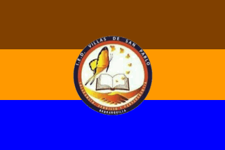 image by Ivan Sache, 13 May 2021
Institución Educativa Distrital Villas de San Pablo is located in Baranquilla (Atlántico). The symbols of IED Villas de San Pablo are prescribed in Article 6 of the Manual de Convivencia (2020).
The flag is a rectangle divided into three horizontal stripes, of equal
size, the first, coffee brown, representing the fertile soil that
sustains life; the second, amber, representing the proper quality of an
harmonious environment that sustains peace; and the third, king blue,
representing the Caribbean Coast, our pride. In the center is placed the
institution's coat of arms.
The coat of arms is of circular shape. The king blue border is inscribed
the name of the institution and the name of the town, Baranquilla, in
white letters. The amber border is inscribed with the institution's
values (Spanish: Perseverance, Dedication and Tolerance], also in white
letters. In the center of the white field is placed an open book,
alluding to knowledge, from which emerges a butterfly that starts small
and increases in perseverance, dedication and tolerance to eventually
represent the pride to complete the educative process. A handshake
emerges from the amber border, representing respect for the others and
diversity.
Source: Manual de Convivencia institucional
Ivan Sache, 13 May 2021
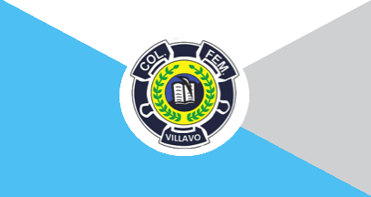 image by Ivan Sache, 1 January 2021
Colegio Nacionalizado Femenino de Villavicencio was established in
Villavicienco (Meta) on 20 December 1955 by Decree No. 321.
Source: Institute's website
The school uses now a different flag, with a slightly different emblem.
The flag of Colegio Nacionalizado Femenino de Villavicencio is quartered per
saltire celestial blue-white-gray-celestial blue, charged in the center with the
school's emblem placed on white disc.
Blue is the color that best
identifies the institution [it was absent from the previous flag]. The
psychology of blue expresses professionalism, knowledge, seriousness and
confidence. Experiments have shown that extended observation of blue color
deepens respiration and decreases pulse and blood pressure. Blue conveys a
feeling of being in a place of union and protection.
Gray, referring to the
brain's gray matter where human understanding is located, represents theory and
reflection. "In the reflection's chromatic agreement, gray combines with blue.
The blue-white-gray combination is found in the agreement of science and
objectivity" ("Psicologķa De Los Colores: El Color Gris", Juan Nśńez, 2015).
White is one of the institution's emblematic colors. In color psychology, white
is associated with feelings of purity, limpidity, simplicity, ingenuity,
nobleness and suavity.
The emblem forms a laurel wreath, a symbol of the
aspiration and achievements of the studying youth.
The central disk is a
symbol of union and fraternity among educators, students and the community. The
open book and the quill are symbols of science, apostate and consecration. The
central circle has a blue background.
http://www.colfemenino.edu.co/pagina/nuestro-colegio/simbolos/itemlist/tag/himno
School website
Ivan Sache, 1 January 2021
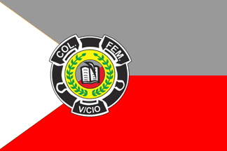 image by Ivan Sache, 06 September 2017
The flag of Colegio Nacionalizado Femenino de Villavicencio was horizontally
divided gray-red with a white triangle placed along the hoist and the
institute's coat of arms all over.
Gray is a symbol of sobriety.
Red is a symbol of vital strength.
White is a symbol of purity.
The coat of arms forms a laurel wreath, a symbol of the aspiration and
achievements of the studying youth.
The central disk, gray and red like the flag, is a symbol of union and
fraternity among educators, students and the community. The open book and the
quill are symbols of science, apostolate and consecration.
Source:
Institute's website
Ivan Sache, 06 September 2017
Photo:
https://sites.google.com/site/colfemcoordi/imagen-ins/bandera
Ivan
Sache, 1 January 2021
"Escuola Normal Superior de Villavicienco" was
created on 20 December 1955 by the National Intendance of Meta
(Decree No. 321) as "Escuela Normal Rural de Meta Santa
Teresita del Niño Jesus".
The flag of the institute, according to a photo shown on the presentation
leaflet of the institute, is horizontally divided white- red
with the emblem of the institute in the middle.
The emblem of the institute, a white disk with a grey outline and
a thicker red border, shows two open hands surmonted by a torch
"going through" an open book. The base of the torch is
charged with three interlaced yellow, blue and red rings. The
name of the institute is written in red capital letters in the
upper part of the disk. The emblem shown on the flag shows minor
difference with the emblem shown graphically on the leaflet.
Ivan Sache, 11 January 2009
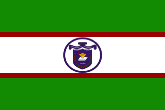 image by Ivan Sache, 28 January 2019
Institución Educativa Técnica de Comercio Virginia Gómez was established
on 17 July 1943 in Ciénaga (Magdalena Department), as Escuela Complementaria.
IETC Virginia Gómez was established by
Resolution No. 1, issued on 1 March
2003; the school is named for Virginia Gómez, a noted teacher from Ciénaga.
The symbols of IETC Virginia Gómez are prescribed in Chapter III of the
Manual de Convivencia. The flag is red for hope, white for purity and wine red
for force and love. The flag is composed of three horizontal stripes, two green,
placed in the upper and lower parts of the flag, and one white in the central
part. Green represents the natural resources of the municipality, as well as the
aspirations and dreams of the members of the educational community. White
represents light that illuminates the minds of the young students, as well as
purity and virtue emanating from the heart of every human being. The wine red
stripes that border the center of the flag are a symbol of force, energy and
love, characteristic of the teachers. In the center of the white stripe is
placed the coat of arms as the institutional symbol.
The coat of arms of
IETC Virginia Gómez features in the upper part a scroll inscribed with the
institutional name of the school. The shield is charged with a burning lamp,
placed on a book, the whole symbolizing the light of knowledge. The lamp and
book are surrounded by the symbol of the wealth of Ciénaga [coffee branches]. In
the upper part is placed the base of our pedagogy, which is dedicated to
integral education of the students.
http://ietcvirginiagomez.edu.co/wp-content/uploads/2018/04/M.-Convivencia-actualizado-2-2018.pdf,
Manual de Convivencia
Ivan Sache, 28 January 2019
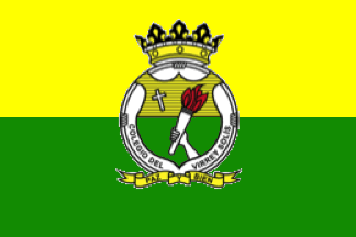 image by Ivan Sache, 16 December 2020
Colegio Franciscano del Virrey Solis was founded in Bucaramanga on 3 February
1941 by a solemn mess celebrated by Friar Bernardo Rangel in the chapel of the
San Francisco convent, which had been founded in 1937.
The establishment of
the school was decided on 10 October 1940 by Friar Jesśs Marķa Velįsquez
Escobar, Provincial Minister of the Order of St. Francis. Friar Emiliano
Bautista was appointed first director of the school, which started with 290
students, a number increased to 900 in 1943.
The school is named for José
Manuel Solķs Folch de Cardona (1716-1770), 3rd Viceroy of New Granada, who
subsequently took the coat in the Franciscan monastery of Purificación de Marķa
in Bogotį.
https://www.colvirreysolis.edu.co/
College website
The flag of Colegio Franciscano del Virrey Solis is horizontally divided
yellow-red with the school's coat of arms in the center.
Yellow
represents resources in knowledge, wisdom, feelings and values.
Green
represents hope that the youth educated in the school will will build a new
society where justice and peace take their genuine meaning, and the natural
environment, associated of the principle of love and respect fro the natural
fraternity issued by ecology's patron saint, St. Francis of Assisi.
The
coat of arms is composed of:
- a crown in the upper part, symbolizing
leadership exerted by the school's namesake, Viceroy Solķs
- the cordon of
the Order of St. Francis surrounded the shield, with three knots representing
the vows professed by the members of the community that manages the institution.
- on a yellow background recalling the flag, the cross expressing the school's
confession; which holds Jesus Christ as the proof of genuine Christian value and
enlightens evangelization of the educational affairs.
- on a green background
recalling the flag, in the lower part, emerges an arm holding a torch, which
expresses knowledge, understanding and enlightening, proper to the Franciscan
philosophy.
- Appended to the cordon, a scroll inscribed "PAZ AND BIEN"
(Peace and Good), which characterizes the clear and firm bases on which the
school evangelizes and educate people.
https://www.colvirreysolis.edu.co/s10/el-colegio/quienes-somos
College
website
Ivan Sache, 16 December 2020
 image by Ivan Sache, 21 March 2019
Gimnaso Vizcaya was established in Tunja (Boyacį Department) by Municipal
Resolution No. 1,1318, adopted on 26 September 2002, as Colegio Integral
Personalizado. The school's founder and director, Alonso Moreno, also
established Gimnasio Santander in the town. The school was renamed to Gimnasio
Vizcaya in 2011, as a reference to the prosperous Spanish region of Biscay;
moreover, the Basque etymology of the name of the region alludes to a mountain
top, representing here academic excellence.
The flag of Gimnasio Vizcaya
is quartered, 1. White with the school's coat of arms, 2. Blue with the school's
name, as written on the coat of arms, 3. Red, 4. Vertically divided
white-blue-white-red-white-blue-white-red.
The shield of Gimnasio Vizcaya
is bordered in blue and quartered by a blue cross inscribed "Gimnasio Vizcaya"
in white letters on the horizontal arms, 1. and 4. Gules a letter "G" argent, 2.
Per bend argent a letter π azure and azure a pen nib argent, 3. Gules three
pallets azure.
Blue is a symbol of the greatness of space, the color of
water, of the sky, of the Earth and also the color of life, growth, hope and
future. Azure means constancy, authority and trust. Red is a symbol of the
vitality and force of the children, and the color of confidence, courage and
optimism. Letter π is a mathematical universal constant, representing the ratio
between the circumference and the diameter of a circle and highlighting the
importance of mathematics and its adequate teaching at the school. The pen nib
represents the development of letters and arts, which is required to stimulate
the children's creativity and development. The vertical stripes represent
integration of girls and boys in the community.
https://www.gimnasiovizcaya.com/simbolos.html#simbolos, School website
Ivan Sache, 21 March 2019